Blue Mediterranean-Rental accommodations
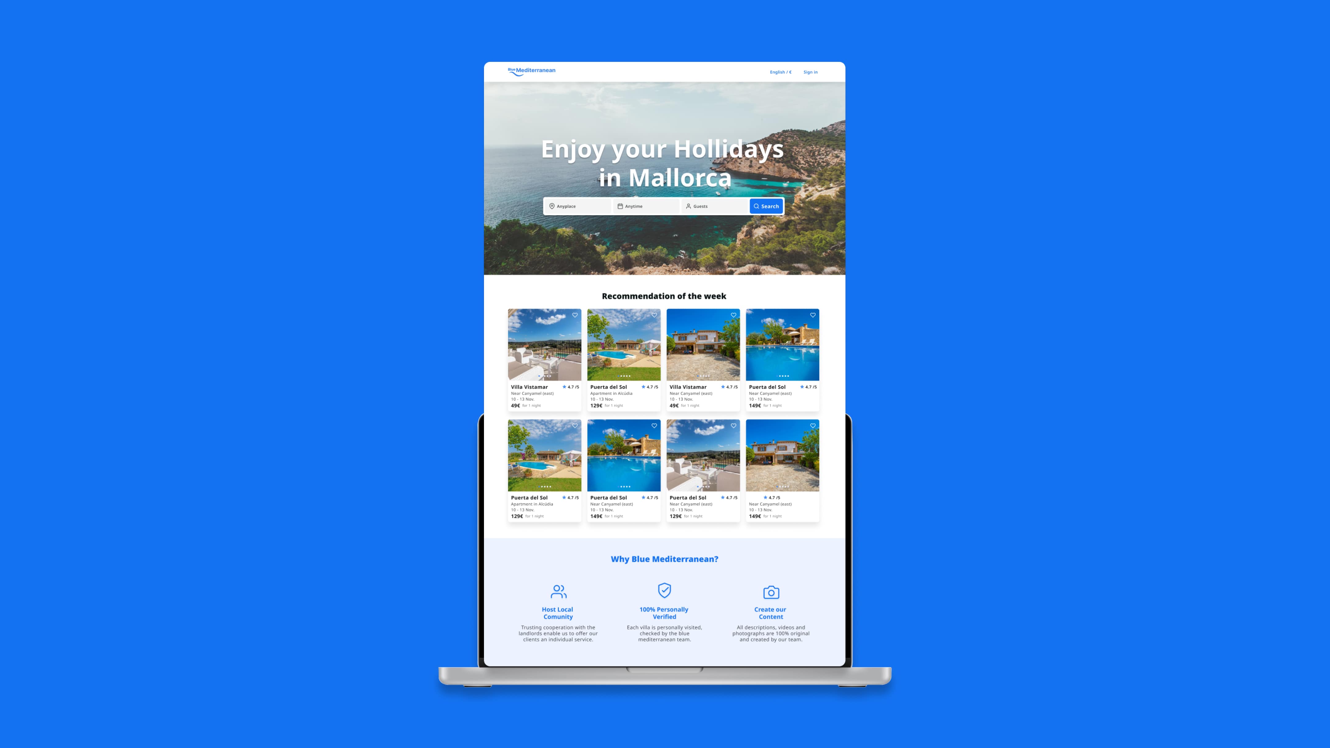
A digital platform on a mission to redefine the booking experience in a monopolized market—by building trust.
THE SCOPE
Project overview
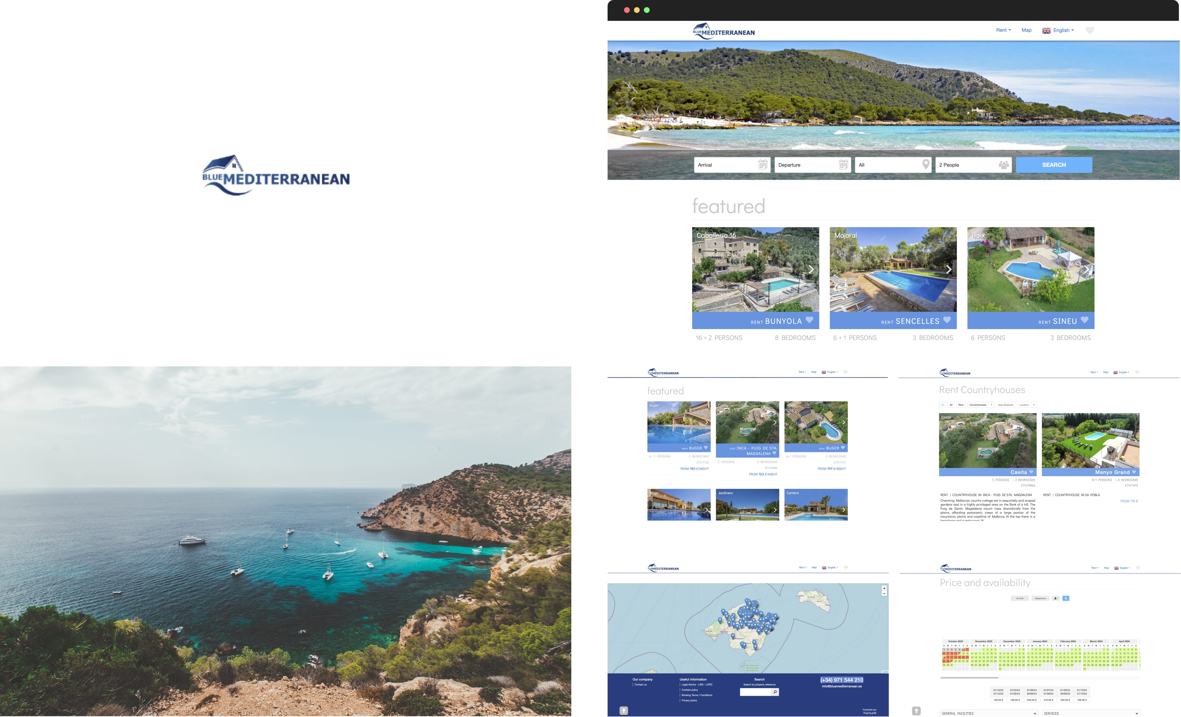
Blue Mediterranean, a vacation rental company in Mallorca Spain, aimed to compete with industry leaders such as Airbnb and Booking.com. Despite offering high-quality services and possessing a strong local presence, their outdated website impeded their ability to communicate their unique value proposition.
Objectives
- Redesign the website to establish credibility and realibility in today's market.
- Refresh the brand to reflect trust, transparency and quality.
THE CHALLENGES
- 1Trust issuesReal estate crisis and lack of trust in small companies
- 2Language barriersNon-Spanish speakers faced difficulties navigating.
- 3Need for clarityUsers required detailed, transparent information on accommodations.
- 4Diverse audience needsTourists, digital nomads, expatriates requires
RESEARCH & INSIGHTS
User Research
- Young adults (20-35): Tourists, digital nomads, and professionals seeking affordable, central accommodations near nightlife and activities.
- Middle-aged individuals (36-55): Families or expatriates looking for spacious, family-friendly options.
- Older adults (56+): Retirees or long-term renters seeking peaceful locales with scenic views.
Demographics
- Regions: Europe (UK, Germany, France, Scandinavia), global digital nomads.
- Income Levels: Ranging from budget-conscious to high-income travelers
- Gender: Balanced demand from both males and females.

UX & UI Design Process
1. Branding & Design System
Challenge: Communicate trust, safety, and quality effectively.
Solution:
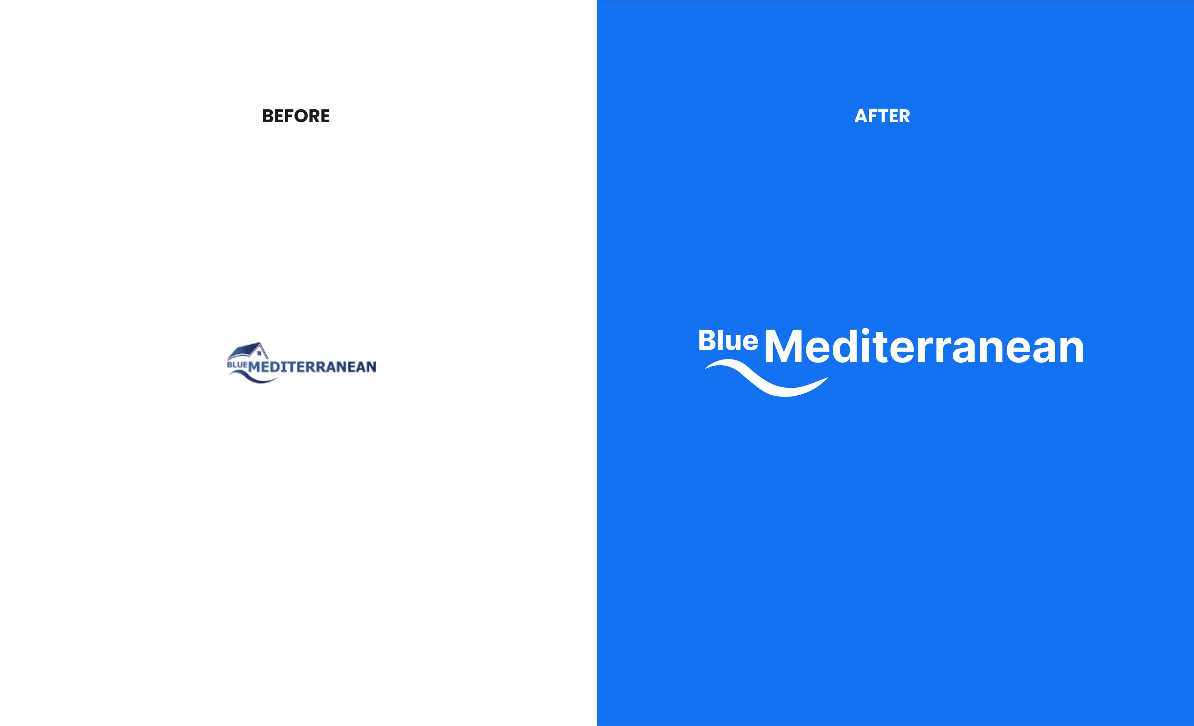
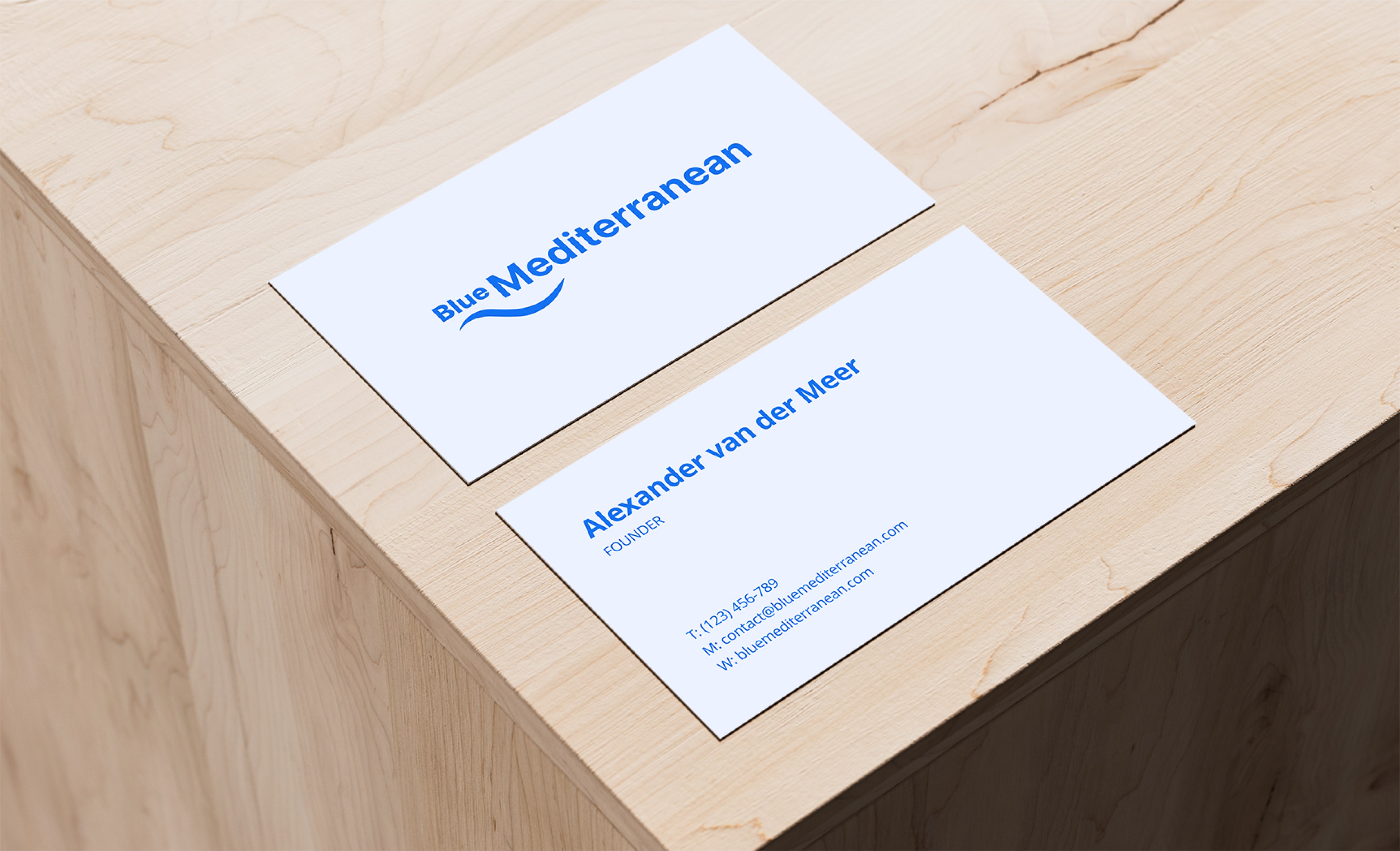
- Redesigned wave logo symbolizing Mediterranean calm and strength.
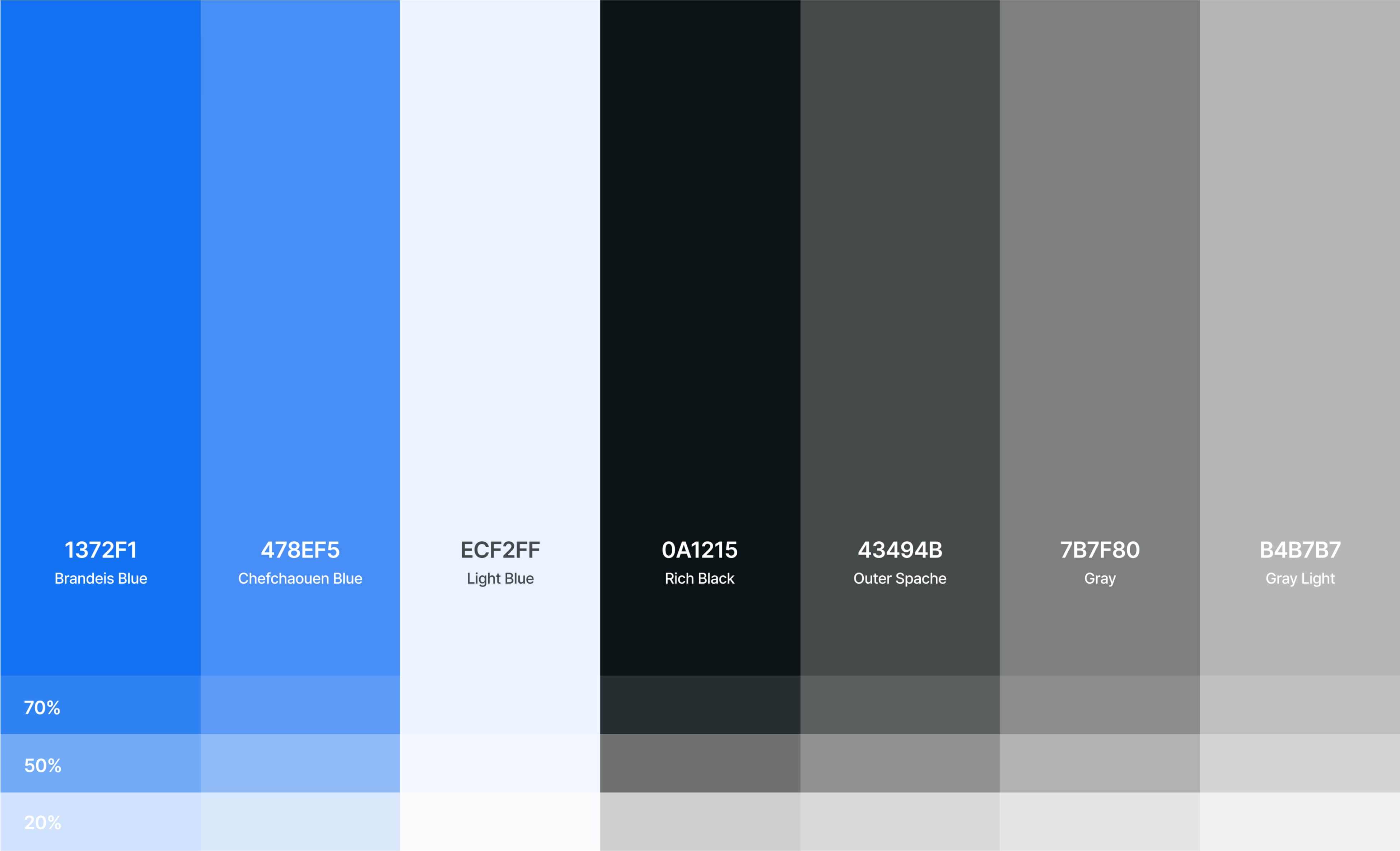
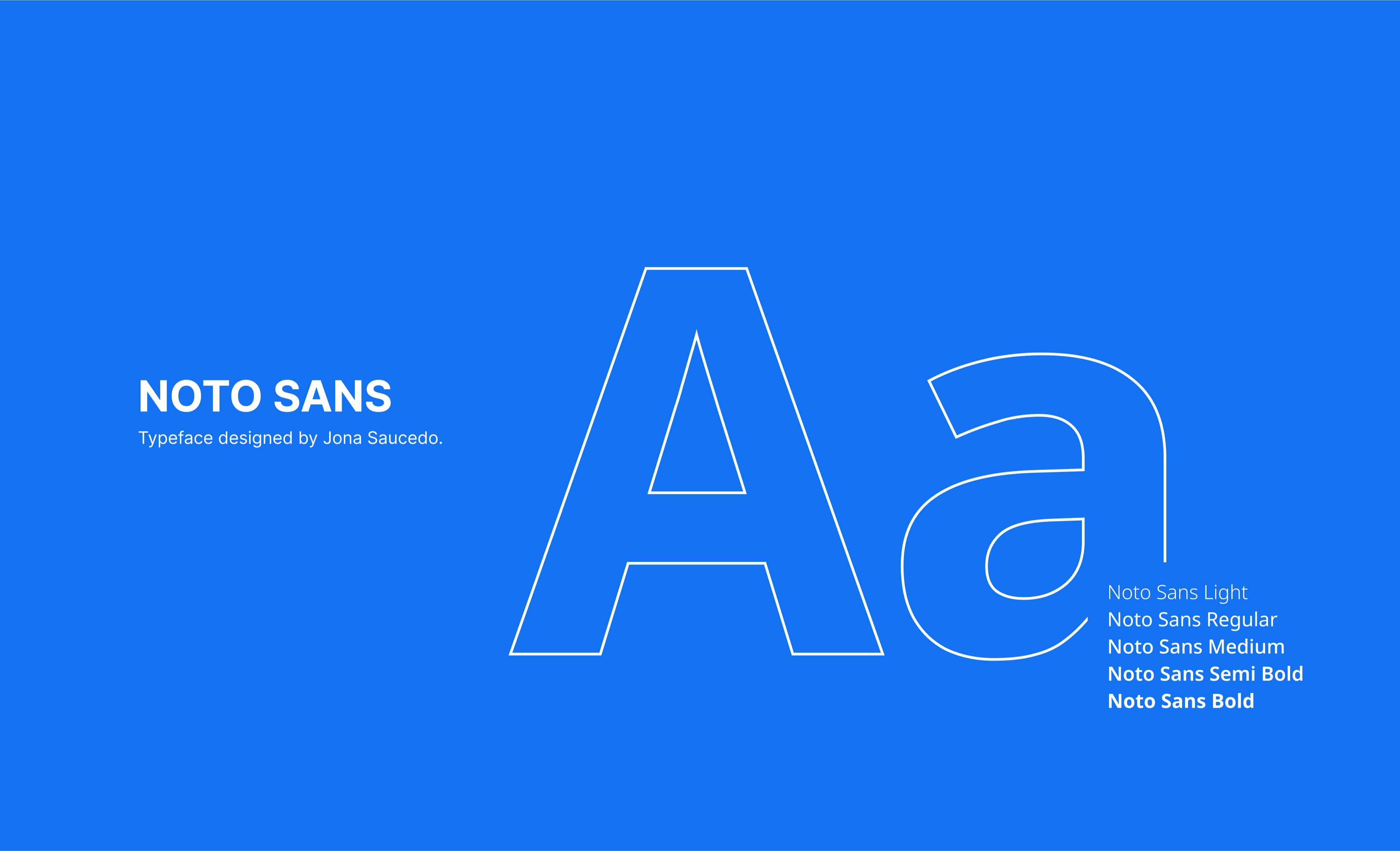
- Clean Noto Sans typography for readability and a modern blue-toned palette for reliability.
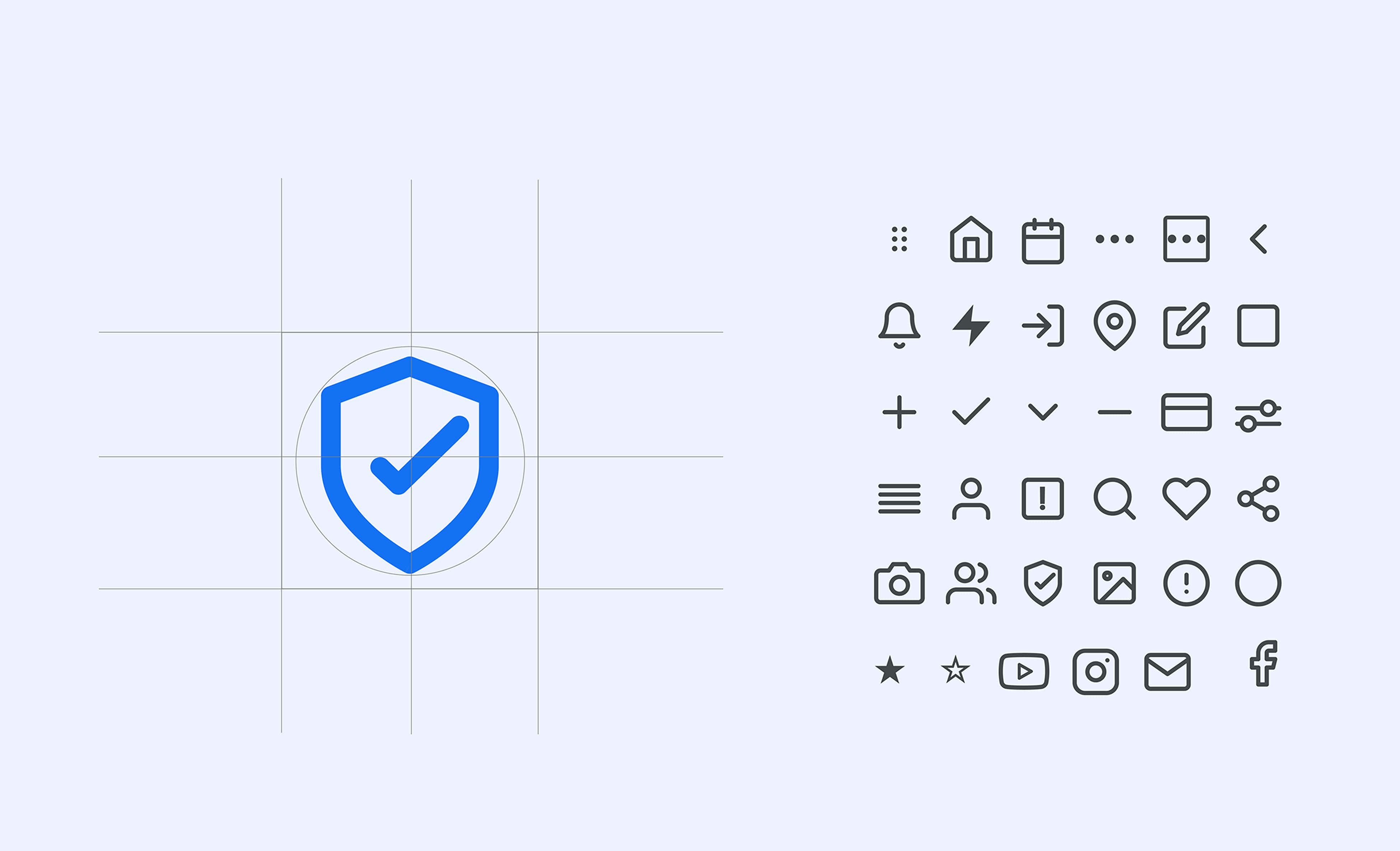
- Cohesive design system with engaging photography.
- New tagline: "Let's make your Mediterranean dream come true".
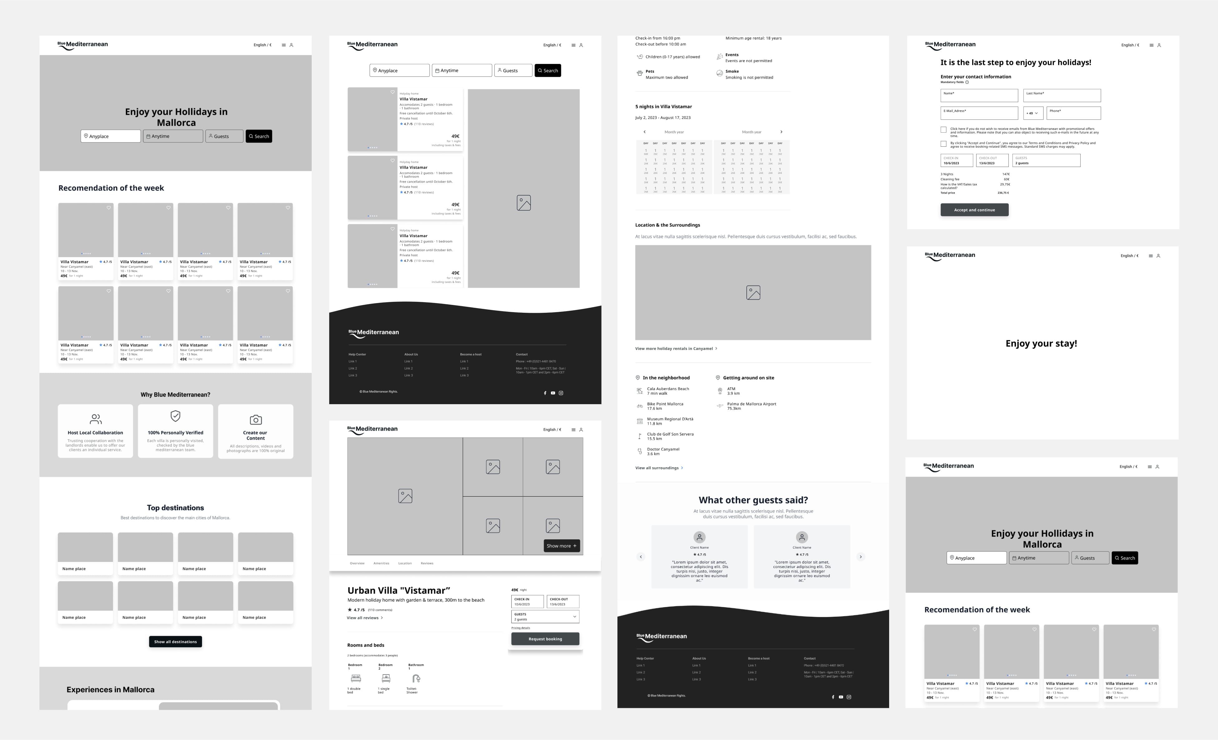
2. Website design
Challenge: Outdated design hindered usability and credibility.
Solution:
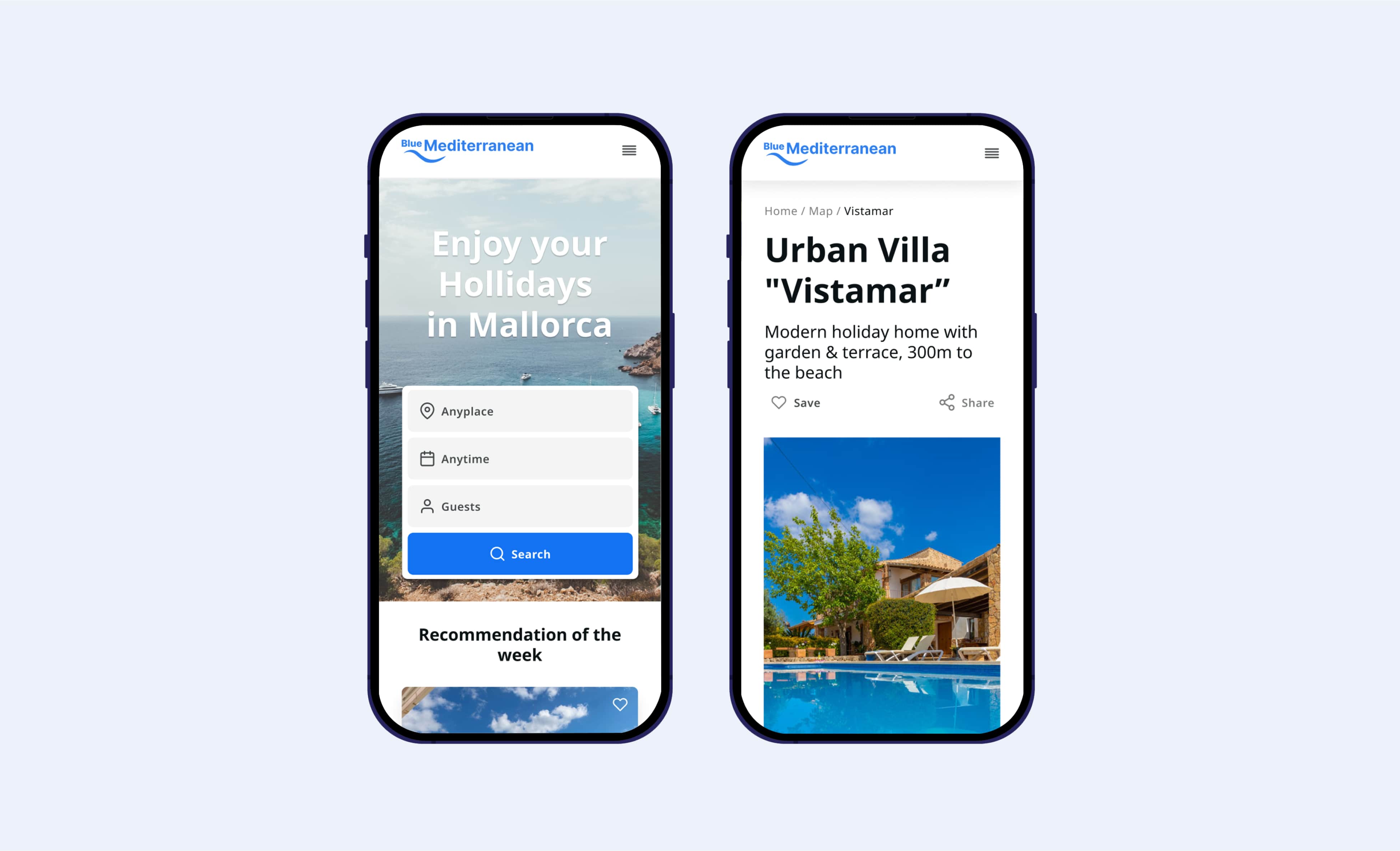
- Improved navigation and clarity.
- Focused on local experiences and verified quality.
- Highlighted user reviews and ratings.
To watch videos, you need to change your cookie settings preferences. Go to cookie manager and accept the field Tracking.
MAIN GOALS &D SOLUTIONS FEATURES
Goal 1. Build trust
Blue Mediterranean struggled to effectively communicate its unique value in a competitive market, limiting its ability to build trust and stand out.
Opportunity

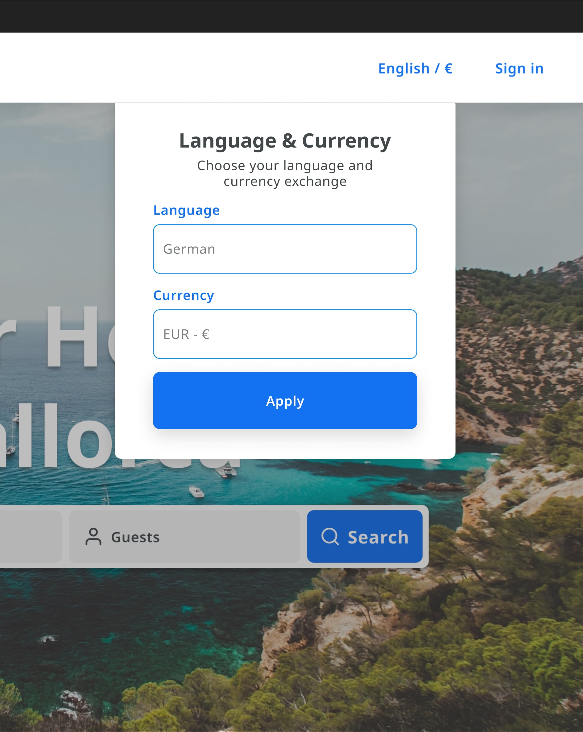
Goal 2. Enhance accessibility
Non-Spanish-speaking users encountered difficulties navigating the website and communicating with hosts.
Opportunities
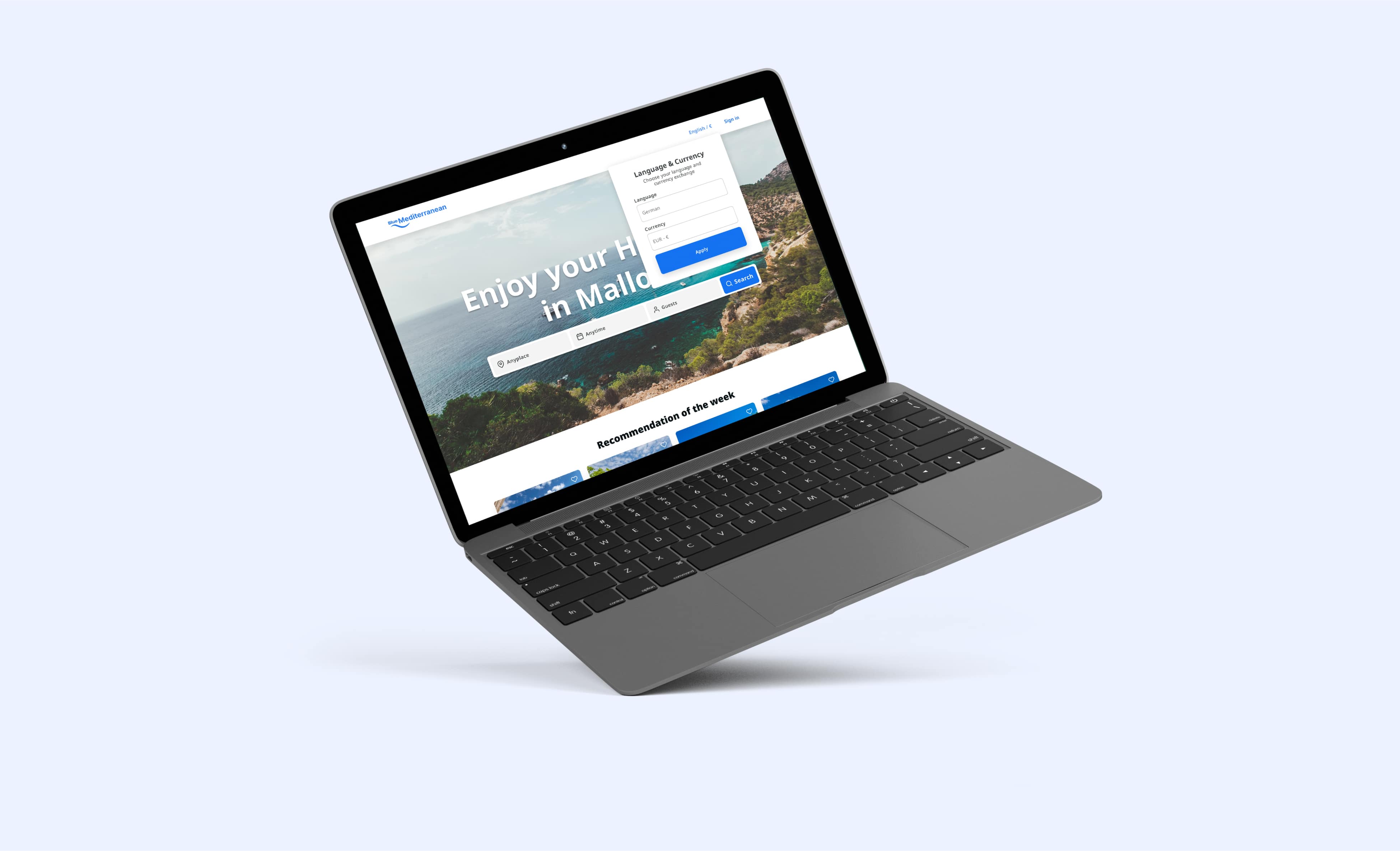
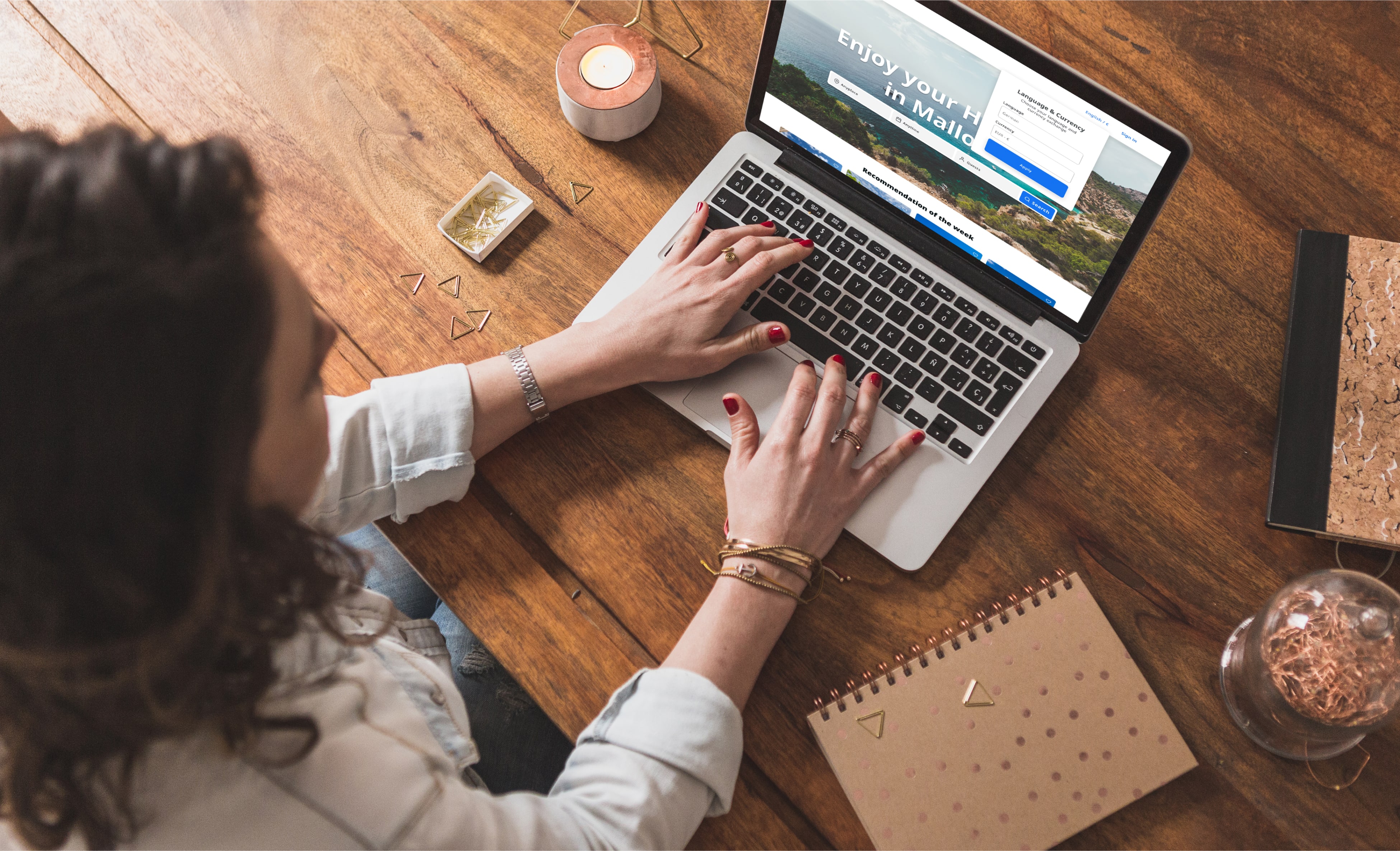
- Introduce multilingual support to cater to non-Spanish-speaking travelers.
- Provide translation options for key content to simplify navigation and communication.
Goal 3. Provide detailed information
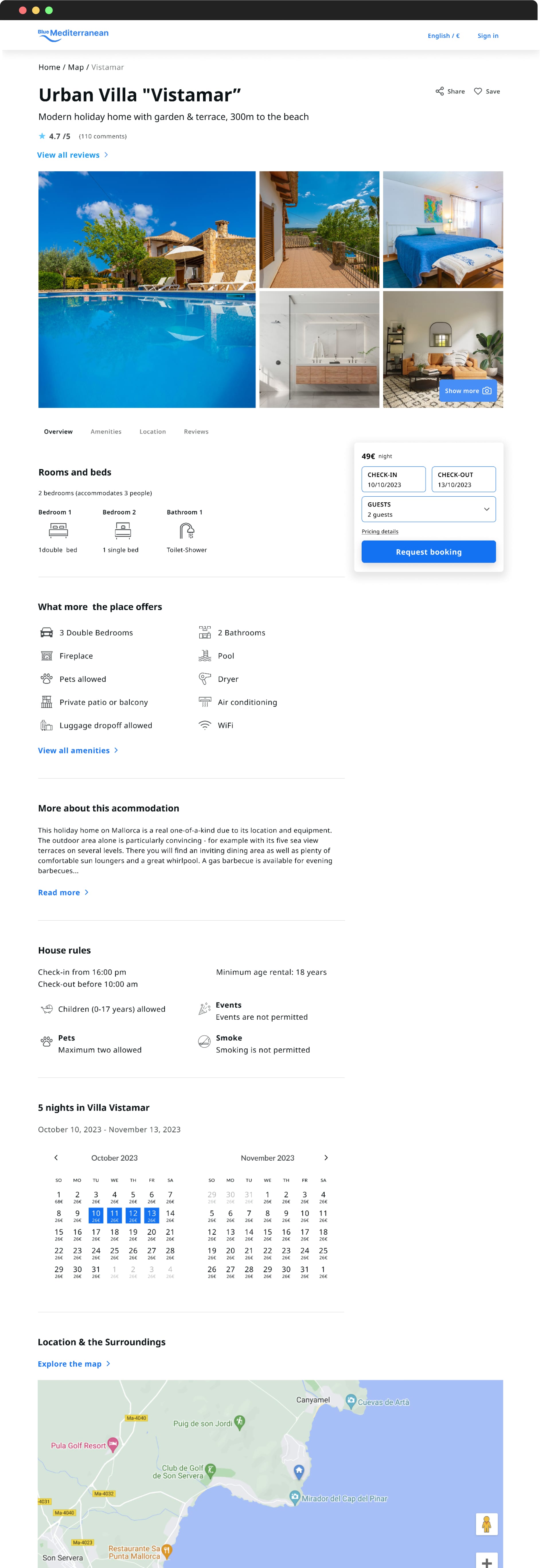
Users often struggled to find comprehensive information about properties and destinations, reducing their booking confidence
Opportunities
- Detailed property descriptions with clear pricing and fees.
- High-quality images and videos showcasing accommodations.
- Destination guides with local highlights and amenities.
- A secure, fluid and easy-to-use payment process
RESULTS & KEY LEARNINGS
Results
- Increased User Growth: Expanded reach across Europe and new markets beyond France, the UK, and Germany.
- Improved Social Media Engagement: Significant growth on Facebook and Instagram.
- Enhanced Trust and Credibility: Boosted direct bookings and user confidence in the platform.
Key learnings
This project gave me the opportunity to fully embrace a user-centric approach and reinforced the importance of highlighting a company's unique value proposition. By focusing on transparency, simplicity, and user needs, I was able to design a platform that not only reflected the client’s vision but also built trust and confidence among a diverse range of travelers, regardless of age or background.
I am especially grateful for the chance to work closely with the company’s owners, whose trust and support allowed me to develop creative solutions in a collaborative environment. This experience was invaluable for my professional growth and deepened my understanding of how thoughtful design can enhance both user experience and business impact.
