Decathlon Recruitment App
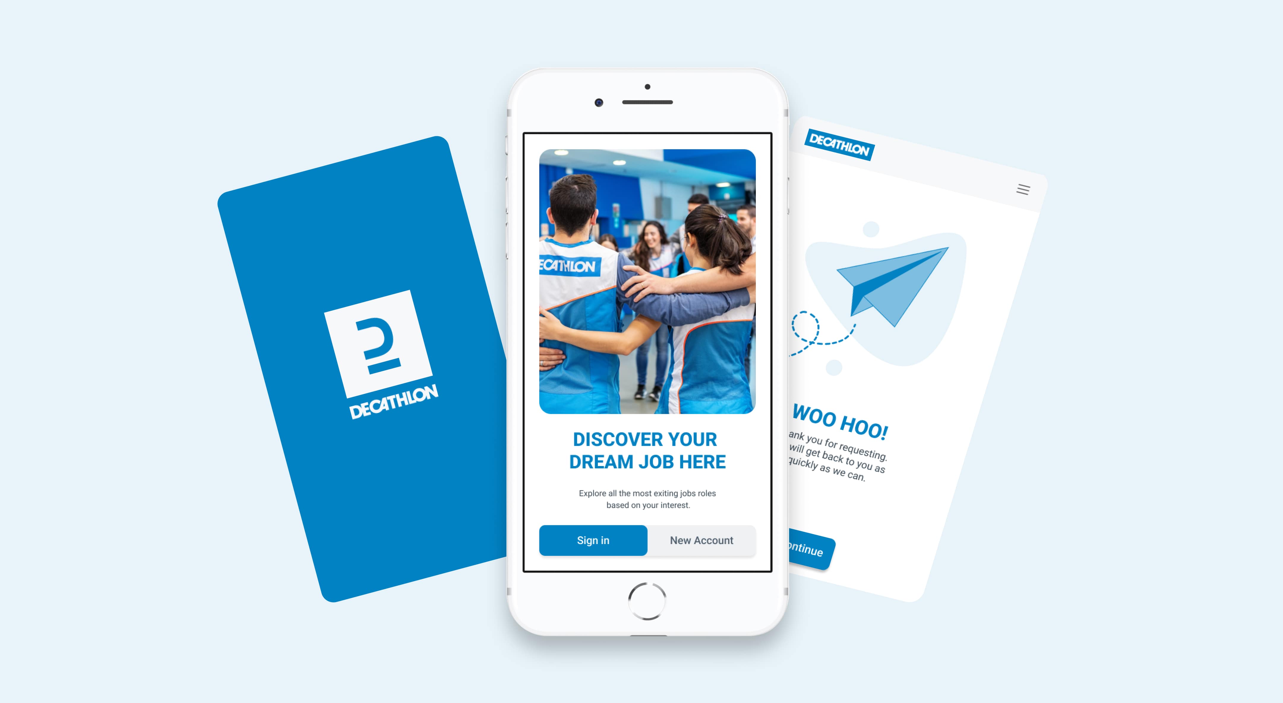
Aligning talent with Decathlon's values: designing a recruitment platform that inspires engagement and growth.
THE SCOPE
Project overview
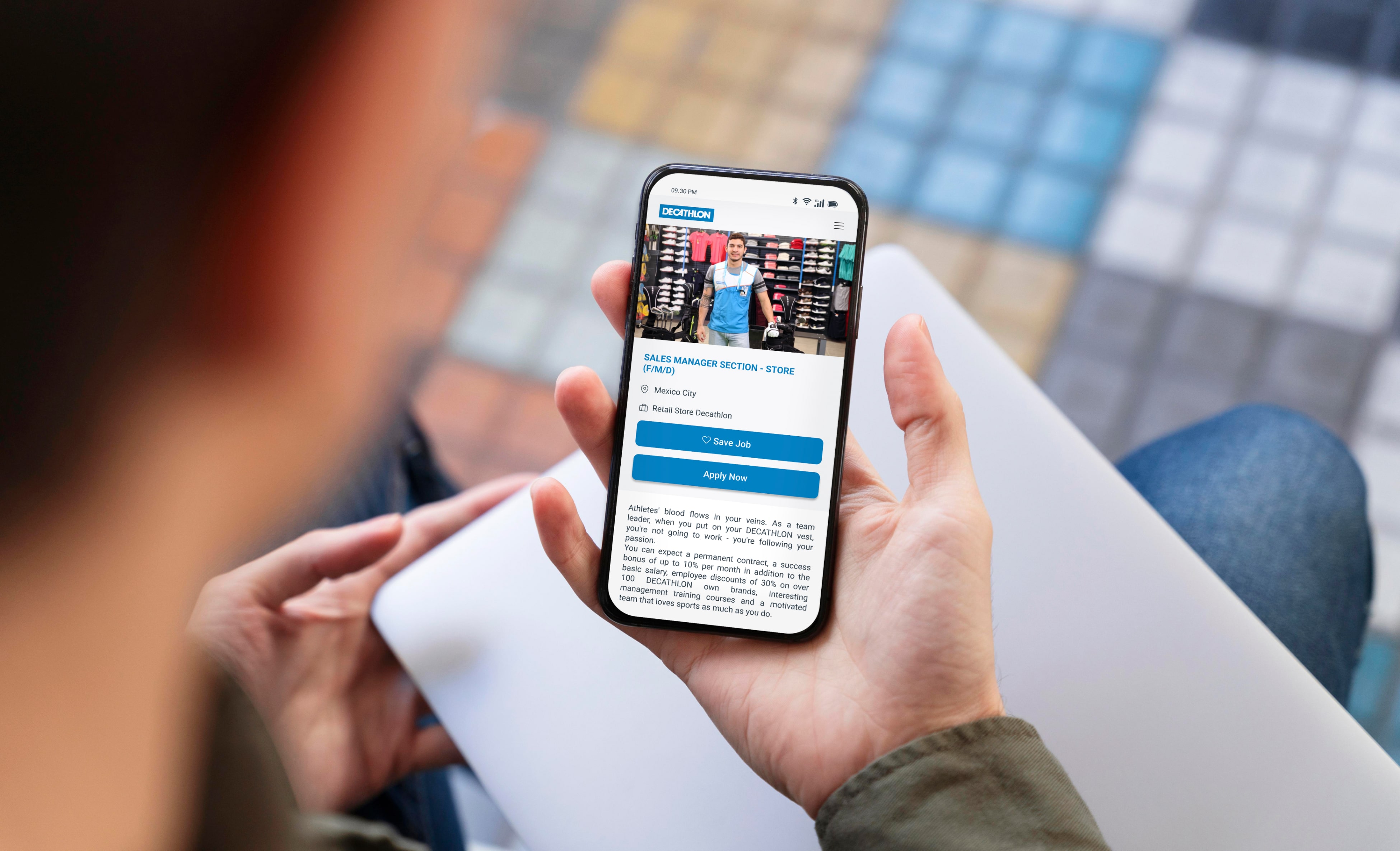
To support Decathlon's growth in the Mexican market, I led the design and development of an in-house recruitment platform. This tool was designed to attract sports enthusiasts who align with Decathlon's brand, focusing on a user-centric and flexible experience for both recruiters and candidates.
Objectives
- The challenge was to create an intuitive recruitment app that mirrored Decathlon's unique identity.
- This needed to be compelling enough to attract candidates passionate about sports and aligned with Decathlon's values, all while accommodating the competitive job market and seasonal hiring demands in the retail sector.
THE CHALLENGES
- 1Targeted recruitingFinding candidates who align with brand values and are passionate about sports.
- 2High competitionCandidates preferring companies that offer a positive experience.
- 3Seasonal demandRetail need flexible workforce solutions to address seasonal demand.
THE AUDIENCE
Decathlon's recruitment audience includes:
- Sports enthusiasts: Candidates who share Decathlon's passion for sports and an active lifestyle, willing to contribute to a dynamic retail environment.
- Job seekers in retail: Individuals looking for opportunities in retail, sales, and customer service, particularly those interested in working for a globally recognized brand.
- Young professionals: Early-career individuals or students seeking flexible, growth-oriented roles in a sports-focused company.
- Team players and leaders: Candidates eager to join a collaborative culture with opportunities for leadership and career development.

SOLVING THE PROBLEM
1. Branding
Challenge: The app had to reflect Decathlon's official brand identity, helping candidates connect with the company's values and fostering a motivated, engaged workforce.
Solutions:
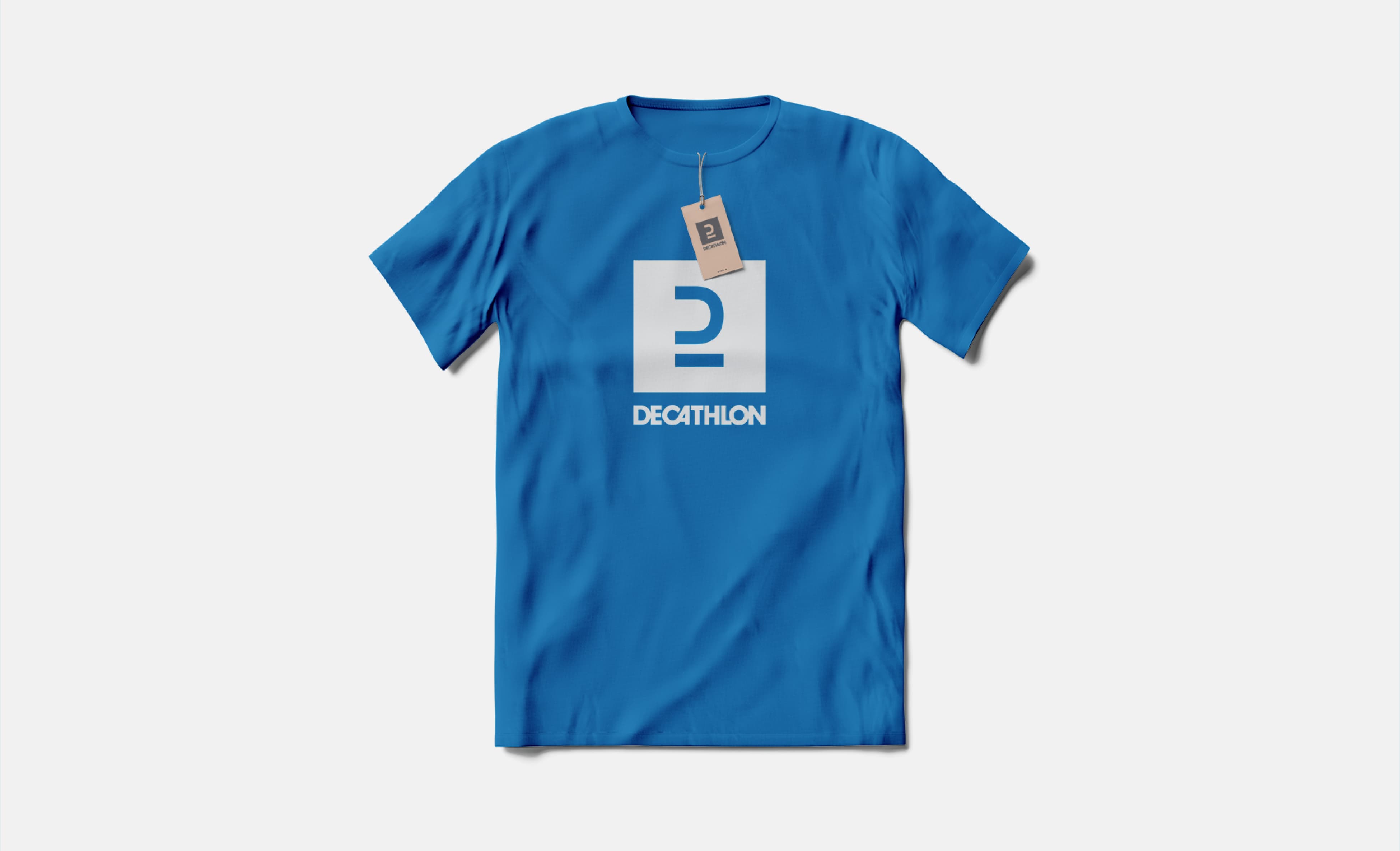
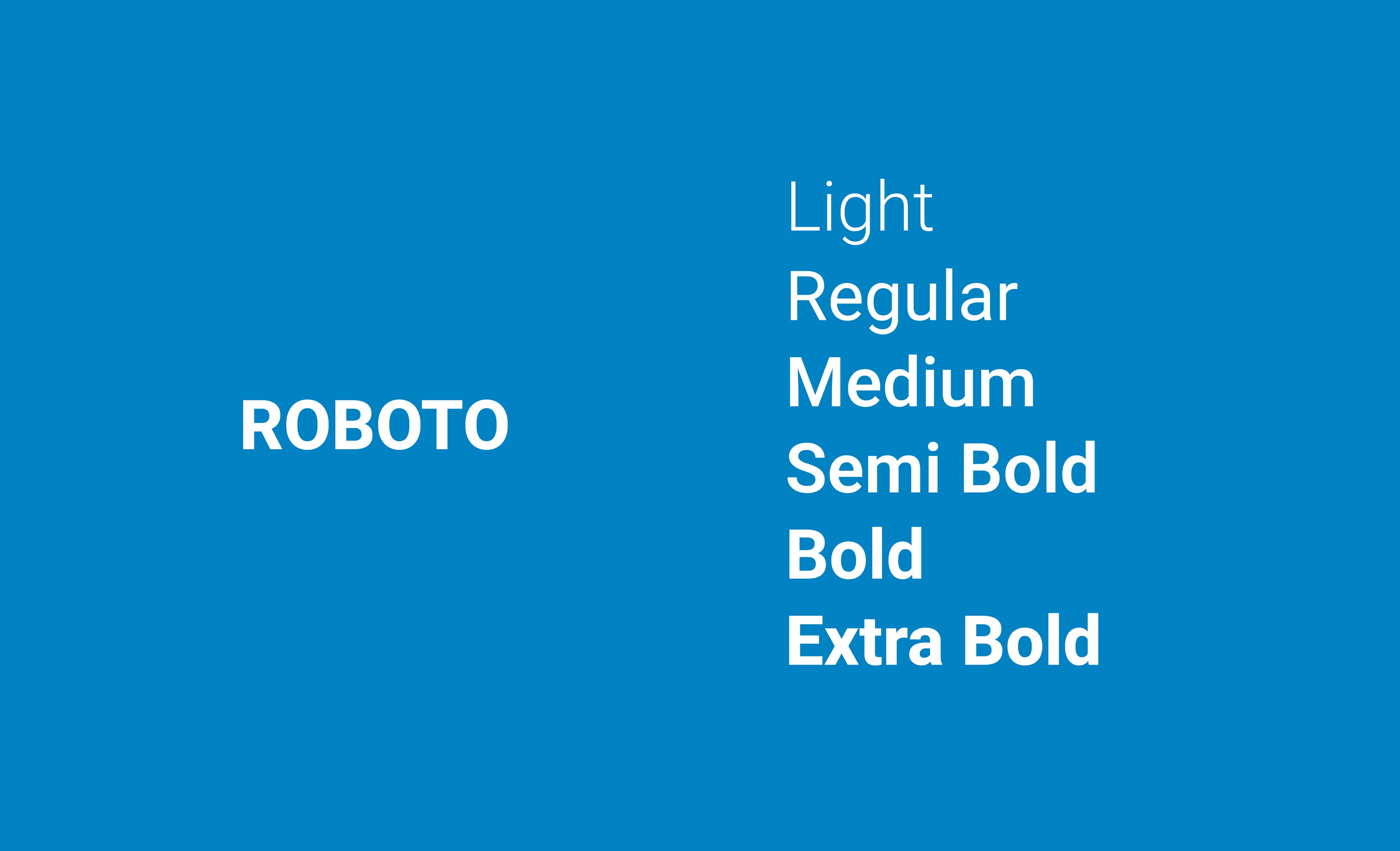
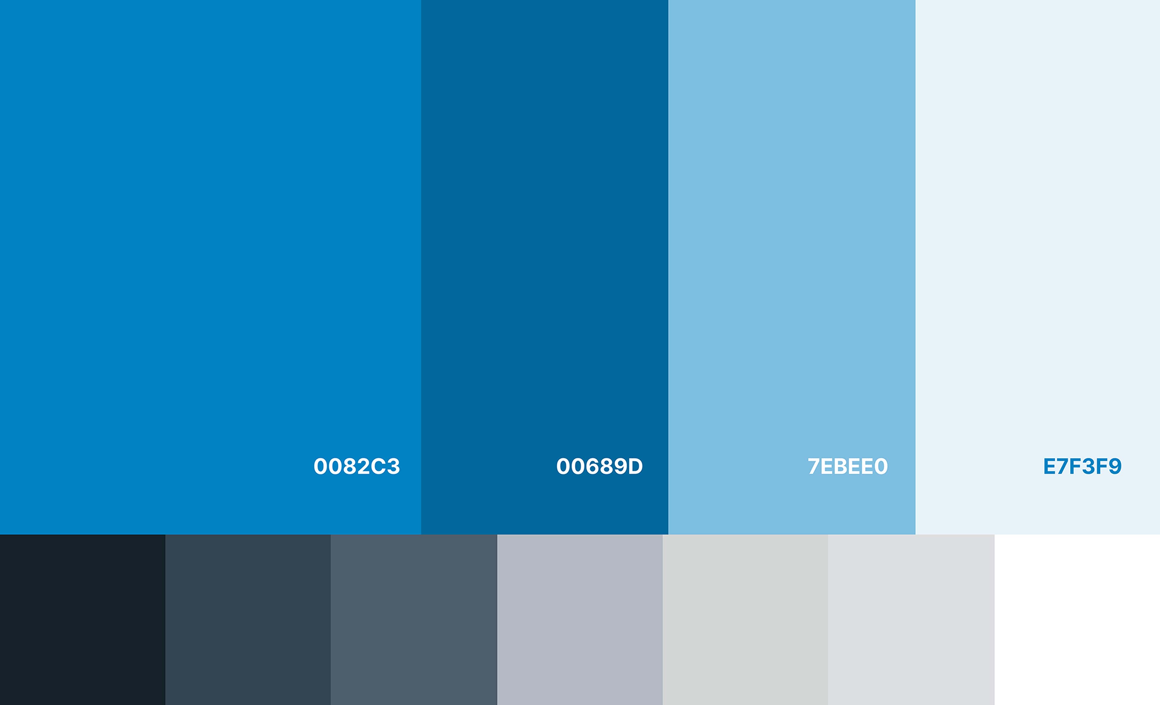
- Created a style guide aligned with Decathlon's official graphic line for consistency.
- Used the logo, Roboto font, and a blue color palette to enhance clarity and vibrancy.
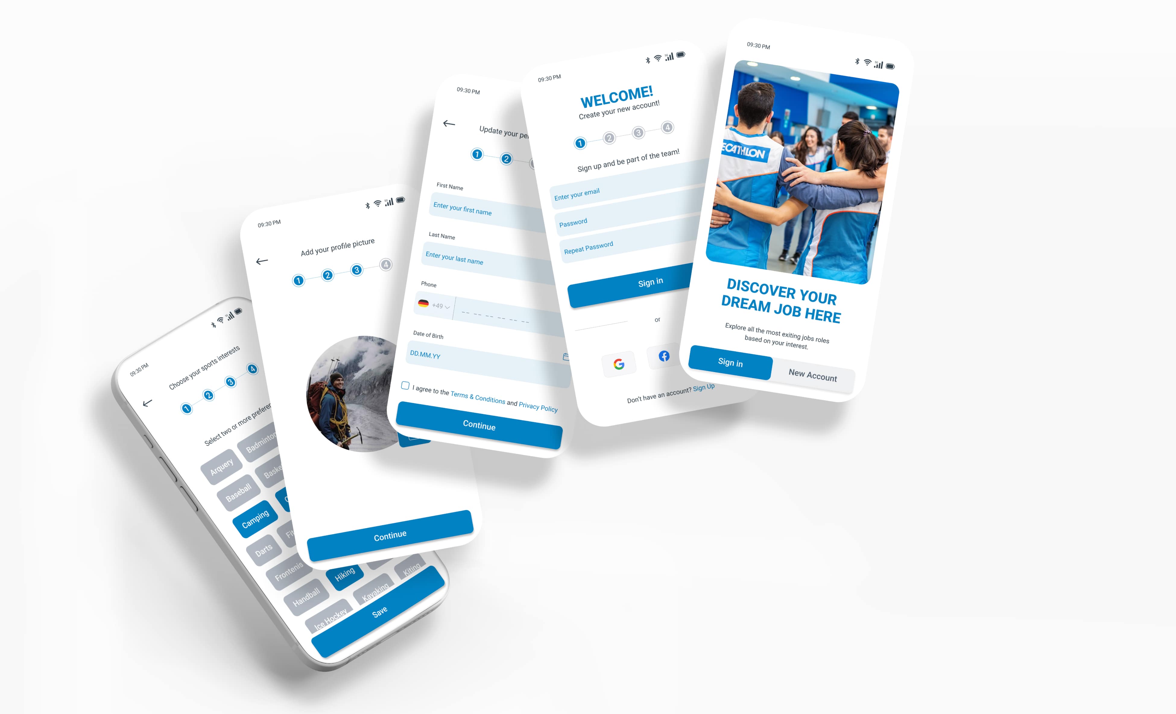
- Integrated videos and photos of employee testimonials and behind-the-scenes content.
- Highlighted Decathlon's inclusive and positive work culture to engage candidates.

2. Website Design
Challenge: The Decathlon Mexico app would highlight the different roles within the company and retail, while reflecting its culture and values.
Solutions:
- Personalized Experience: The app featured intelligent algorithms to offer personalized job recommendations based on interests and skills, emphasizing Decathlon's focus on sports.
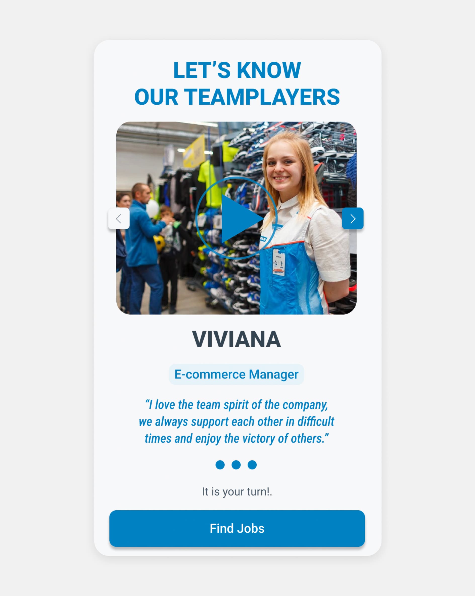
- Community Engagement: We integrated employee testimonials, behind-the-scenes videos, and social media connections to foster a sense of community and alignment with Decathlon's culture.
- Mobile-First Design: A mobile-first approach enabled easy job applications and real-time updates, with simple resume uploads and one-click applications.

To watch videos, you need to change your cookie settings preferences. Go to cookie manager and accept the field Tracking.
EXPLORING THE MAIN GOALS AND FEATURES
Goal 1. Enhancing Talent Acquisition
Recruiters have expressed concern that traditional recruitment methods, resulting in many candidates lacking passion and alignment with the company's core values.
Opportunities
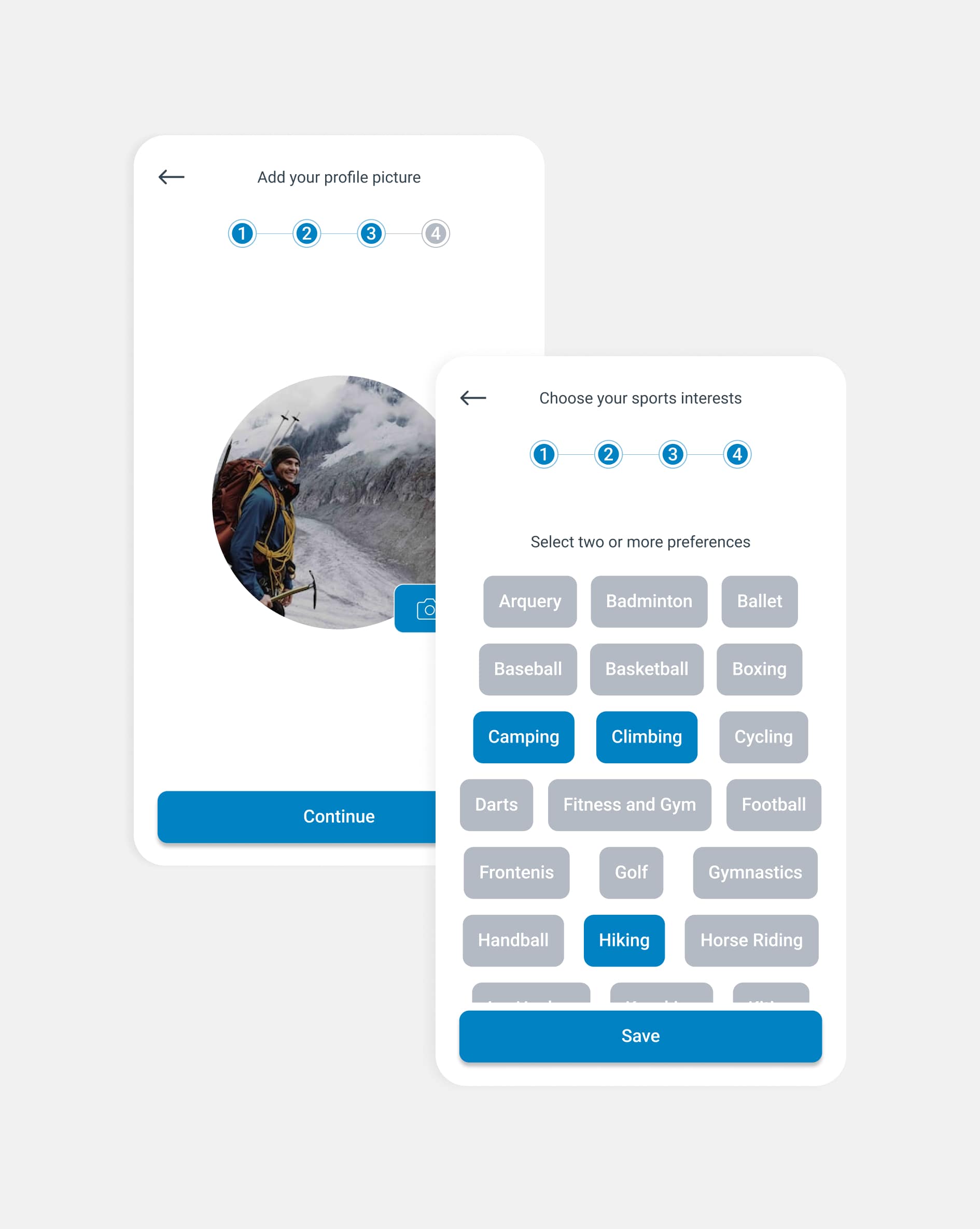
- Personalized job recommendations through the implementation of intelligent algorithms to match job candidates based on their interests, skills, and passion for sports.
- Integrating social network sharing and recommendations to foster a sense of community.
- Interest-based recruiting to allow users to specify their interest in different sports categories, understanding candidates' specific passions (e.g., running, cycling, team sports).
Goal 2. Fostering authentic connections with users.
User research has shown that key factors influencing customer loyalty include personalized communication, transparency in the process.
Opportunities
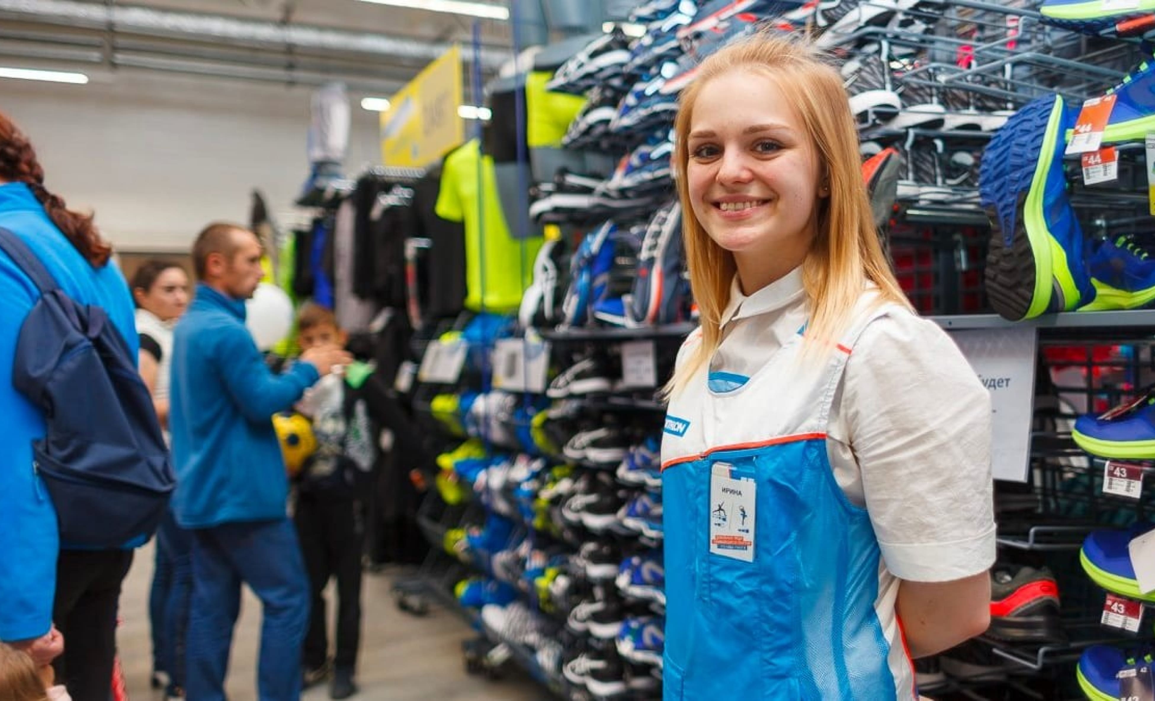
- Personalize the experience with behind-the-scenes content, and direct engagement options such as videos and testimonials, highlights Decathlon's culture.
- Employee opinions on their daily tasks and how they experience the company culture.
Goal 3. Optimising and accelerating the recruitment process
Research indicates that retail sports businesses experience significant fluctuations in demand based on the season (e.g., summer vs. winter sports).
Opportunities
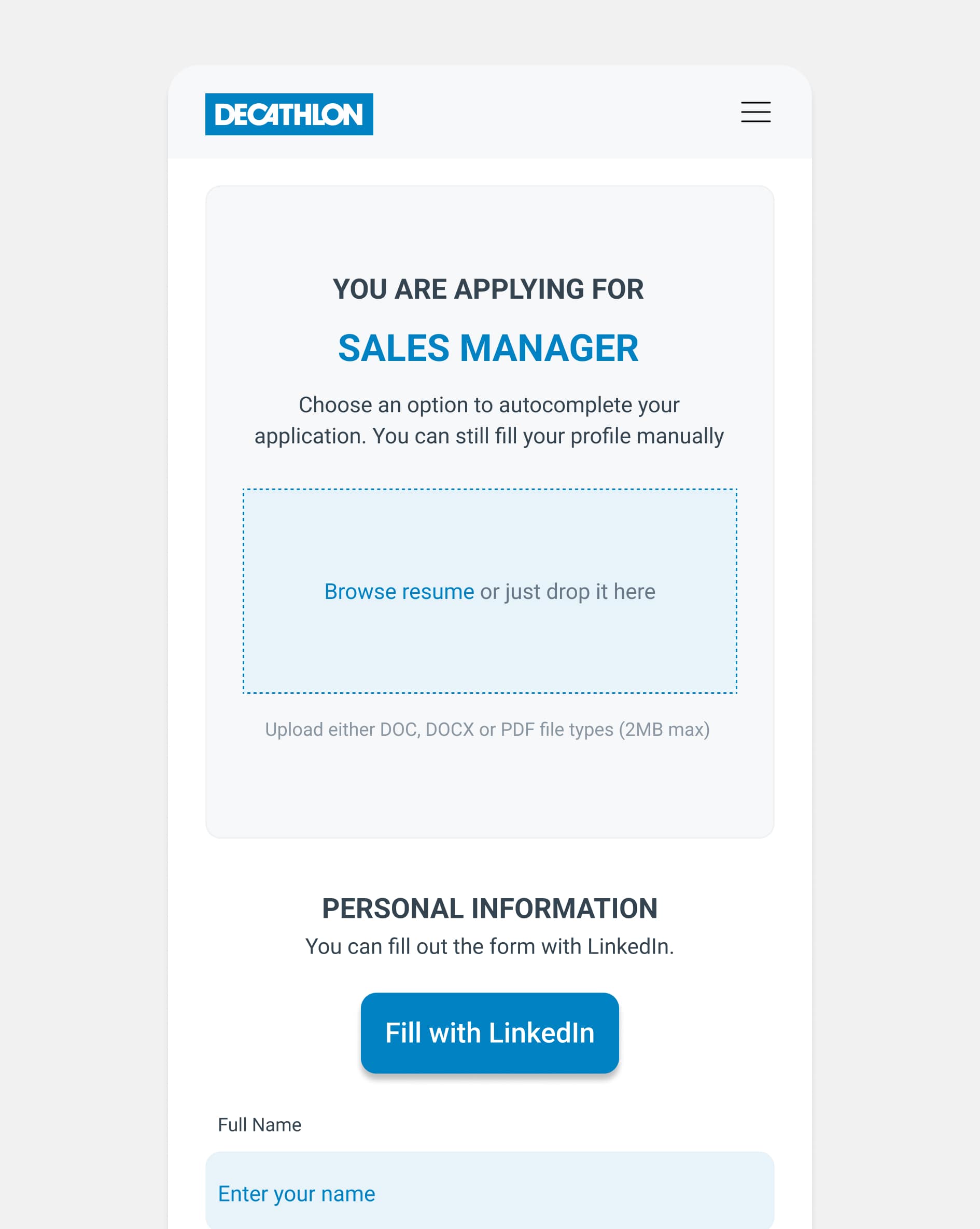
- Developed a mobile-first design with one-click applications for seamless use.
- Enabled resume uploads with pre-filled application options for convenience.
FINAL THOUGHTS
Results
The app fostered a motivated workforce and strengthened Decathlon's position in the Mexican market. Some key KPIs include:
- Boost retention rate by 20% among candidates recruited through the app within the first 6 months.
- Increase cultural fit scores for new hires.
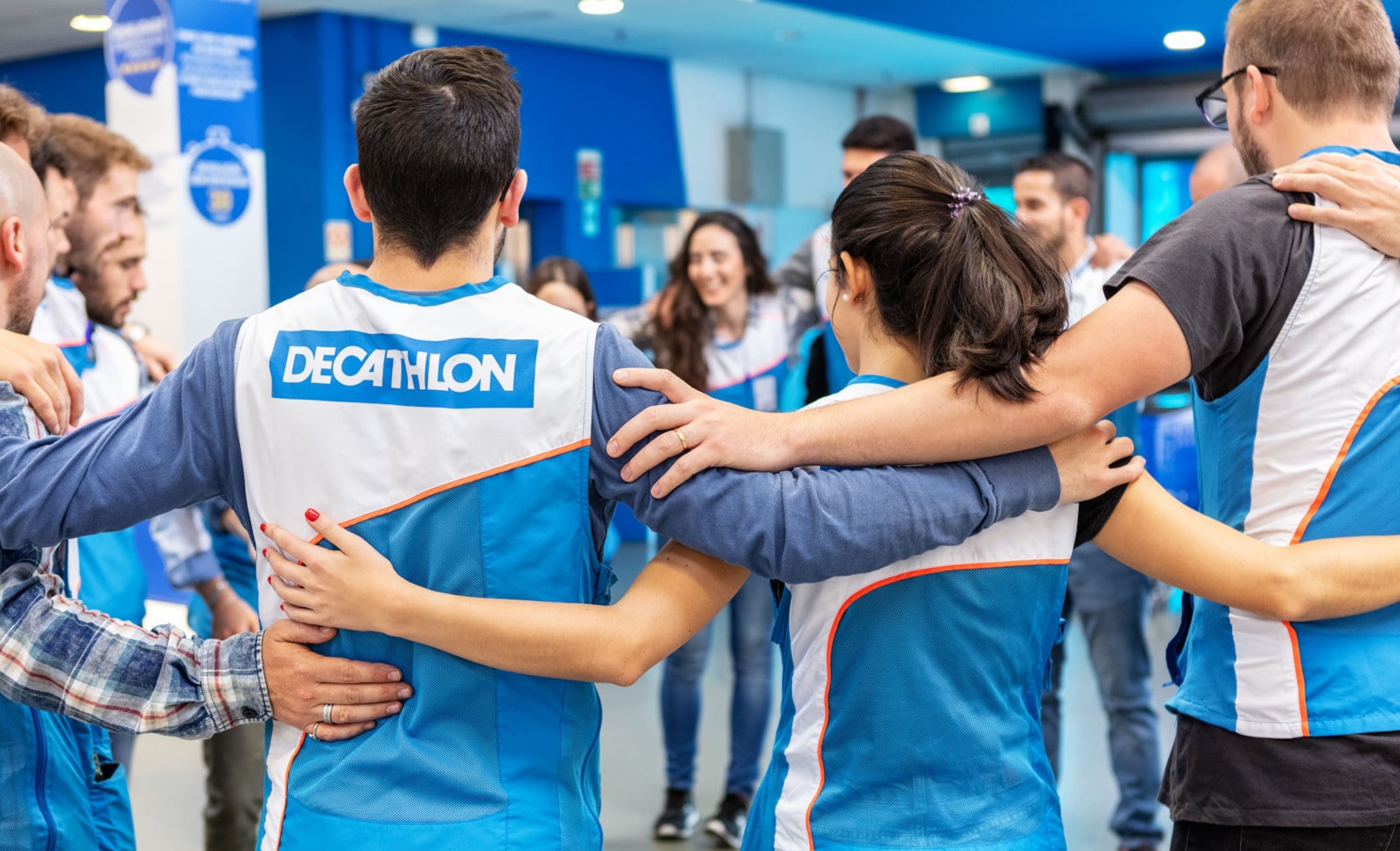
- Increase the fill rate of seasonal positions during peak hiring periods.
Key learnings
I love working in a team and achieving my goals. An example of this was my first project as UX/UI Designer, where I also assumed the role of project coordinator. We had the challenge of developing a recruitment application for Decathlon Mexico. Although there was the option of hiring an external agency, I managed to form an internal team with programmers and designers who were looking for new challenges within the company. It was a very challenging experience, as it was the first time I was leading a project of this kind. I had to learn fast and apply my knowledge in real time. Fortunately, I had a great ally: a fellow programmer who helped me organize the tasks and distribute the team's work. Thanks to this collaboration, I was able to design together with the other designers and successfully reach our goal. And that was the beginning of my career as a UX/UI Designer.
