Leo Enlisn — Art E-commerce Website
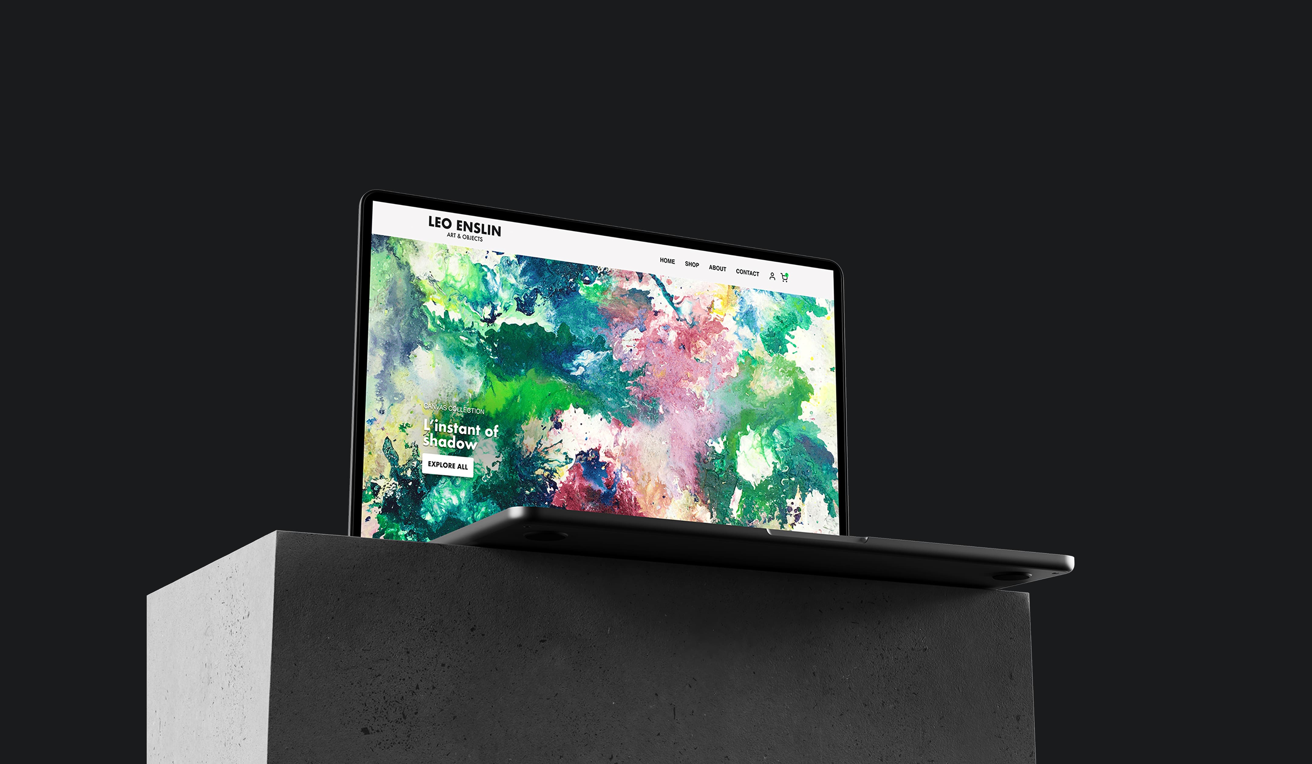
From Etsy to independence: Elevating Leo Enslin's artistic brand with a custom E-Commerce experience.
THE SCOPE
Project Overview
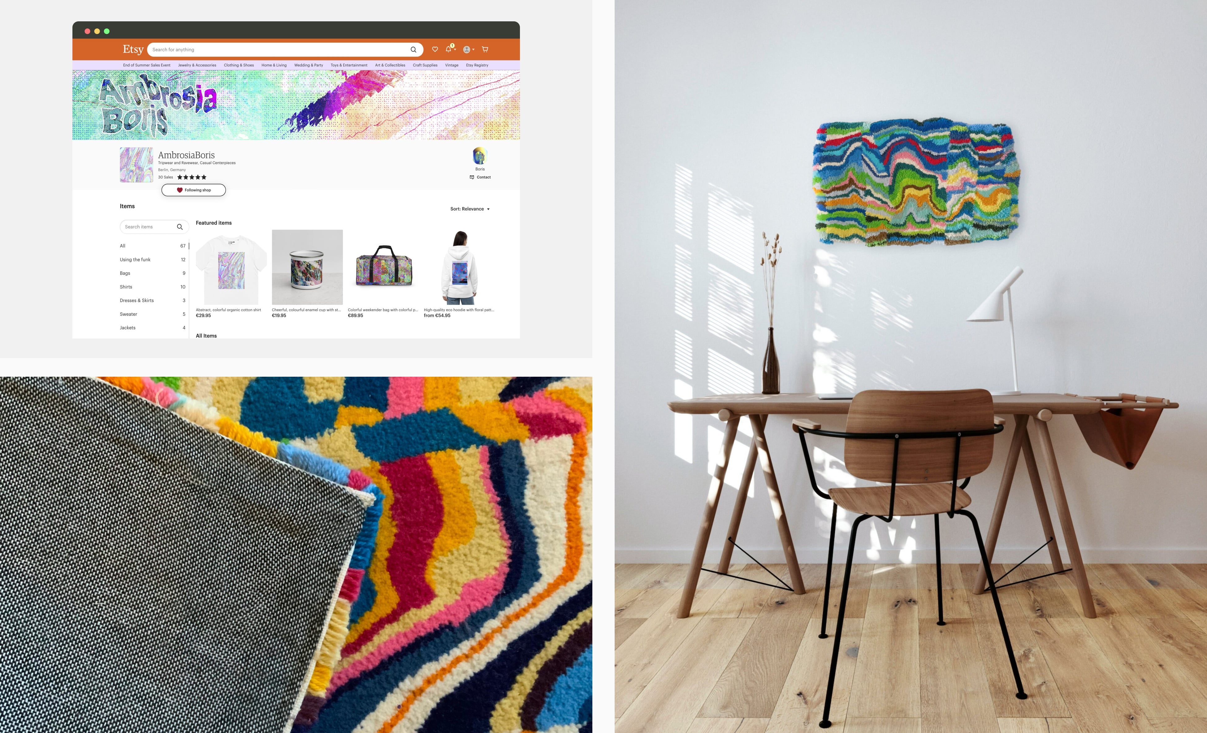
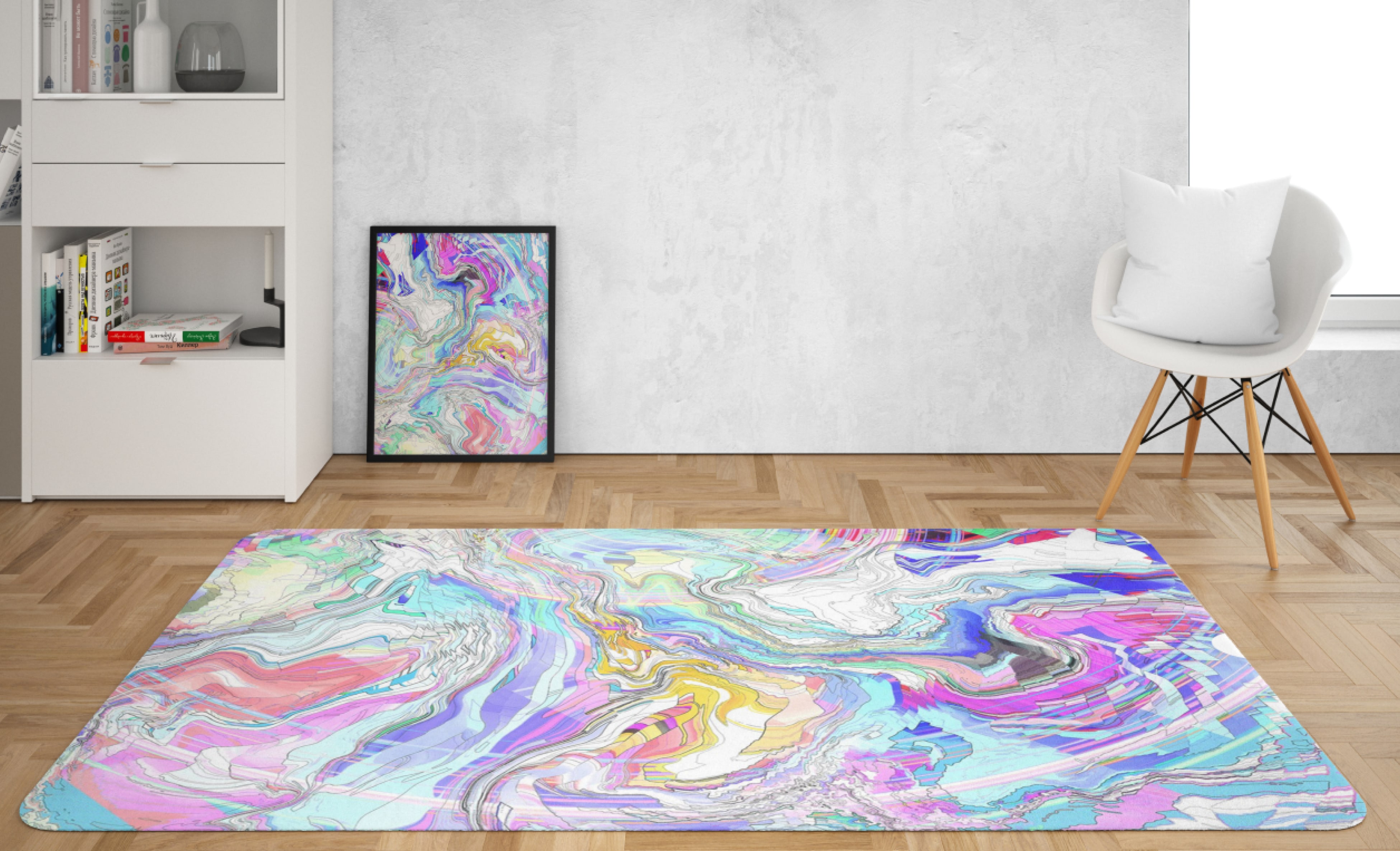
Berlin-based artist Leo Enslin creates unique, boundary-pushing art that includes clothing, home decor, accessories, and handmade rugs. Previously on Etsy, Leo sought a dedicated online platform to showcase his pieces in a space that reflects his artistic identity and expands his reach. We developed a custom e-commerce site that aligns with his vision, offering an intuitive and seamless shopping experience that encourages product discovery and sales.
Objectives
- Design a platform that highlights Leo's unique artistic style, creating a personalized and engaging user experience.
- Develop a branding strategy for Leo that distinguishes him in a competitive art market.
THE CHALLENGES
- 1Brand Dilutionon platforms like Etsy hinders unique brand presence.
- 2Lack of PersonalizationInteraction limits meaningful buyer engagement and loyalty.
- 3High CompetitionReduces visibility and makes it challenging for Leo to reach his audience.
THE AUDIENCE
Target Audience
- Home Décor Enthusiasts:: Individuals seeking unique and vibrant art pieces
- Art Collectors::: Those looking for exclusive, boundary-pushing work.
- Young Art Lovers:: Millennials and Gen Z audiences interested in wearable art and home decor.
- Gift Buyers:: Shoppers seeking memorable, artistic gifts.
- Corporate Clients:: Businesses seeking statement pieces for offices or events.
Demographics
- Regions:: Germany
- Gender:: Balanced demand from both males and females.

SOLVING THE PROBLEM
1. Branding
Challenge: In a saturated art market, Leo needed a brand identity that would resonate with diverse audiences while staying true to his modern, psychedelic style.
Solution:
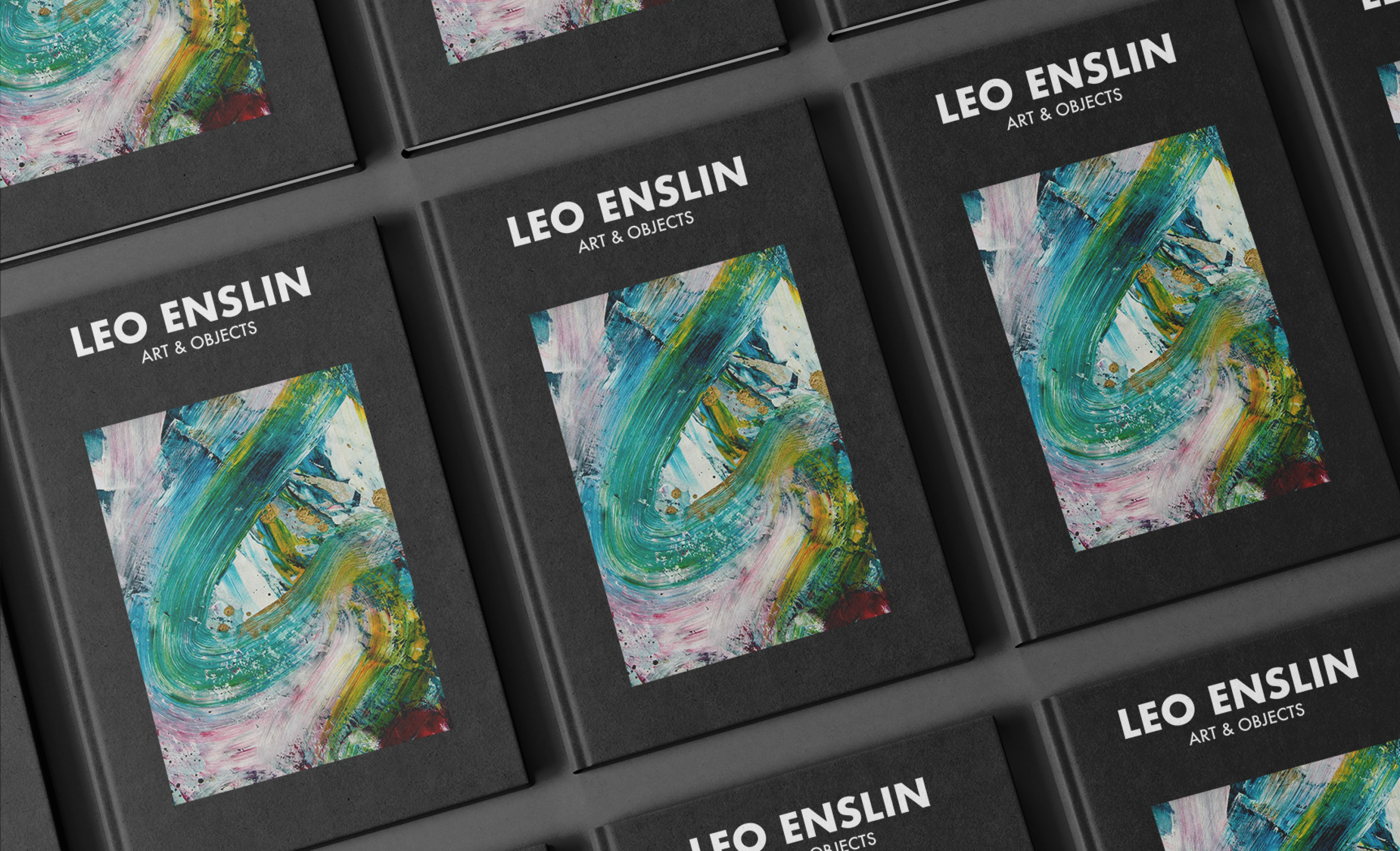
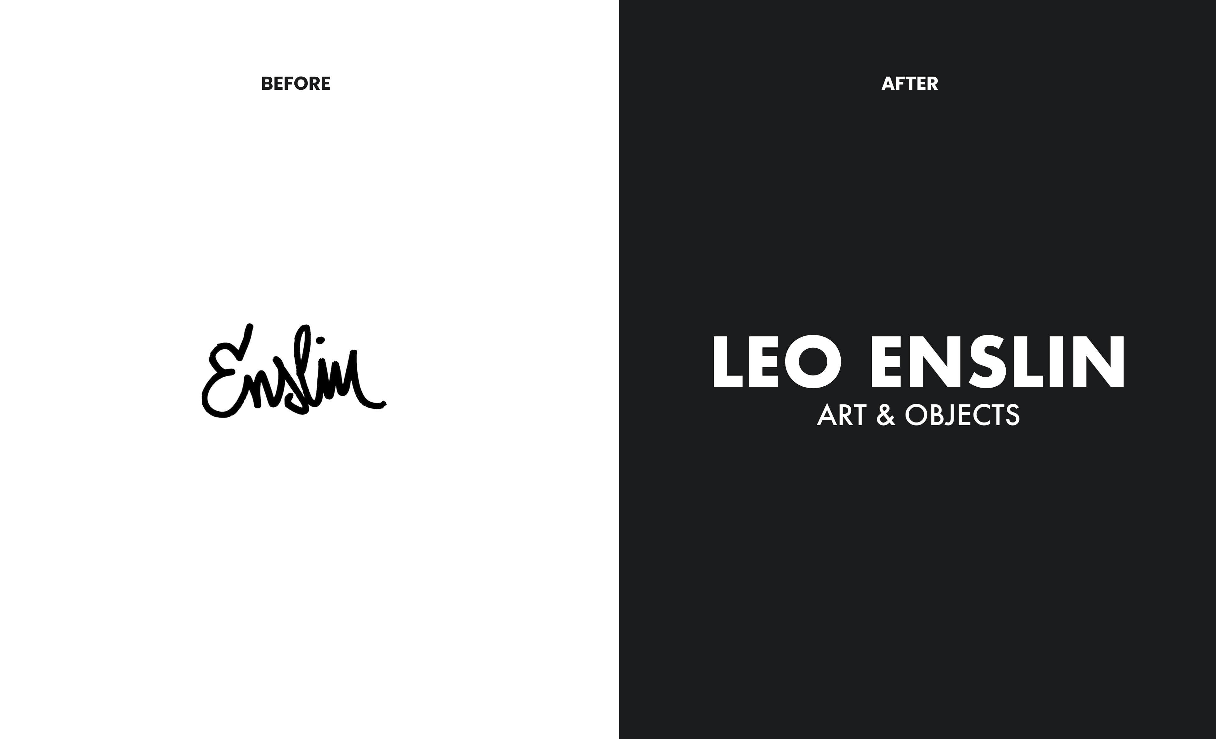
- Logo Design: A bold and minimalist logo was created to reflect Leo's artistic vision, paired with the tagline "Art and Objects" to clarify his offerings.
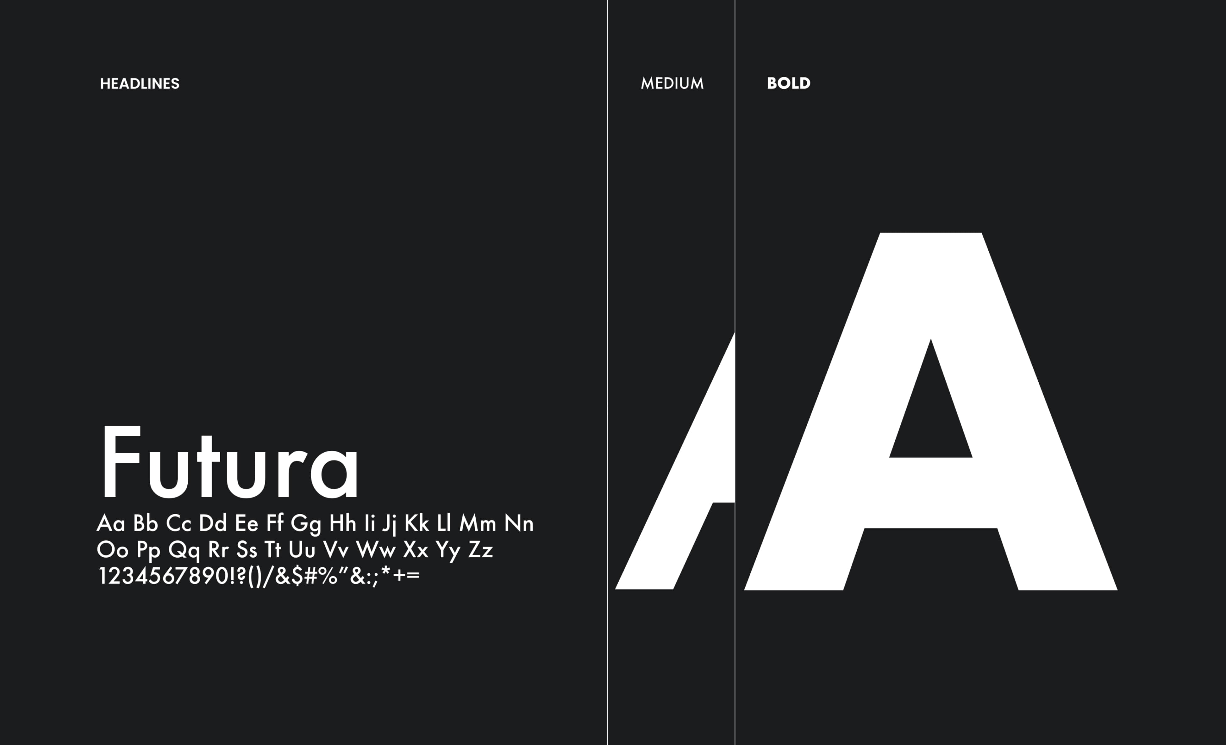
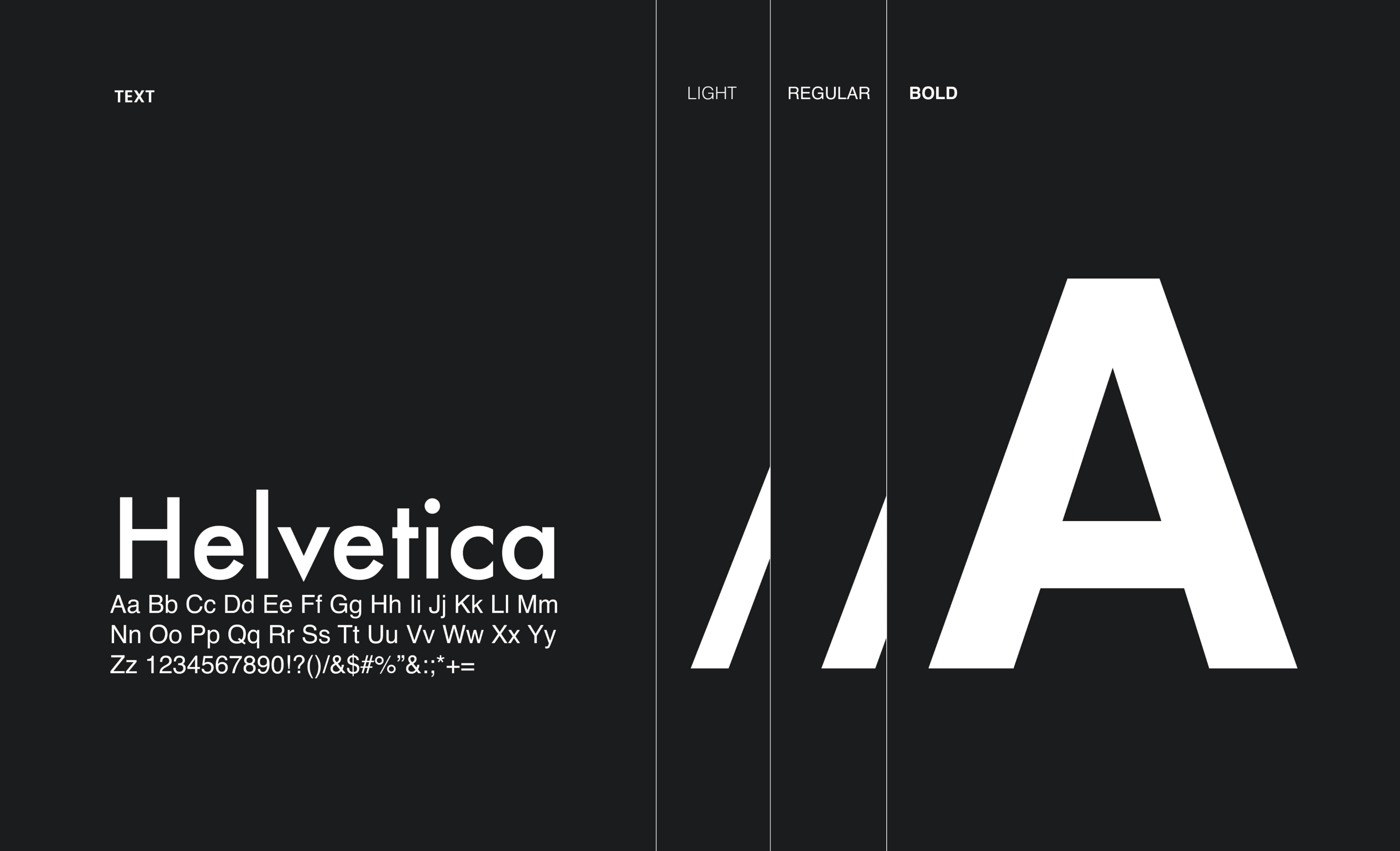
- Typography: Titles use Futura for a sleek, modern feel, while Helvetica ensures readability and timeless appeal for body text
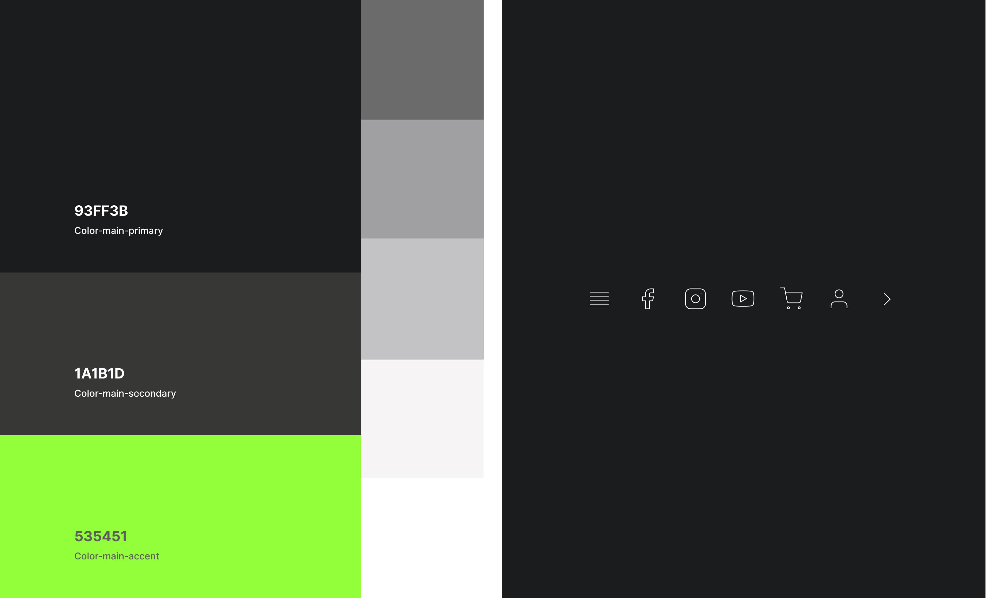
- Color Palette: Neutral gray tones with green accents were chosen to subtly balance and highlight the vibrancy of Leo's artwork
- Visual Consistency: A cohesive design system was developed, including high-quality imagery and guidelines to maintain consistency across all brand touchpoints
2. Website Design
Challenge: Effectively showcase Leo's artistic identity and offerings while implementing features that encourage engagement, such as user-friendly navigation, detailed product descriptions, and an intuitive checkout process.
Solution:
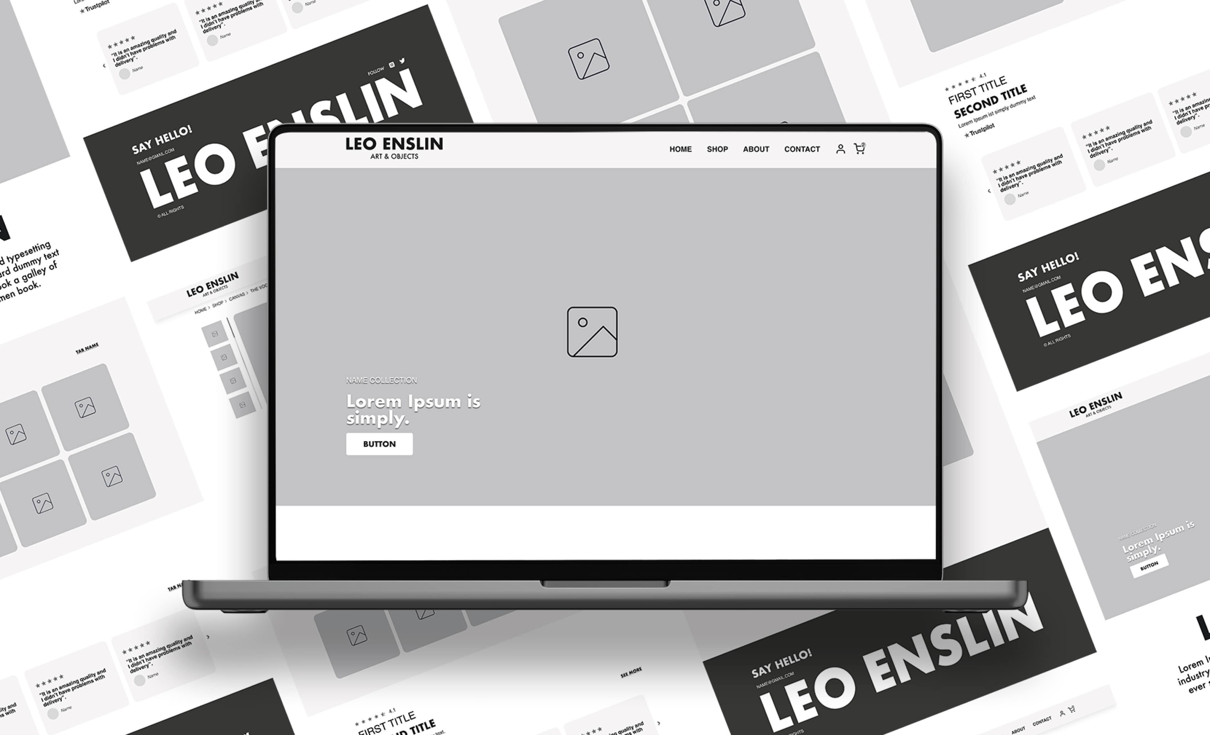
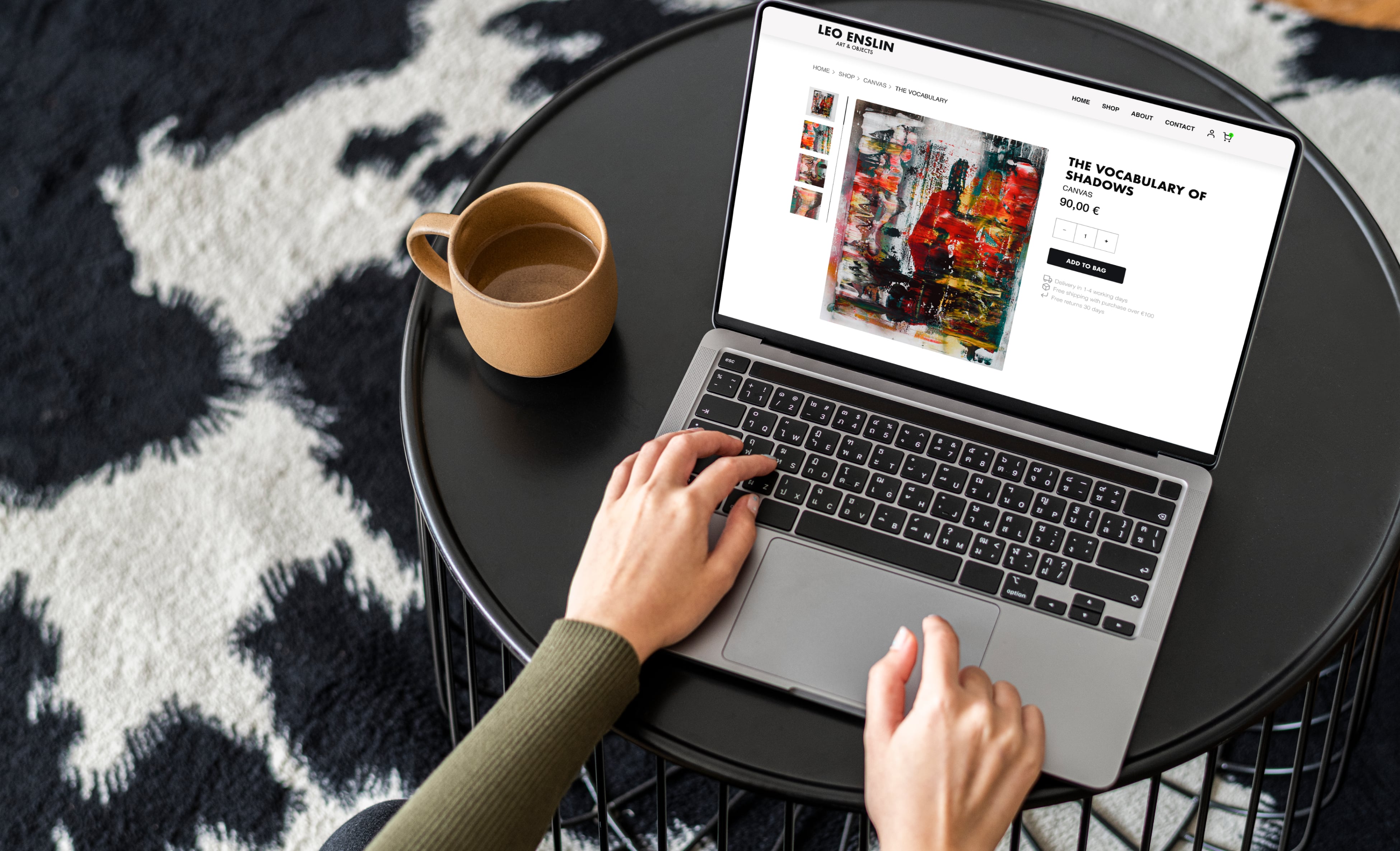
- Streamlined Layout: Designed for easy navigation, enabling effortless exploration of Leo's artwork.
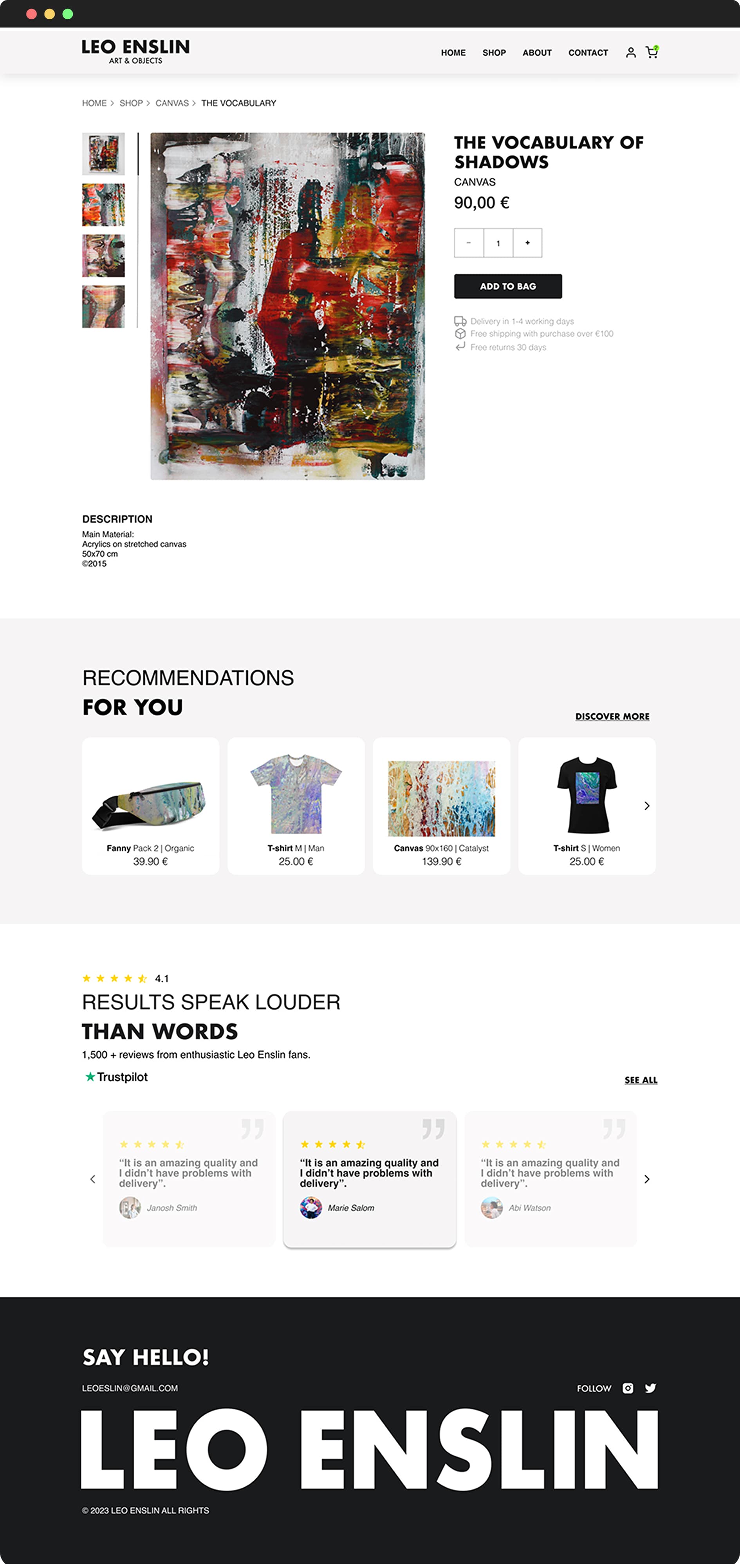
- Comprehensive Product Descriptions: Include essential details such as inspiration, dimensions, and care instructions to help buyers make informed decisions.
- Intuitive Checkout Process: Simplifies the purchasing journey with clear calls-to-action, multiple payment options, and secure transactions for a seamless user experience.
To watch videos, you need to change your cookie settings preferences. Go to cookie manager and accept the field Tracking.
EXPLORING THE MAIN GOALS AND FEATURES
Goal 1. Establish a recognizable brand that fosters loyalty
Often, users find it difficult to navigate the Etsy platform, leading to trust issues and a sense of disconnection with the artist.
Opportunities
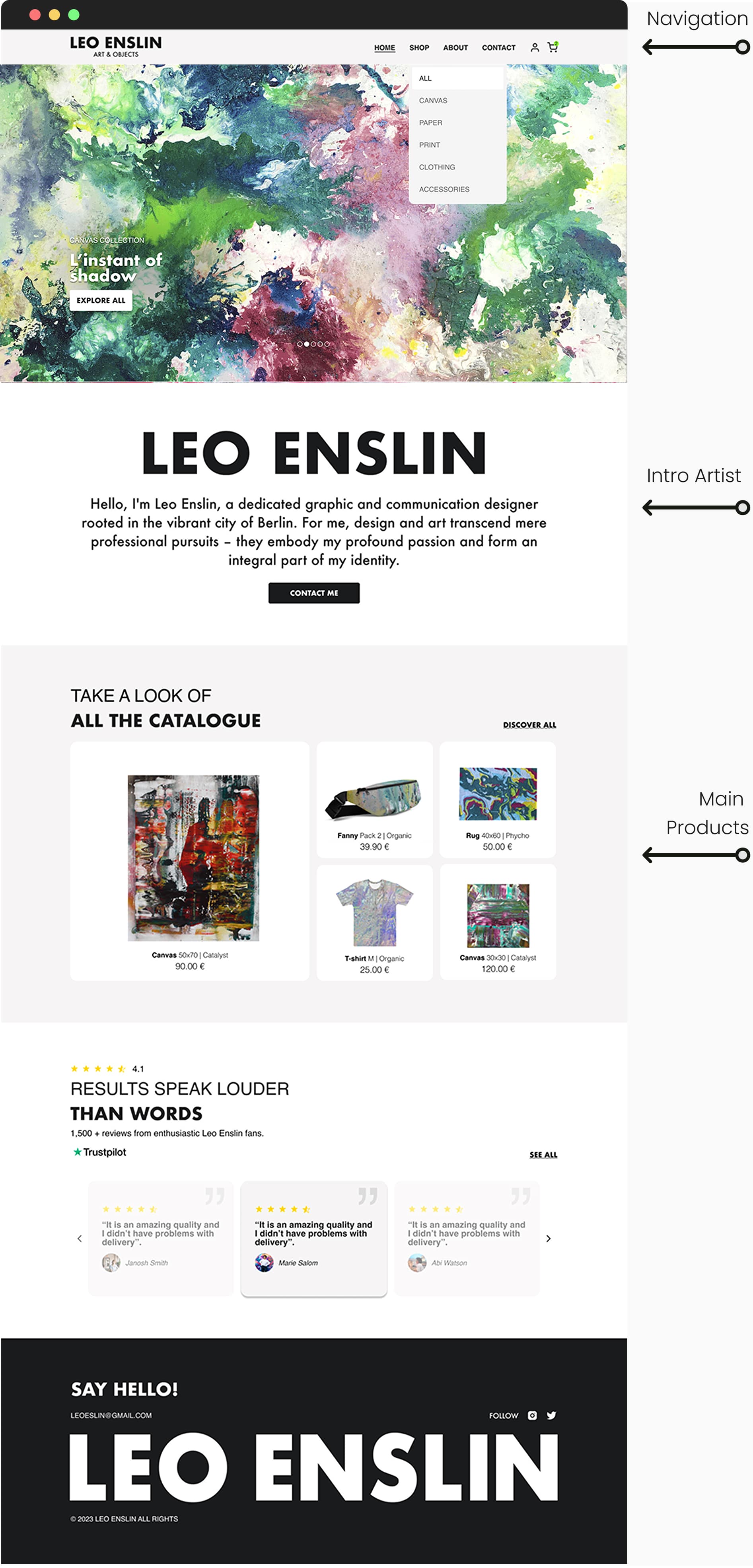
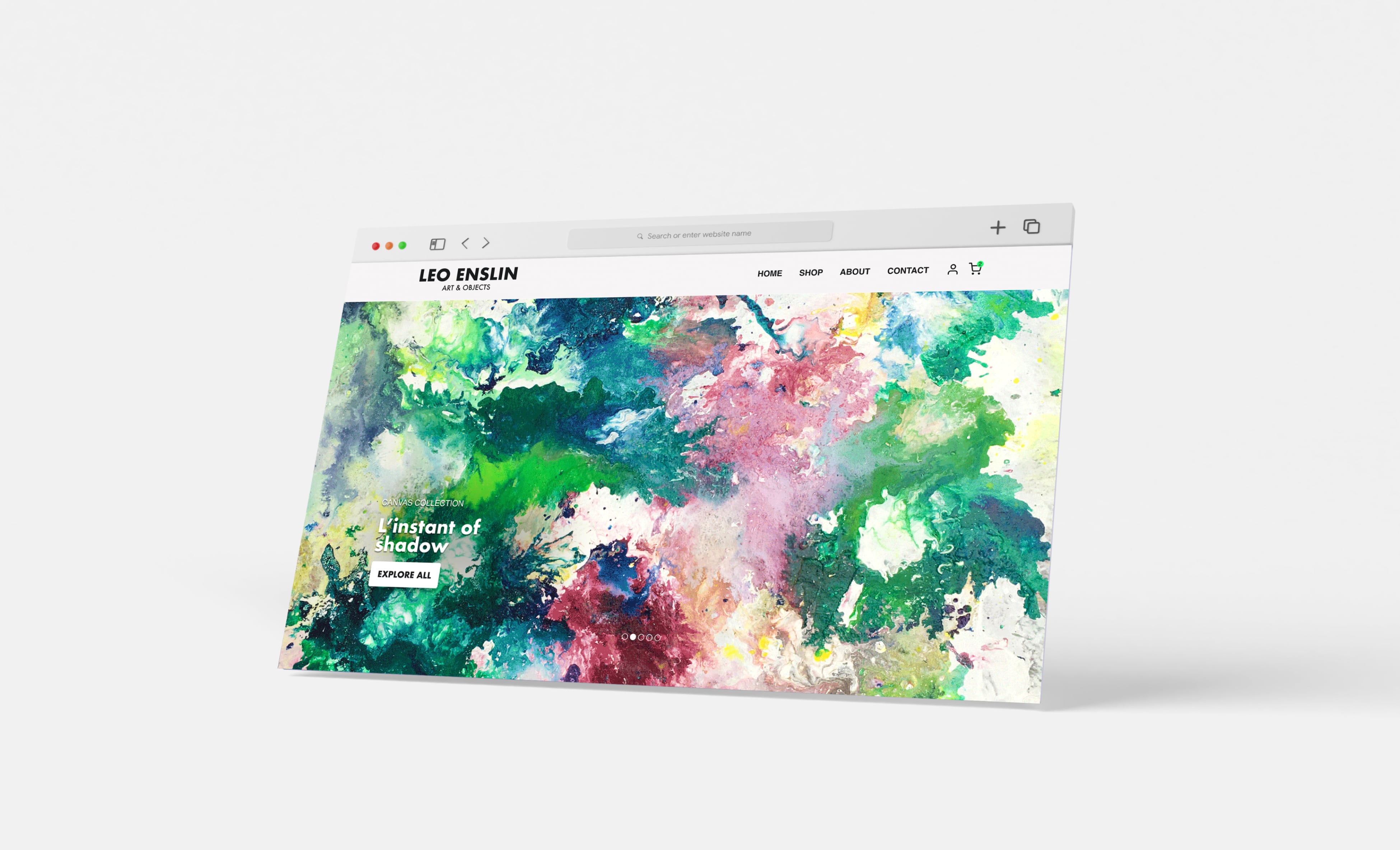
- Develop a brand story that highlights Leo's vision and inspirations. To enhance foster connection, accompany the story with an "About the Artist" section and high-quality images of his artwork.
- Streamline navigation by organizing the main pages to improve visibility and facilitate access directly from the home page.
- Introduce an artist's most popular products section to make them stand out and resonate with the audience.
Goal 2. Foster authentic connections with buyers
Research shows that 48% of loyal customers prefer personalized communication, transparency in the creative process and opportunities for interaction.
Opportunities
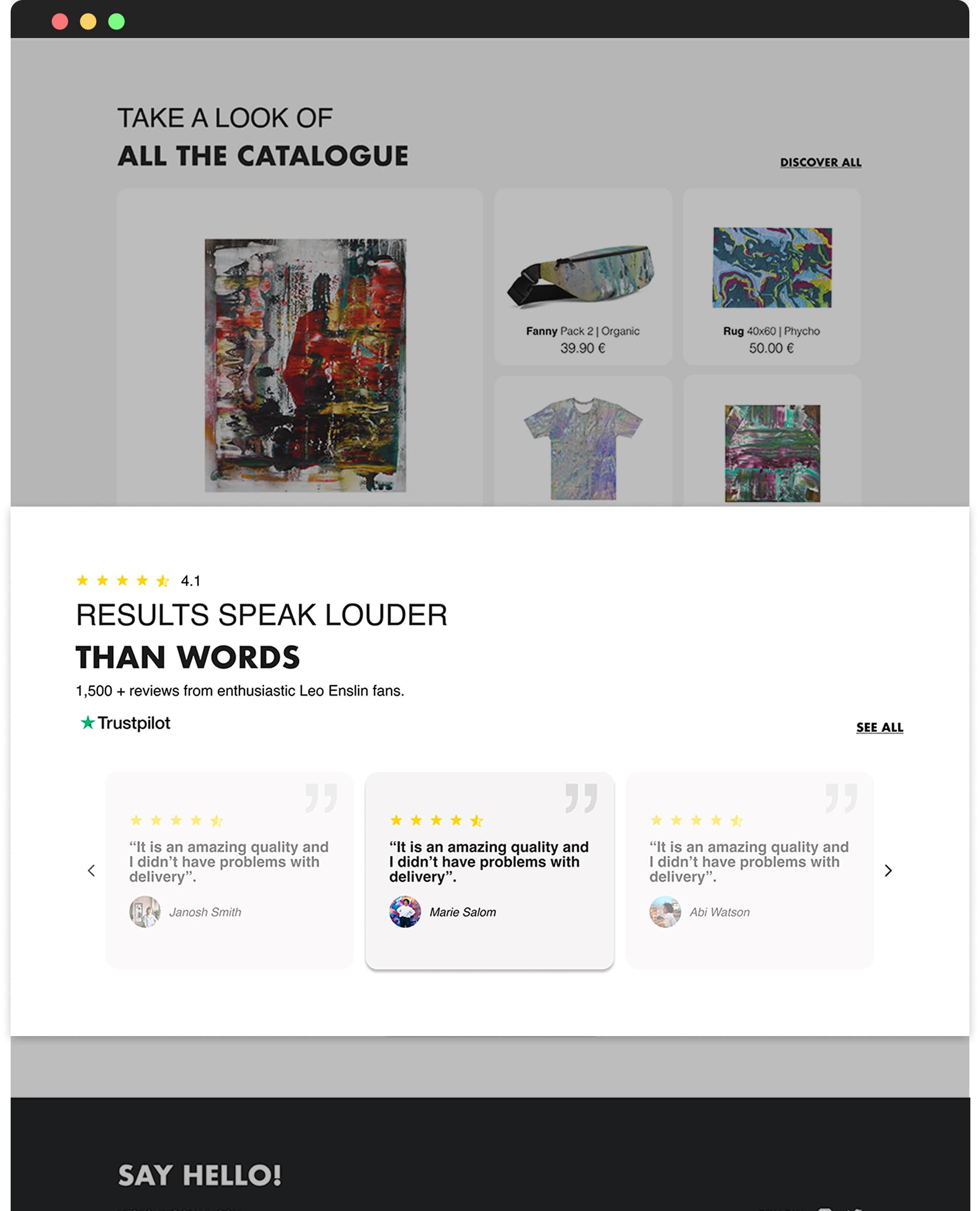
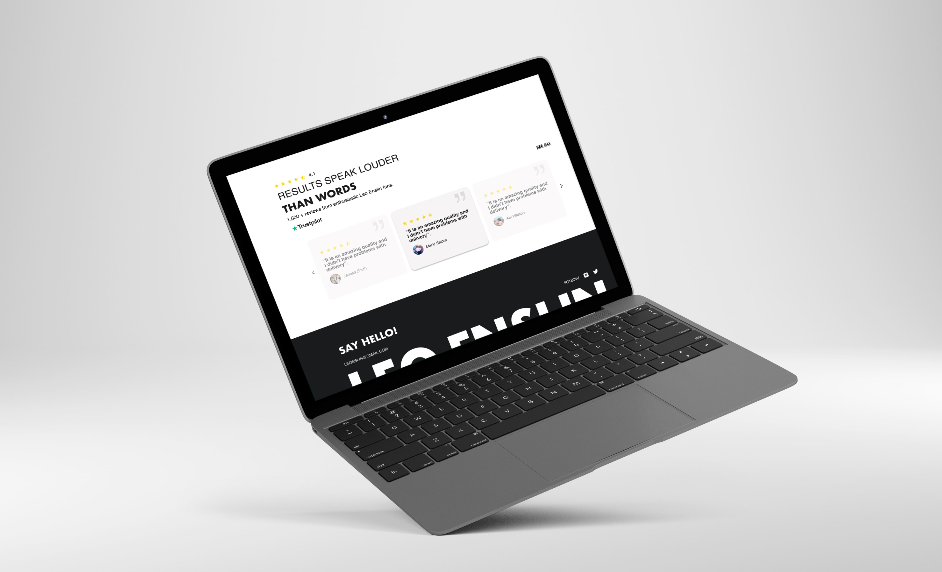
- Personalize the experience with product reviews, behind-the-scenes content, and direct engagement options.
- Encourage reviews and integrate Trustpilot to build credibility.
Goal 3. Increase visibility and sales by standing out in the market
Research shows that users need to feel confident in their purchase decisions, which is achieved by providing multiple images and detailed information about size and material.
Opportunities
- Showcase high-quality images for each product to build customer trust and confidence in their purchasing decisions.
- Implement product recommendations based on user preferences and browsing history to encourage continued shopping and increase sales.
FINAL THOUGHTS
Results
- The site's streamlined interface enhances user navigation, fostering trust and satisfaction.
- A personalized user experience drives customer loyalty, and higher sales.
- The cohesive, artist-focused design authentically reflects Leo's identity, strengthening connections with his audience.
Key learnings
This project allowed me to experience the role of a full cycle UX/UI Designer. I worked in a team with other designers, especially in the Research phase and in the first prototyping, which allowed me to learn a lot from the process. Later on, the client requested an individual version from each designer and, to my surprise, they chose mine because of its alignment with the visual and usability goals they were looking for. It was a valuable experience that helped me better understand how to make design decisions based on user and business needs.
