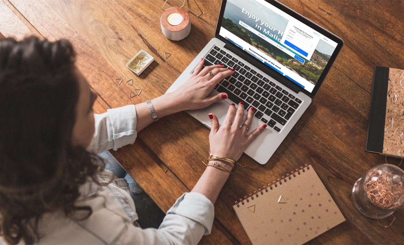
Blue Mediterranean-Rental accommodations
1. Context
Blue Mediterranean is a vacation rental company based in Mallorca, Spain. Users were arriving, exploring, and leaving before booking. In a market dominated by Airbnb and Booking.com, trust wasn't optional. It was the default lens users applied to every decision. And we didn't have it.
2. Problem
Blue Mediterranean approached me to refresh their platform, which they felt was outdated and underperforming in conversions. At first glance, the issue appeared to be visual and usability-related. However, early evaluation revealed a deeper challenge:
Users were not completing bookings — not due to lack of demand, but due to a lack of trust at the moment of decision.
Rather than focusing on surface-level improvements, the goal became to identify the root cause behind low conversion and design solutions that addressed the underlying problem, not just its symptoms.
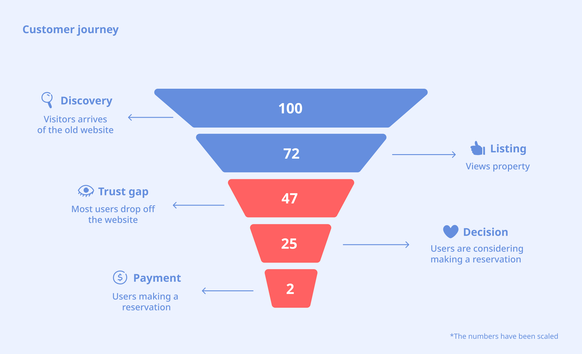
3. Trust Gap Journey Diagram
To understand where and why users were dropping off, I conducted usability testing on the existing platform with 15 participants. The goal was to observe real user behavior and identify the exact moment where the booking flow was breaking. And the testing revealed a consistent pattern:
The biggest drop-off occurred between browsing a listing and committing to a booking.
At this stage, users ask:
- Is this legitimate?
- Can I trust this host?
- What if something goes wrong?
4. Research Approach
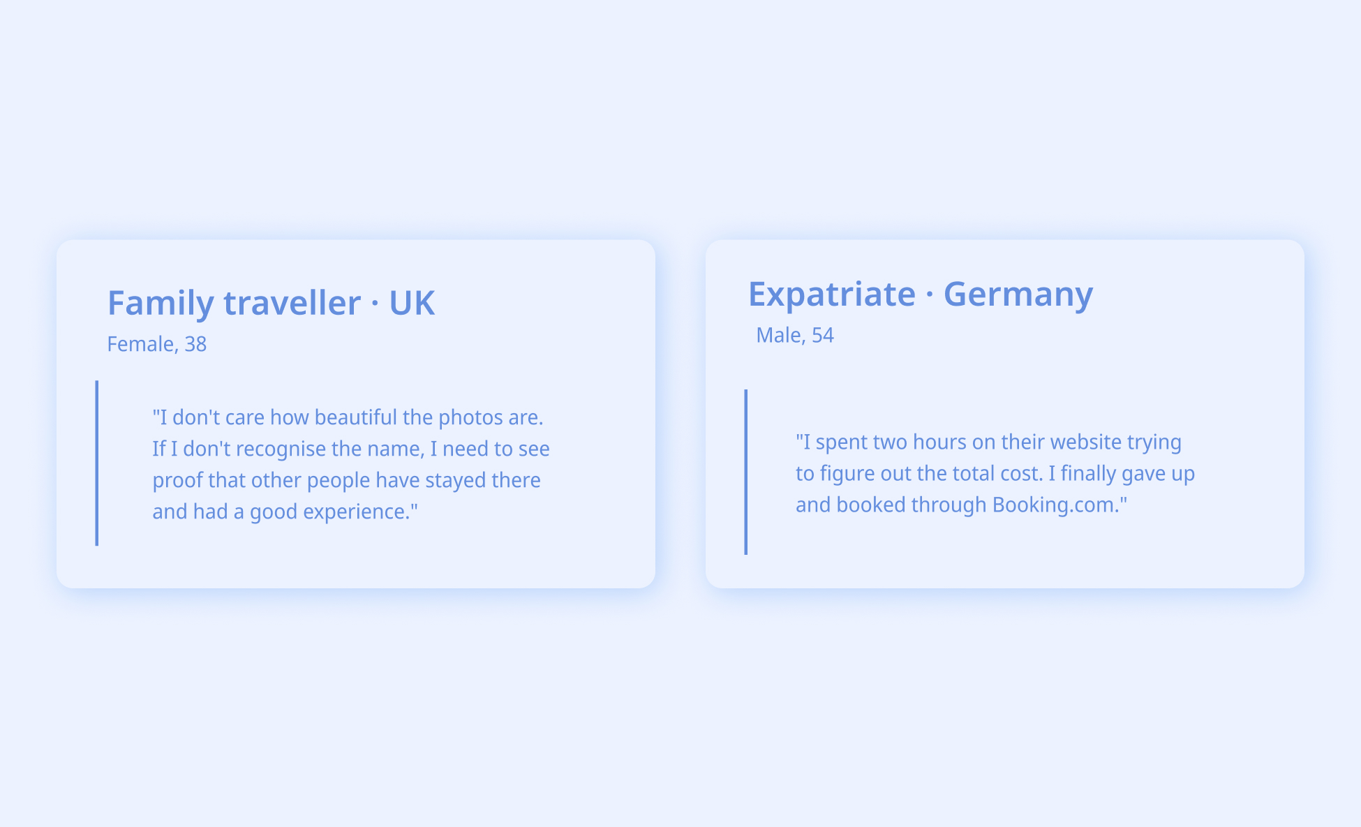
To understand why users were not completing bookings, I focused on identifying where trust was breaking across the experience and what prevented users from feeling confident enough to commit.
Methods
- 60 Interviews
- Heuristic Evaluation
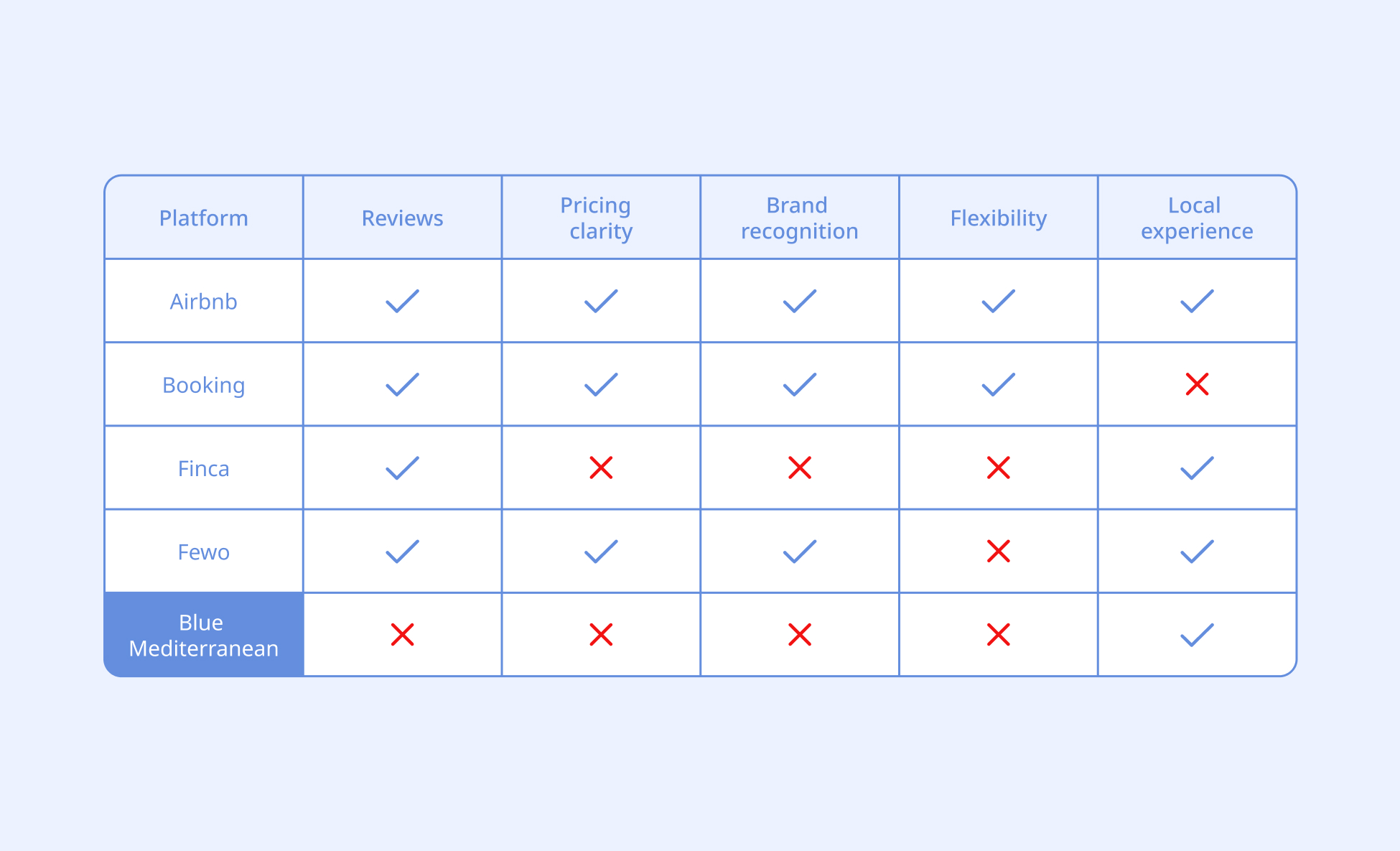
- Competitive Audit
5. User Personas — Who We're Designing For
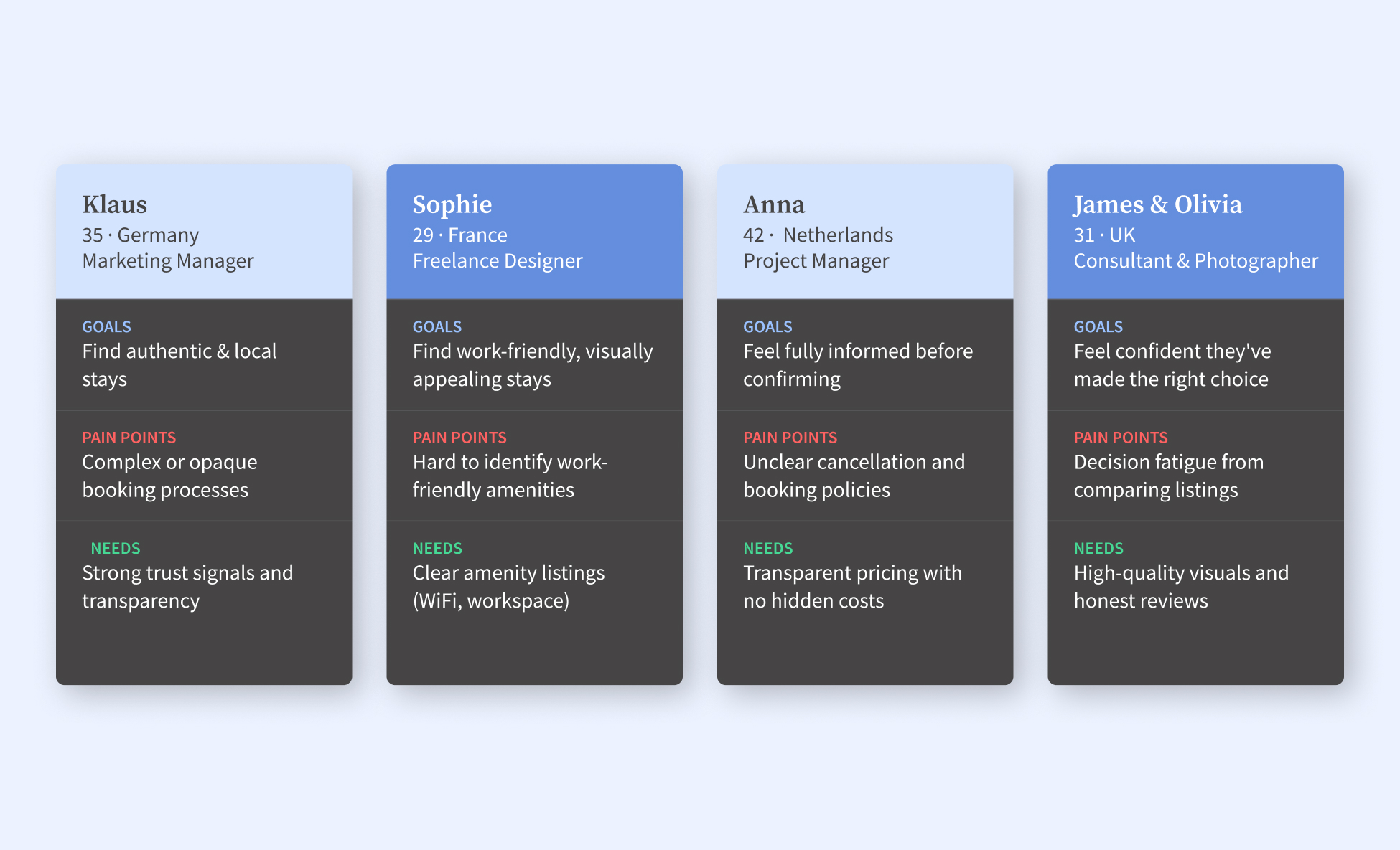
Blue Mediterranean serves a diverse international audience searching for short and mid-term stays in Mallorca. The market includes leisure travelers, remote workers, families, expatriates, and retirees, each with distinct accommodation needs and booking behaviors.
The platform primarily attracts visitors from key European markets, including the UK, Germany, France, and Scandinavia, alongside a growing segment of digital nomads seeking flexible living arrangements.
6. Key Insights & Design Direction
As the lead UX/UI designer, I identified key drop-off points and synthesized the research findings to better understand the factors that influence user trust. By grouping behaviors into recurring patterns, I was able to define the core problem and chart a clearer design direction.
The insights revealed several key needs:
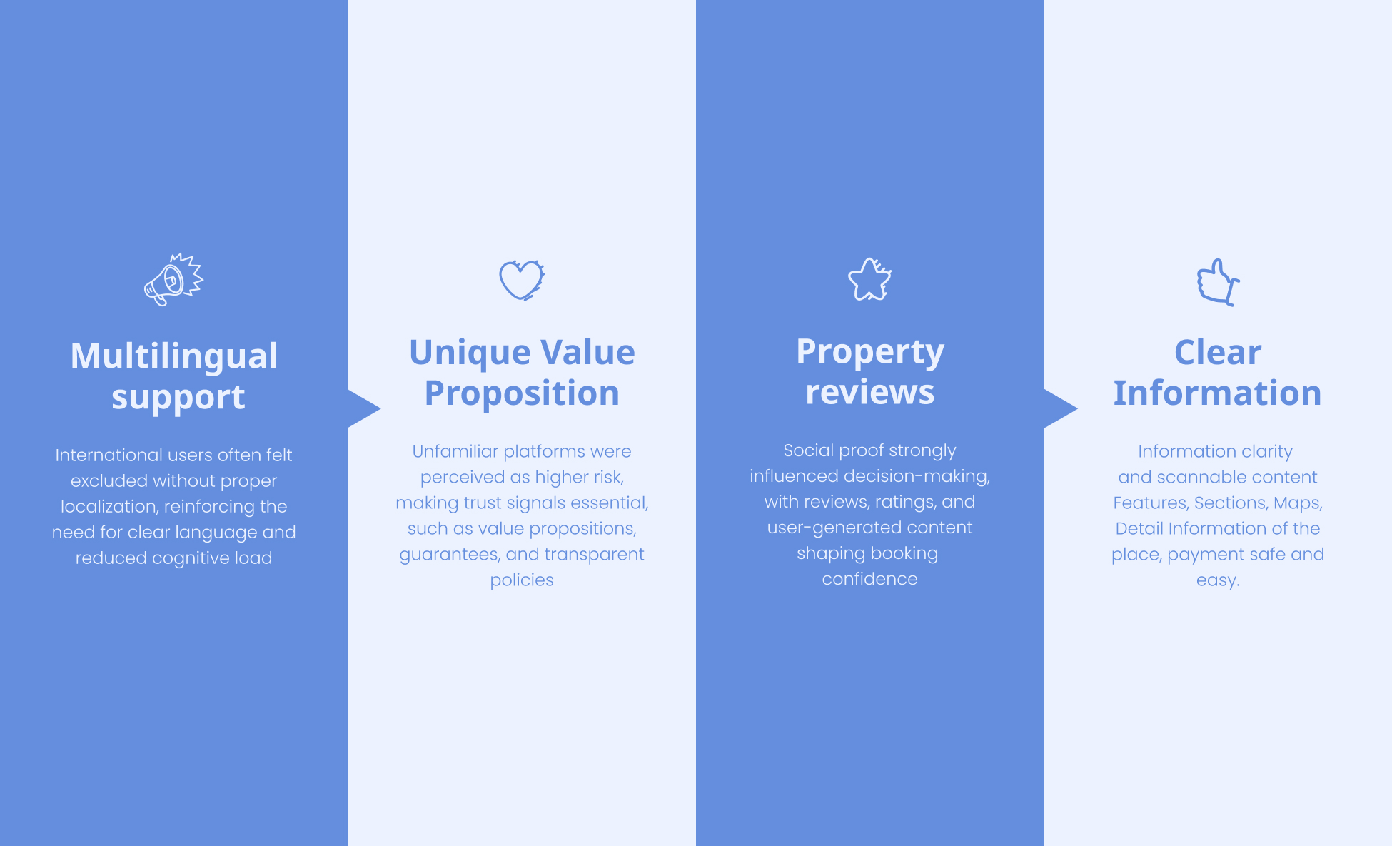
How might we build trust and credibility for a lesser-known platform while creating a clear, intuitive, and transparent experience for an international audience?
7. From Insights to Product Decisions
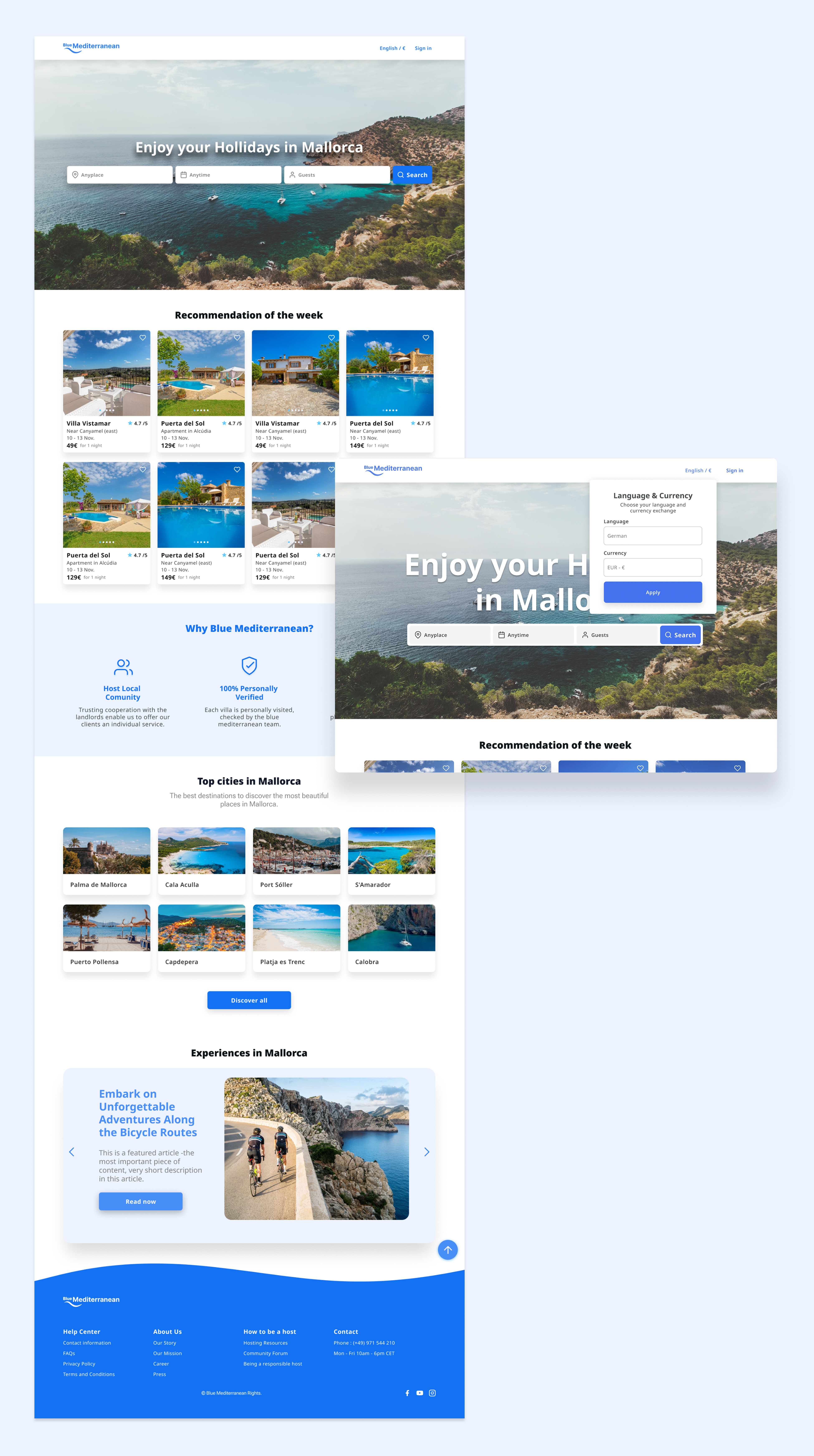
- Multilingual support — from exclusion to inclusion
Non-Spanish-speaking users in the UK, Germany, France, and Scandinavia weren't finding the site difficult — they were finding it unreadable. They couldn't evaluate properties, understand pricing, or communicate with hosts.
The language selector was placed in the navigation bar — visible at every step of the journey — so switching language never interrupted the booking flow.
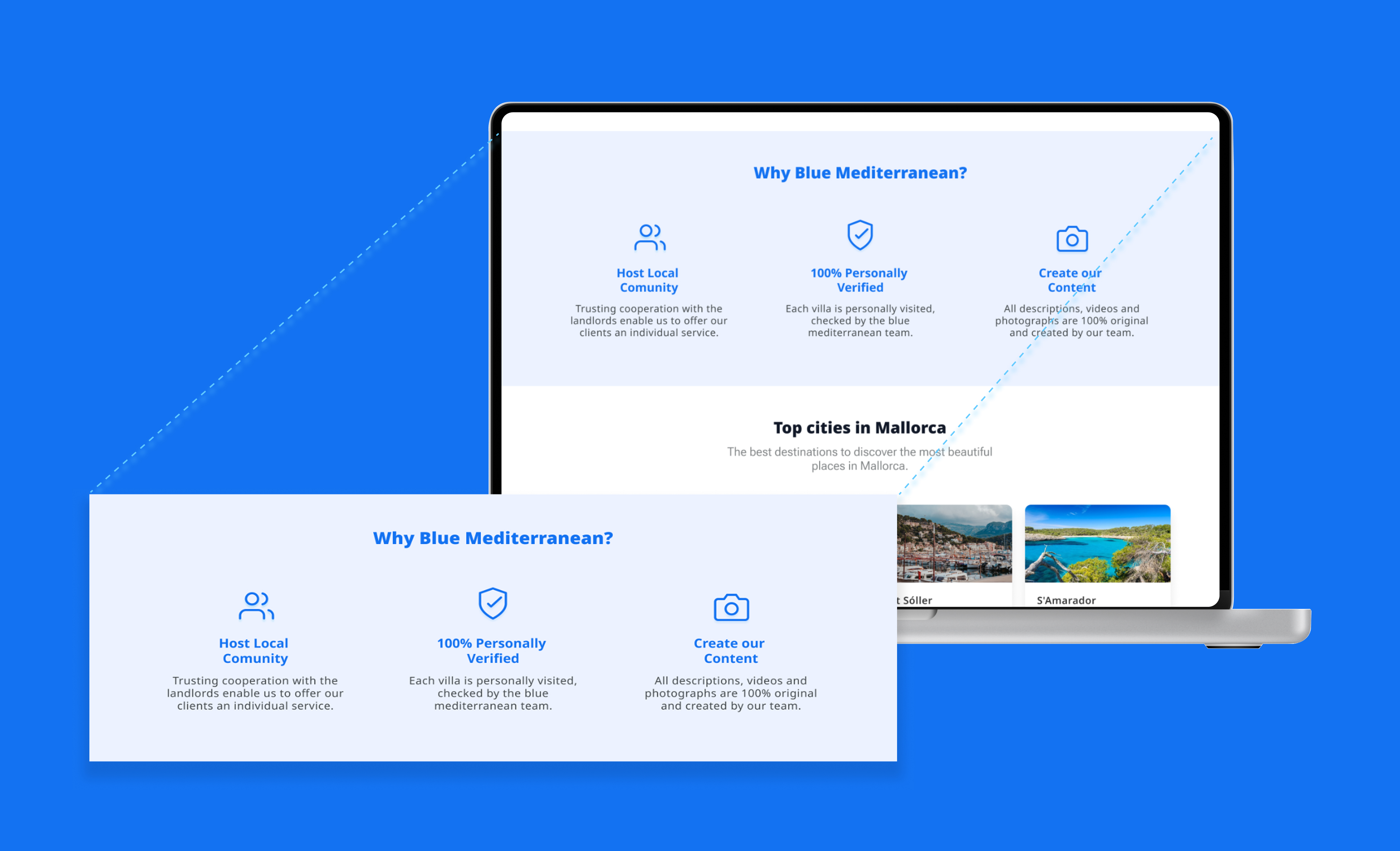
- Differentiators made visible — unique value proposition
Blue Mediterranean had real strengths—years of local experience, reliability proven by its customers, and an in-house professional team that created the content—but none of them were reflected in the product.
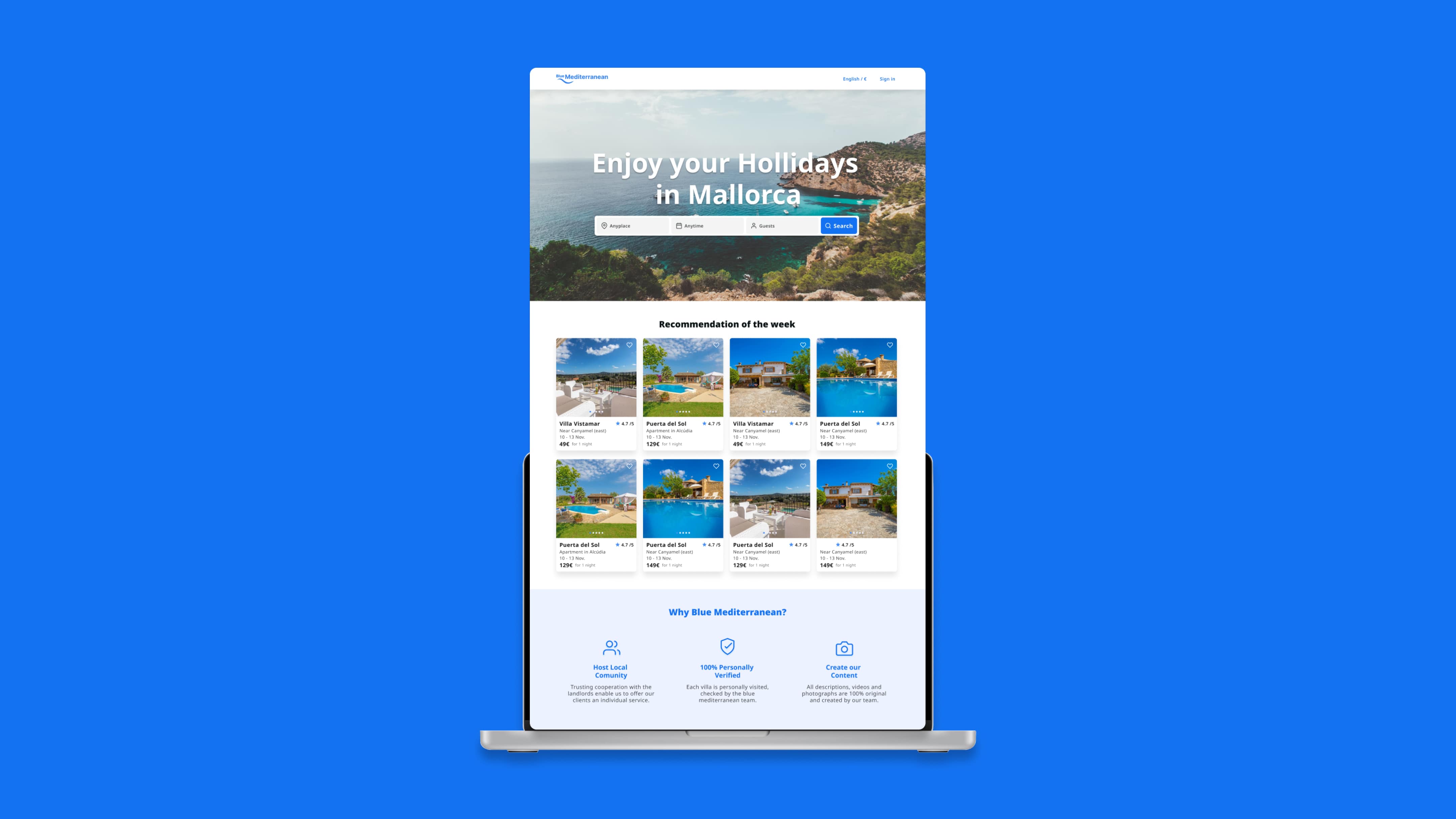
I worked with the owners to explicitly define those differentiating factors and then designed a featured section on the homepage to showcase the brand’s strengths and unique value
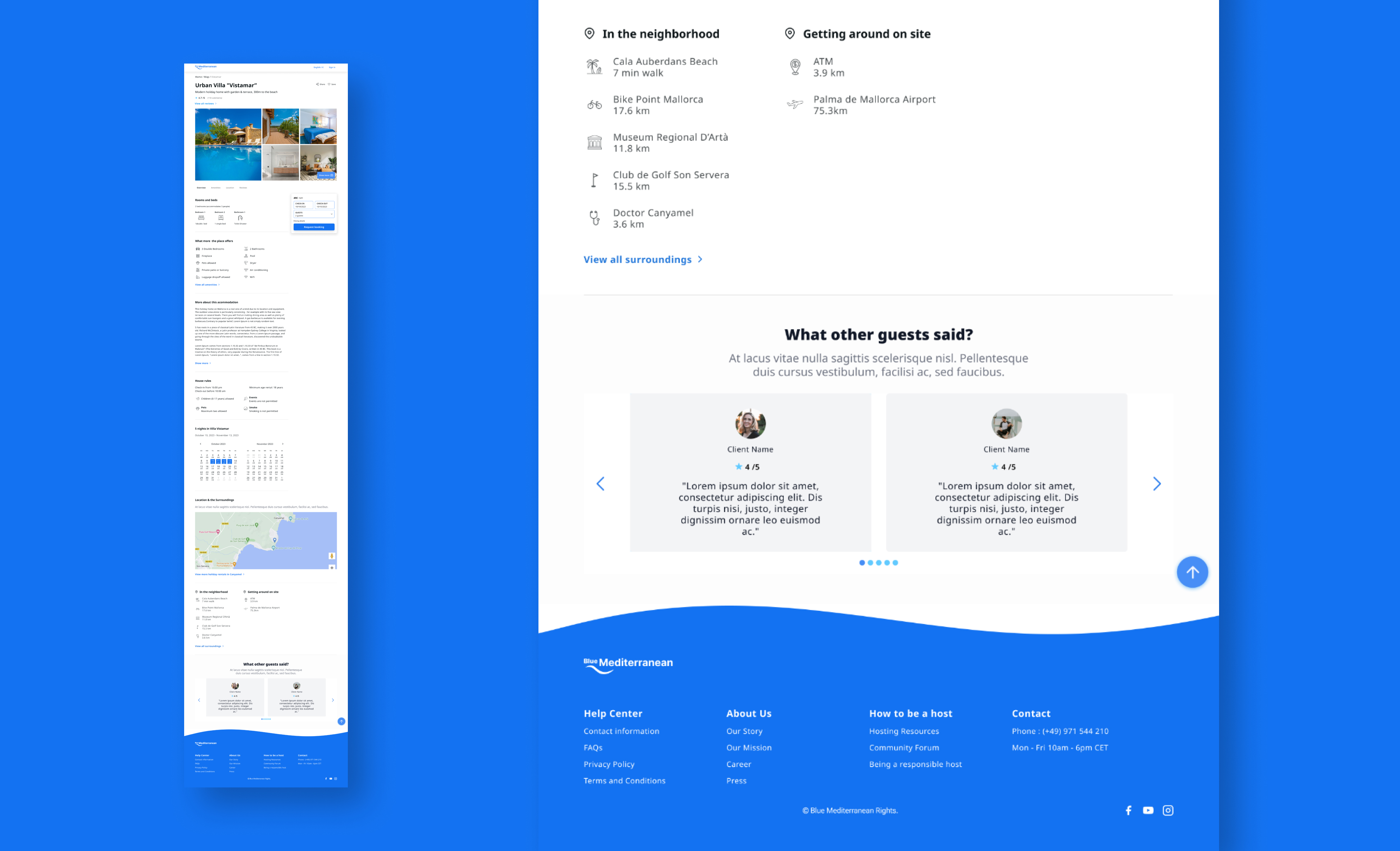
- Property reviews — trust at the listing level, not just the platform level
Users needed validation for each specific property, not just the brand. Reviews and ratings were implemented at the listing level — where the booking decision is actually made — so users could access authentic guest feedback at the exact moment of hesitation.
8. Visual System — Supporting Trust.
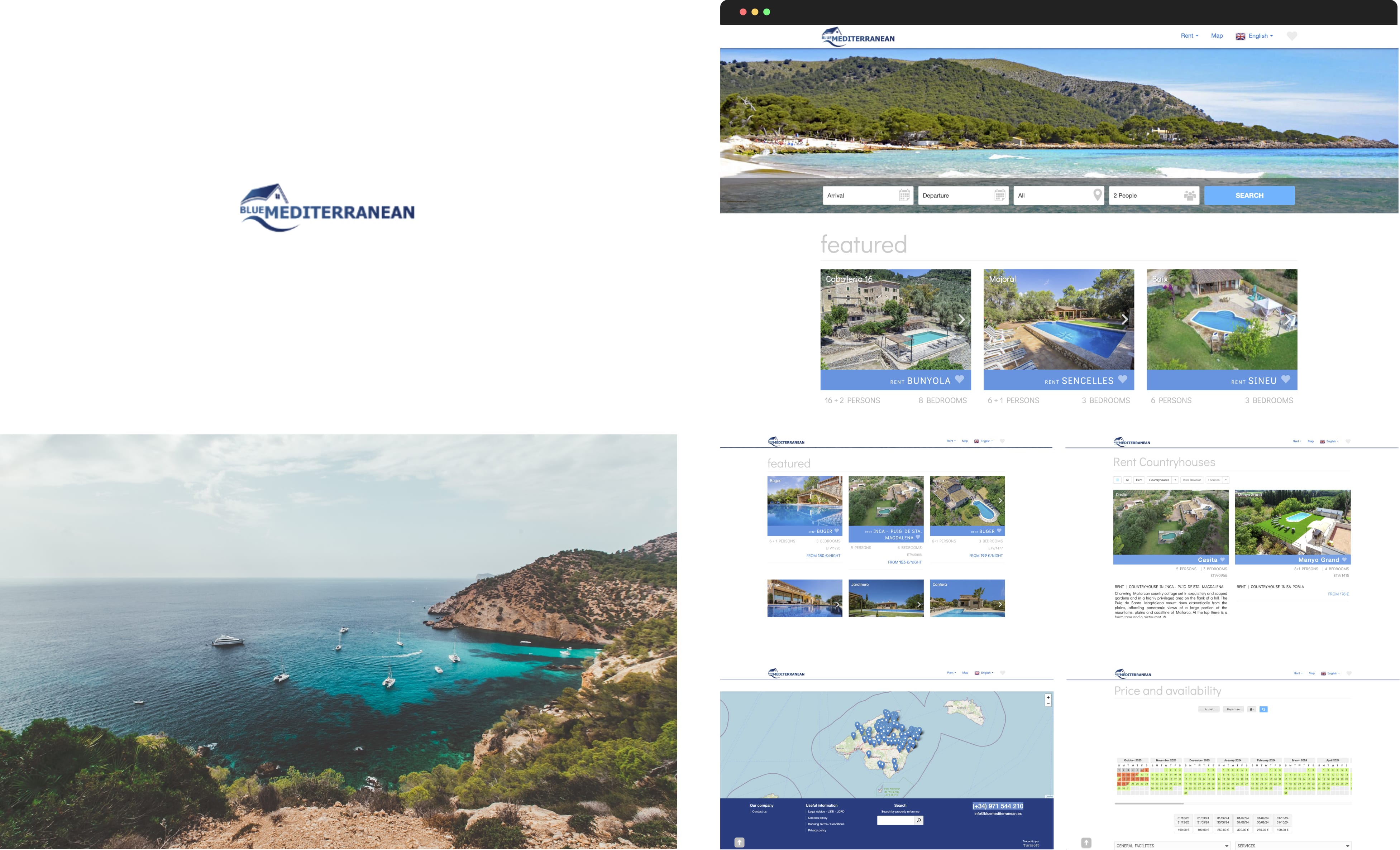
The original visual identity relied on a generic symbol and an inconsistent visual style that failed to communicate quality or reliability. While reviewing the existing assets, I discovered that the original files were no longer available, which created an opportunity to fully rethink and elevate the identity from the ground up.
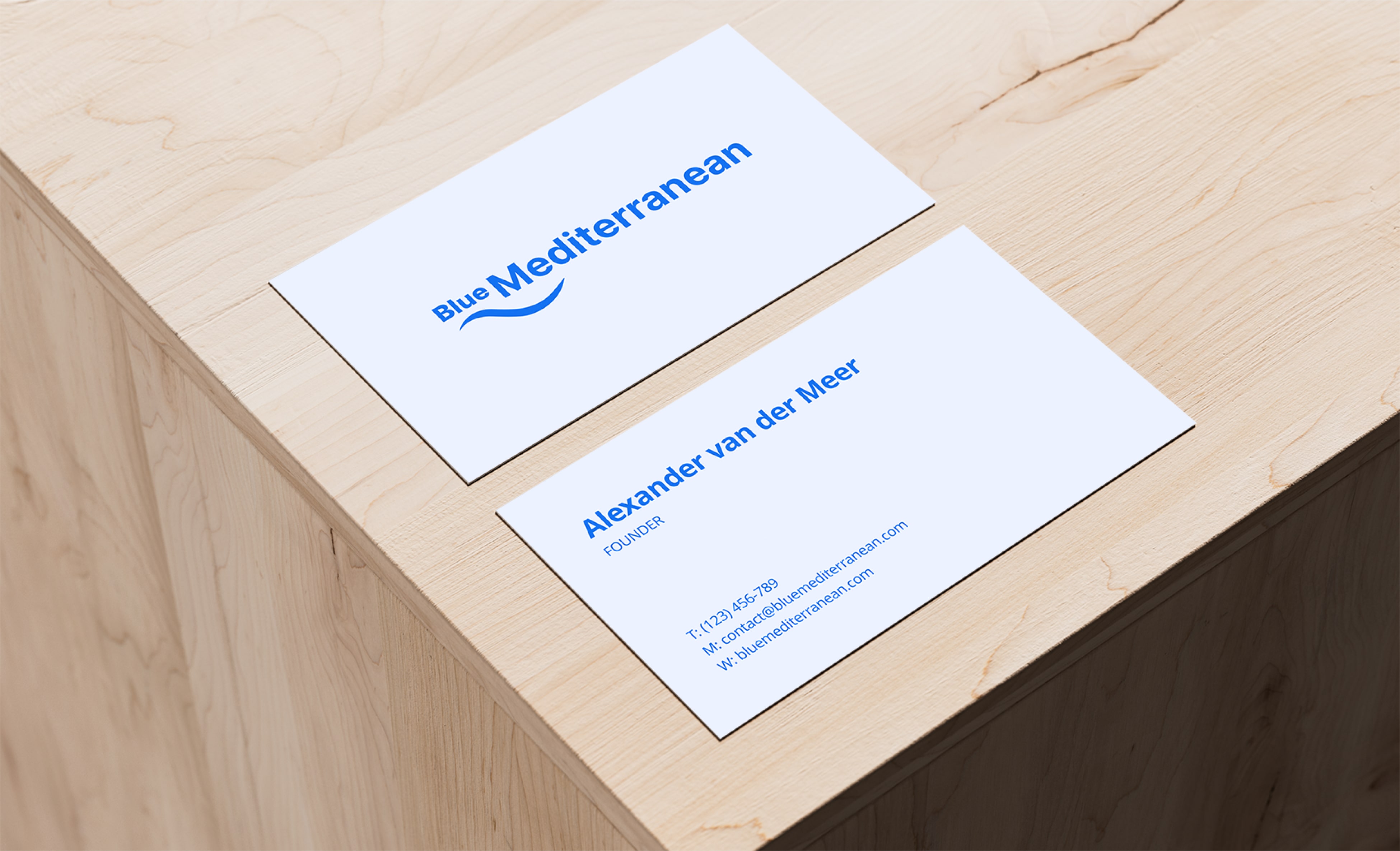
- Logotype
I redesigned the logotype using a wave-inspired concept, translating it into a more structured and minimal identity system. The new direction balances warmth with professionalism, creating a clearer and more cohesive brand expression aligned with trust and quality.
- Typography
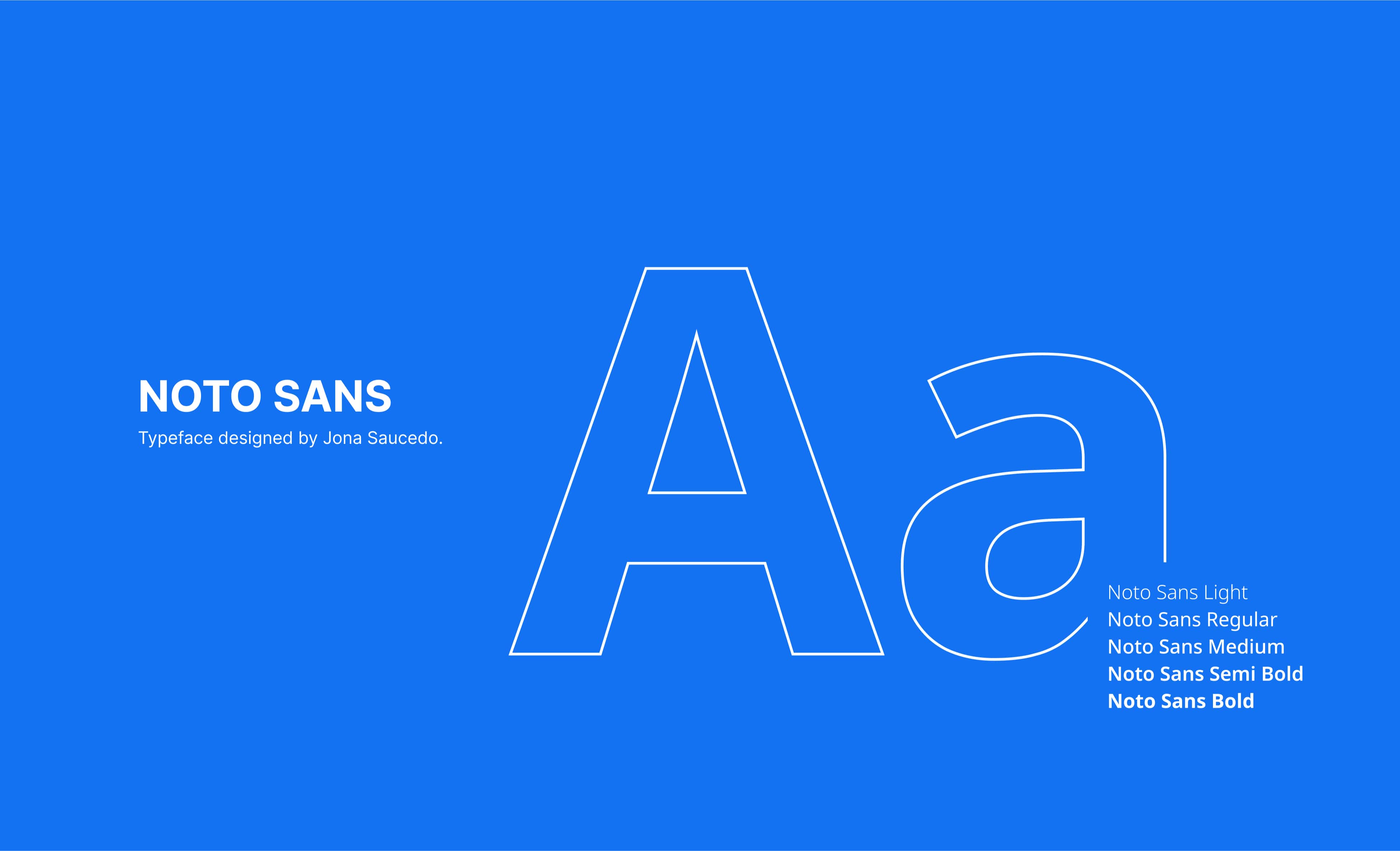
Noto Sans for its high legibility across multiple languages, neutral tone, and strong readability at small sizes, ensuring clarity across all touchpoints.
- Color palette
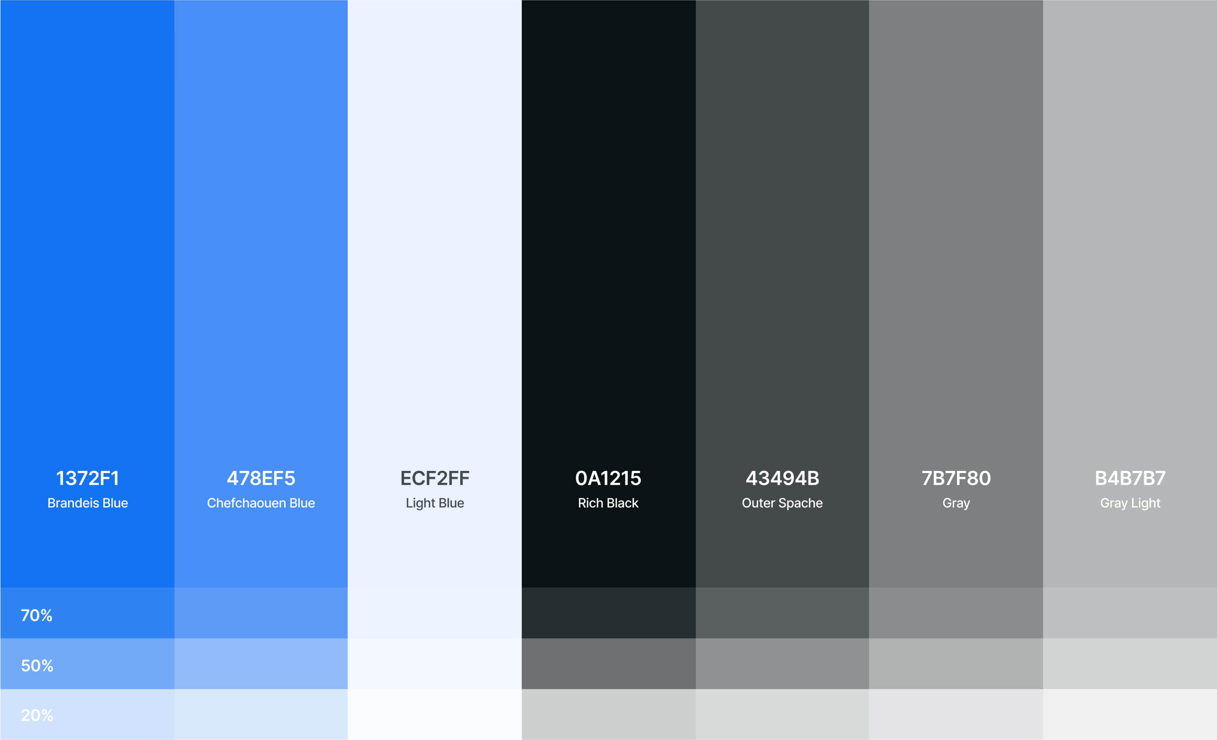
Color system selected to reinforce a sense of reliability, clarity, and trust across the experience.
- Iconography
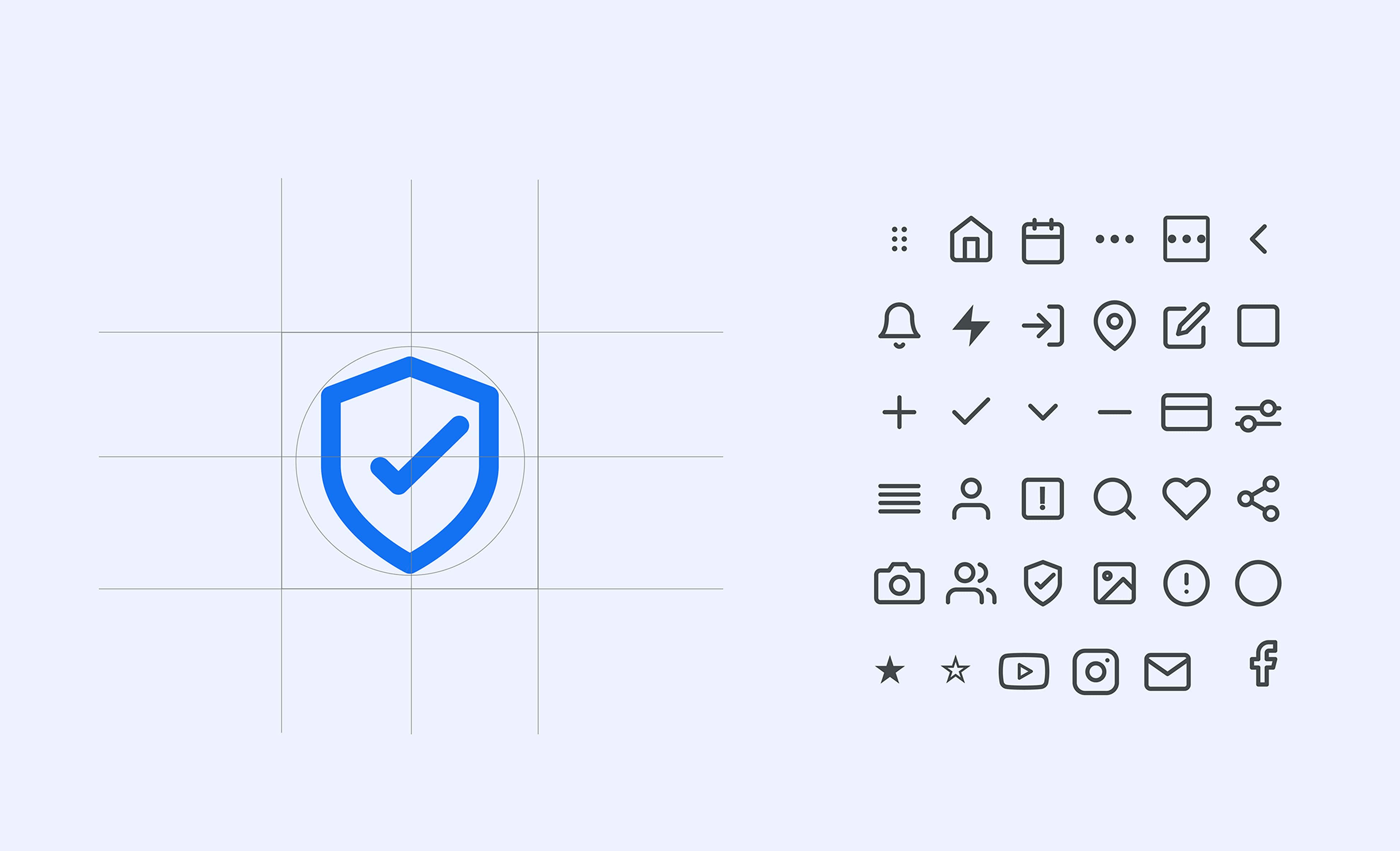
Using minimal symbols to reduce cognitive load and support faster recognition throughout the interface.
- Responsive version
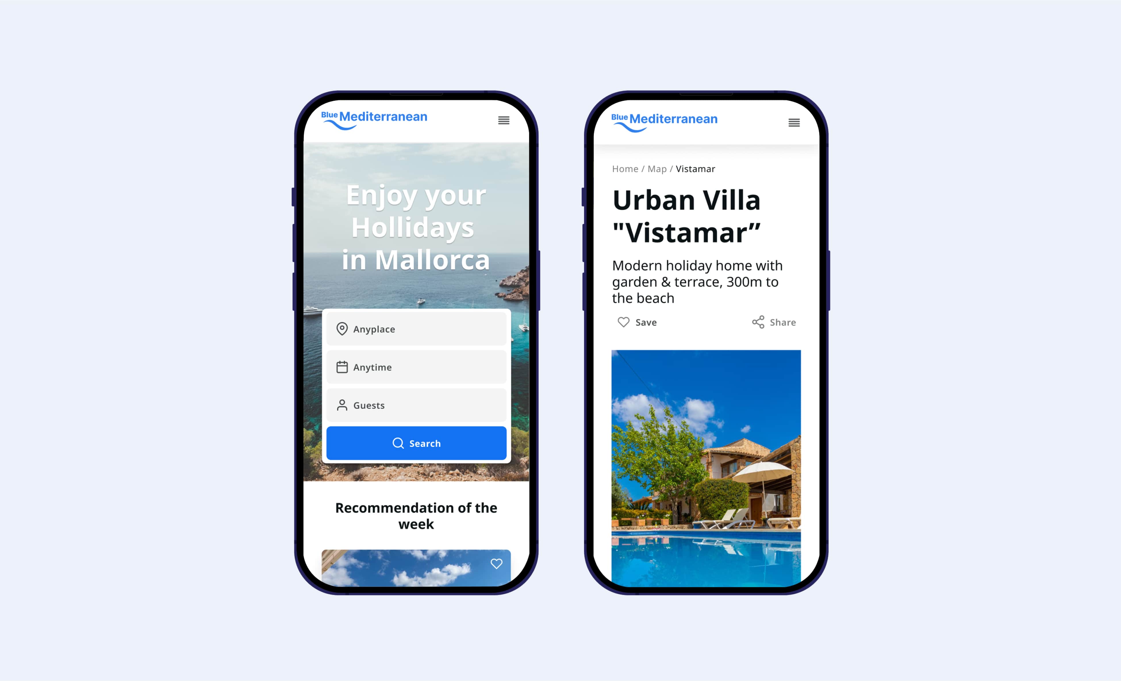
9. Prototype
To watch videos, you need to change your cookie settings preferences. Go to cookie manager and accept the field Tracking.
10. Impact
Analytics reviewed 3 months post-launch:
- +82% direct booking conversion rate — up from 2.1% to 3.4%. Trust-focused design and restructured IA addressed the barriers that had been causing visitors to leave without booking.
- 35% faster time from search to confirmed booking — through friction removal and mobile optimisation across the flow.
- 58% → 74% checkout completion — eliminating dead ends and adding clear progress indicators produced a significant improvement at the highest-anxiety step in the funnel.
- 4 new markets unlocked — for the first time, the platform reached UK, German, French, and Scandinavian audiences who had previously been locked out by language and trust barriers. These weren't marginal gains: they were audiences the product had never been able to reach.
11. Learnings
This project taught me that trust isn’t about adding more information, but about structuring it in the right sequence. Users weren’t lacking content—they were lacking guidance. Especially when it comes to decisions that require a high level of trust, clarity must guide the experience.
Mapping out the journey as a funnel helped me identify where confusion was disrupting the flow. This reinforced a key principle that I now apply consistently: a good user experience (UX) isn’t about simplification, but rather intentional structure.