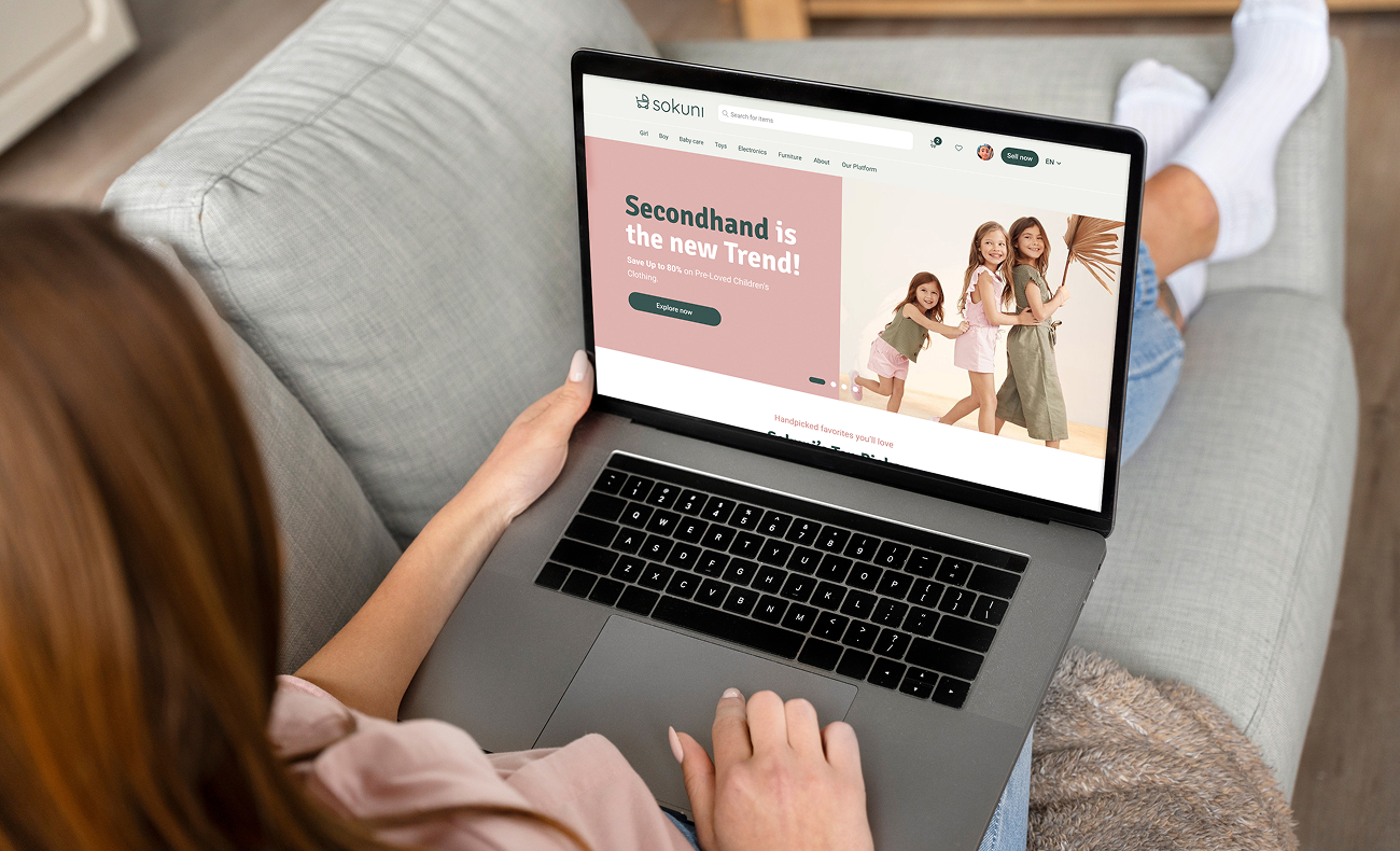
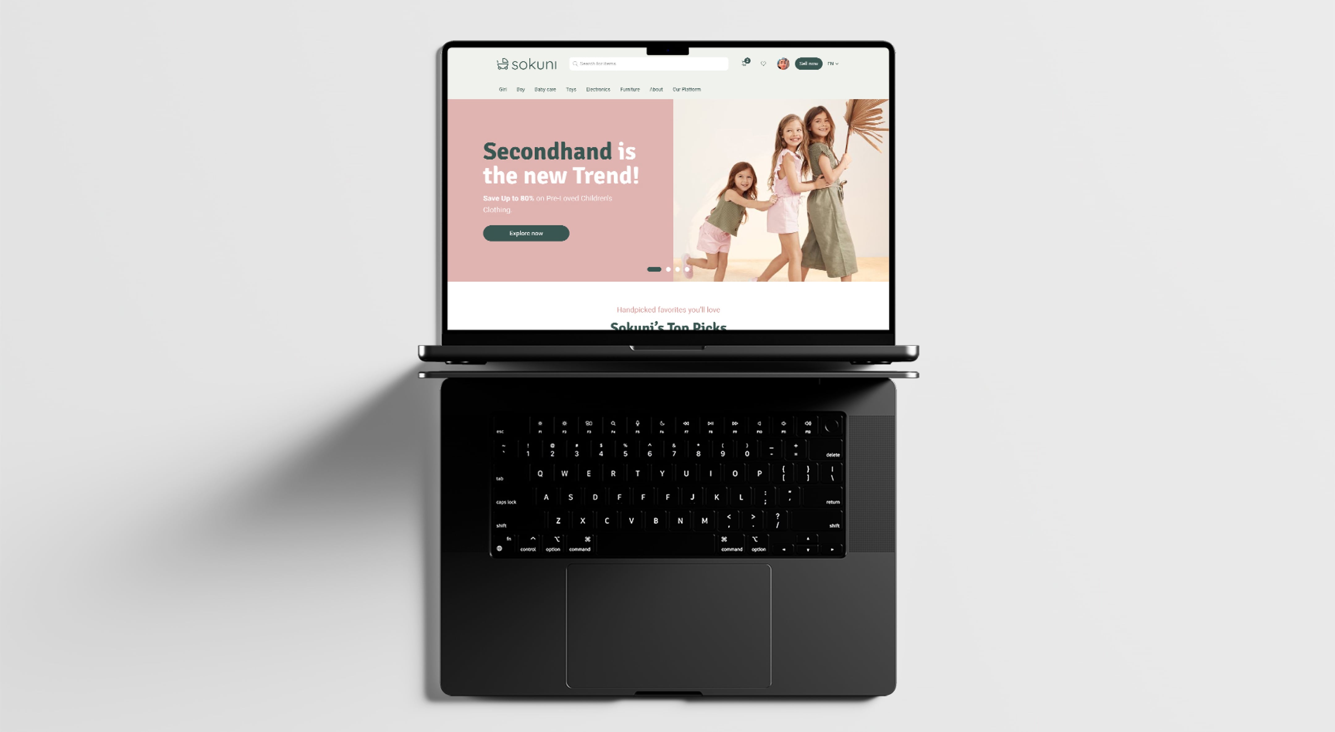
SOKUNI— Designing trust into a second-hand baby marketplace
1. Context
Sokuni is a Netherlands-based startup building a sustainable second-hand marketplace for baby gear, designed for modern parents navigating financial pressures and environmental responsibilities.
Baby products are expensive, used for a short period, and often end up stored or discarded. While second-hand marketplaces exist, fragmentation, inconsistent quality standards, and hygiene concerns prevent widespread adoption.
I joined at an early stage, contributing across the full product lifecycle—from initial research to final UI system. Working in a small, cross-functional team required not only execution, but ownership over product direction and decision-making.
2. Problem
When we joined Sokuni, the goal was clear: create a product that could disrupt the second-hand baby gear market in the Netherlands. But the starting point was messy — many ideas, no clear direction.
We aligned everything around what parents truly need: trust, simplicity, and confidence. From there, we built both product and brand as one cohesive experience designed to stand out.
3. Business Objectives
- Design a website that reflects trust, transparency, and quality
- Develop a standout brand identity in the second-hand baby gear market
4. Research & Insights
1. Surveys
To understand how parents approach second-hand baby gear, we combined surveys and in-depth interviews across Europe. What emerged wasn’t surprising — but it was revealing in priority:
- Affordability matters (60%), but it’s not enough on its owne
- Trust is fragile, with 62% concerned about hygiene and product quality
- Clarity drives decisions, as 75% expect detailed descriptions and high-quality images
- Logistics still create friction, with 30% wanting more transparent delivery options
2. Competitive Analysis
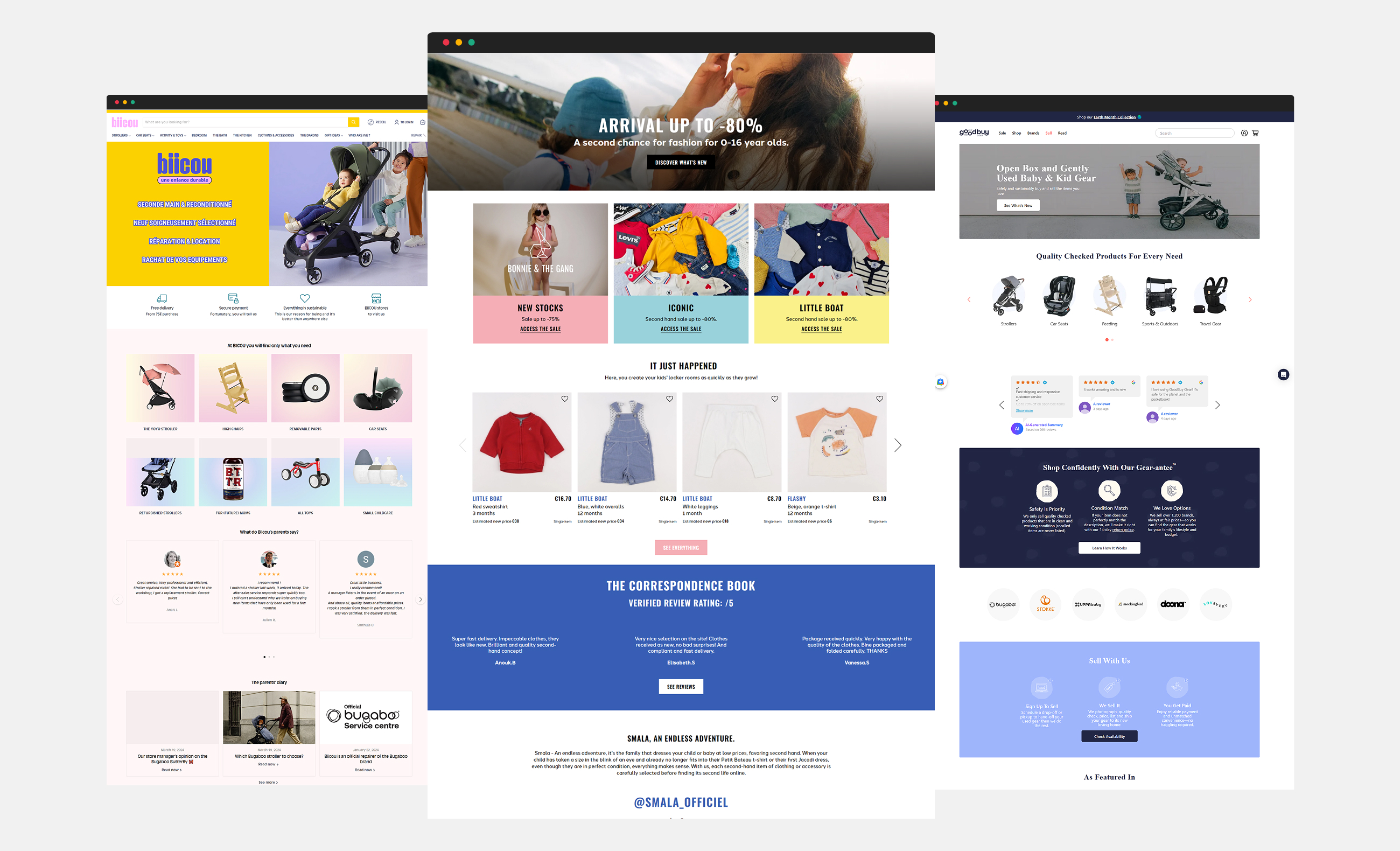
We then analyzed platforms like Smala, GoodBuy Gear, and Biicou, focusing on trust signals, product discovery, and the checkout experience. The key insight wasn’t about missing features — it was deeper: no platform clearly communicated how quality is ensured.
5. User Personas — Who We're Designing For
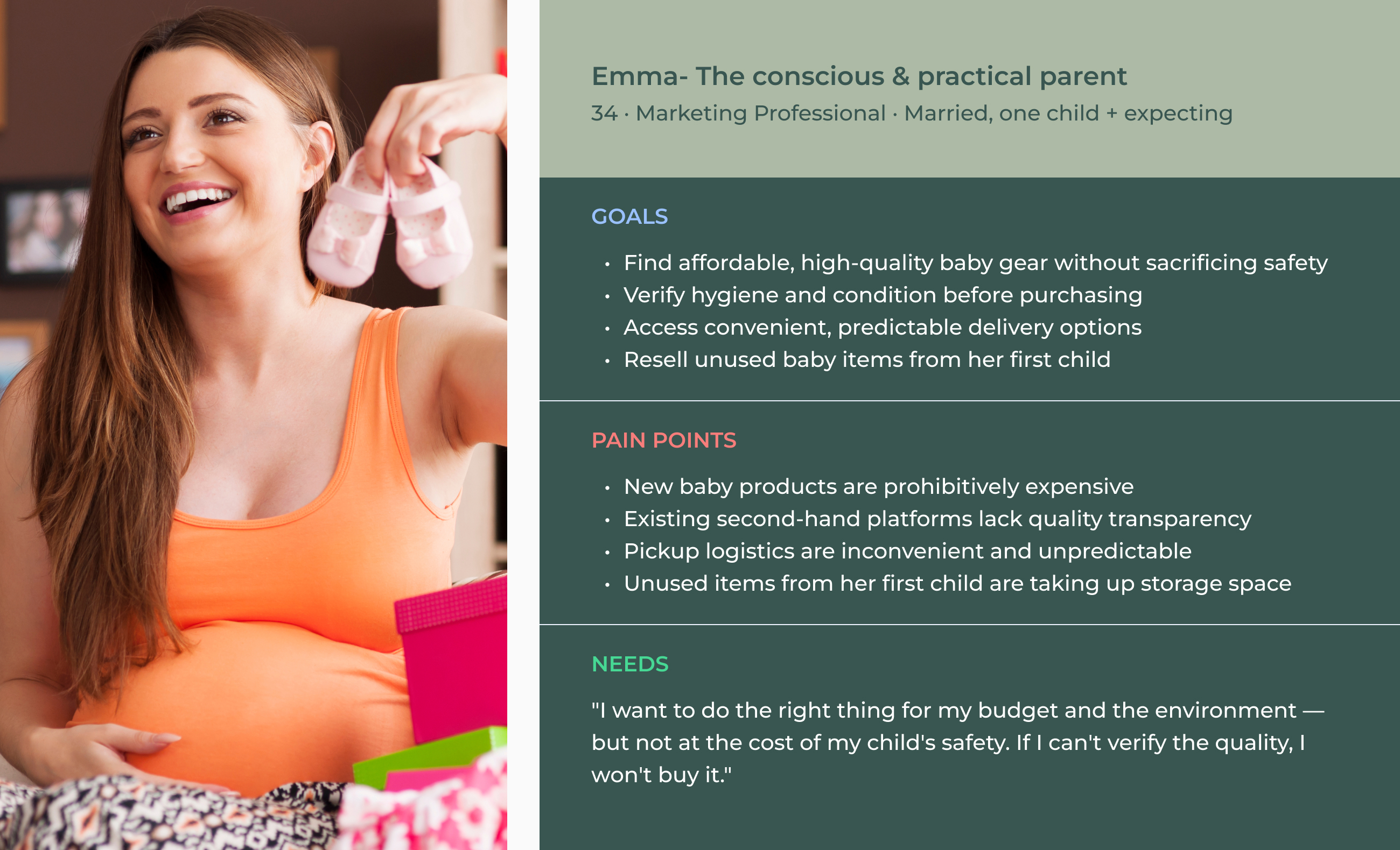
Segments
- Young parents who care about quality
- Middle-income families who are budget-conscious and prioritize reliability
- Digital natives who are comfortable with online marketplaces
6. Key Insights
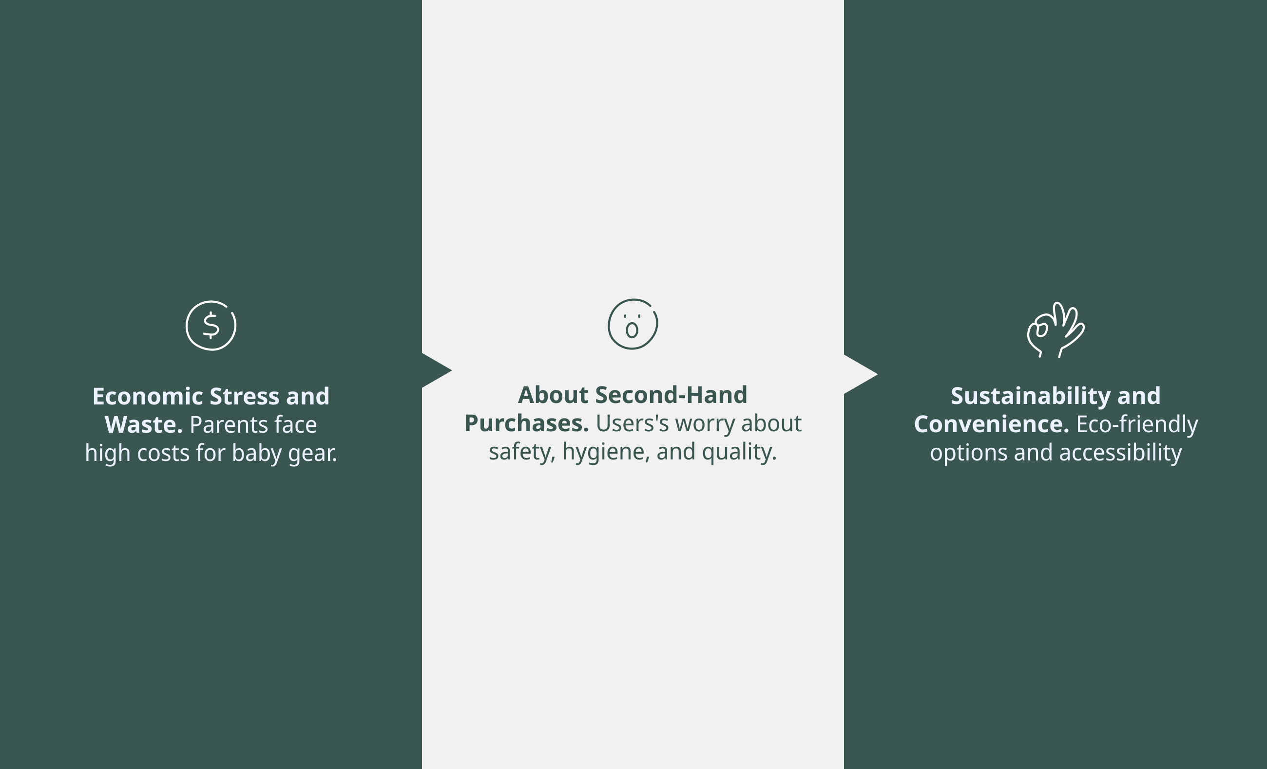
By grouping behaviors into recurring patterns, we were able to define the core problem and chart a clearer design direction.
The findings revealed some key needs:
7. From Insights to Product Decisions
- Reduce Financial Pressure & Waste
Solutions
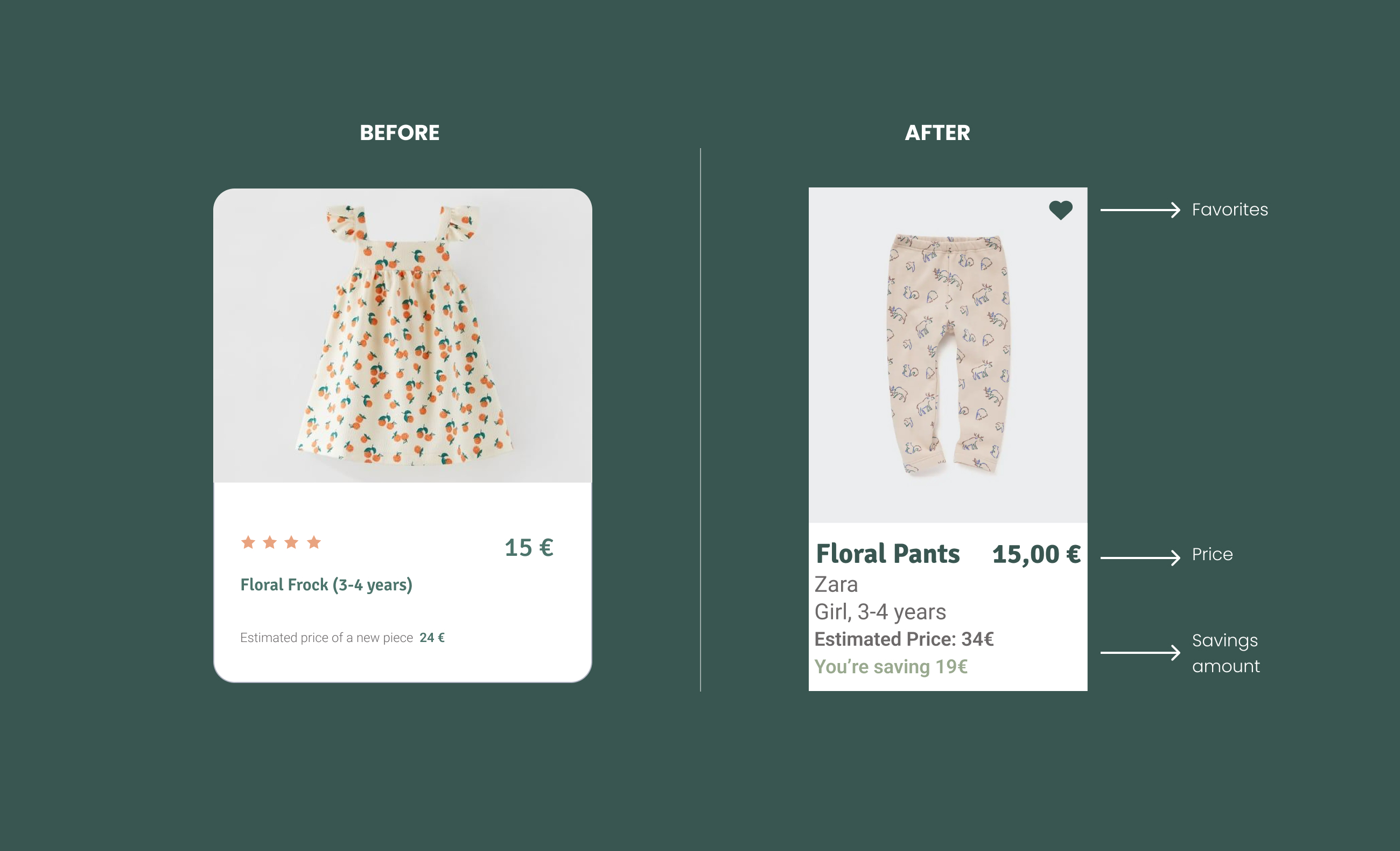
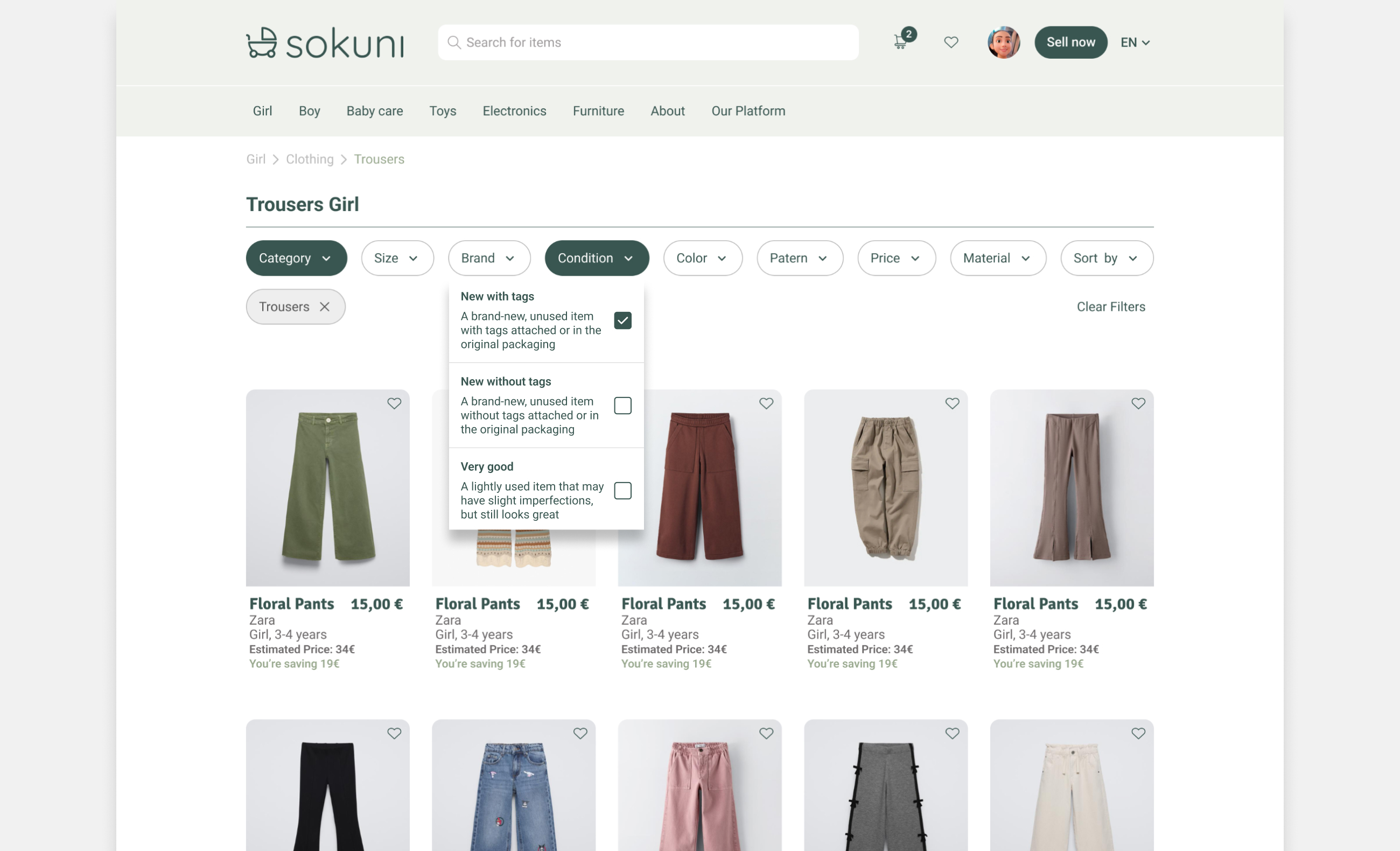
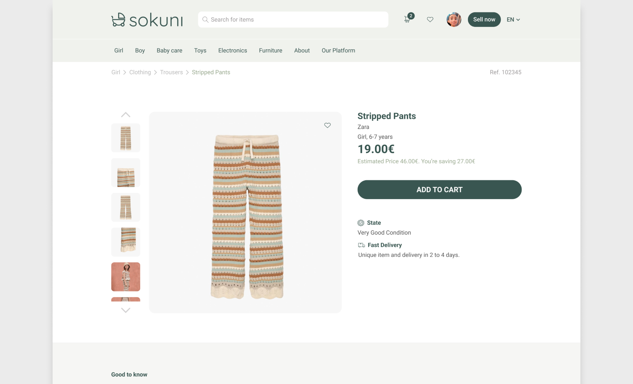
- Transparent pricing with visible savings
- Product cards showing price comparison & value
After the usability test, we refined the product card to better reflect the value proposition. By improving content structure, descriptions, and price transparency, users can quickly understand both the product and the savings.
- Build Trust Through Transparency
Solutions
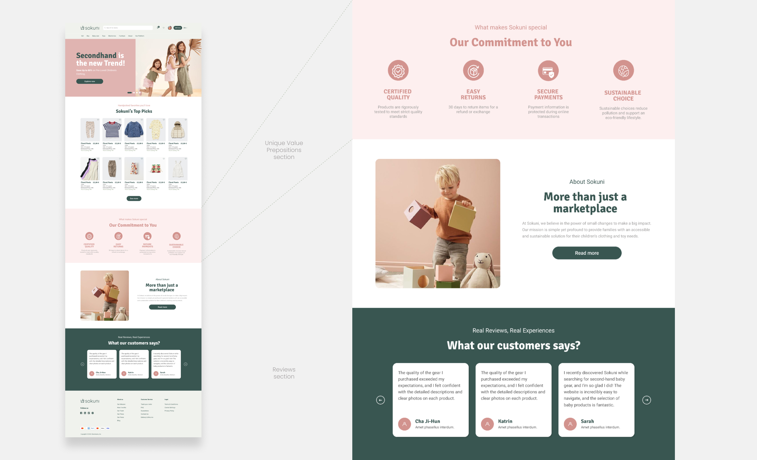
- A value proposition section highlighting safety & sustainability
- User reviews to increase trust & transparency
- Multiple condition filters: “New with tags,” “Very Good,” etc.
- Balance Sustainability with Convenience
Solutions
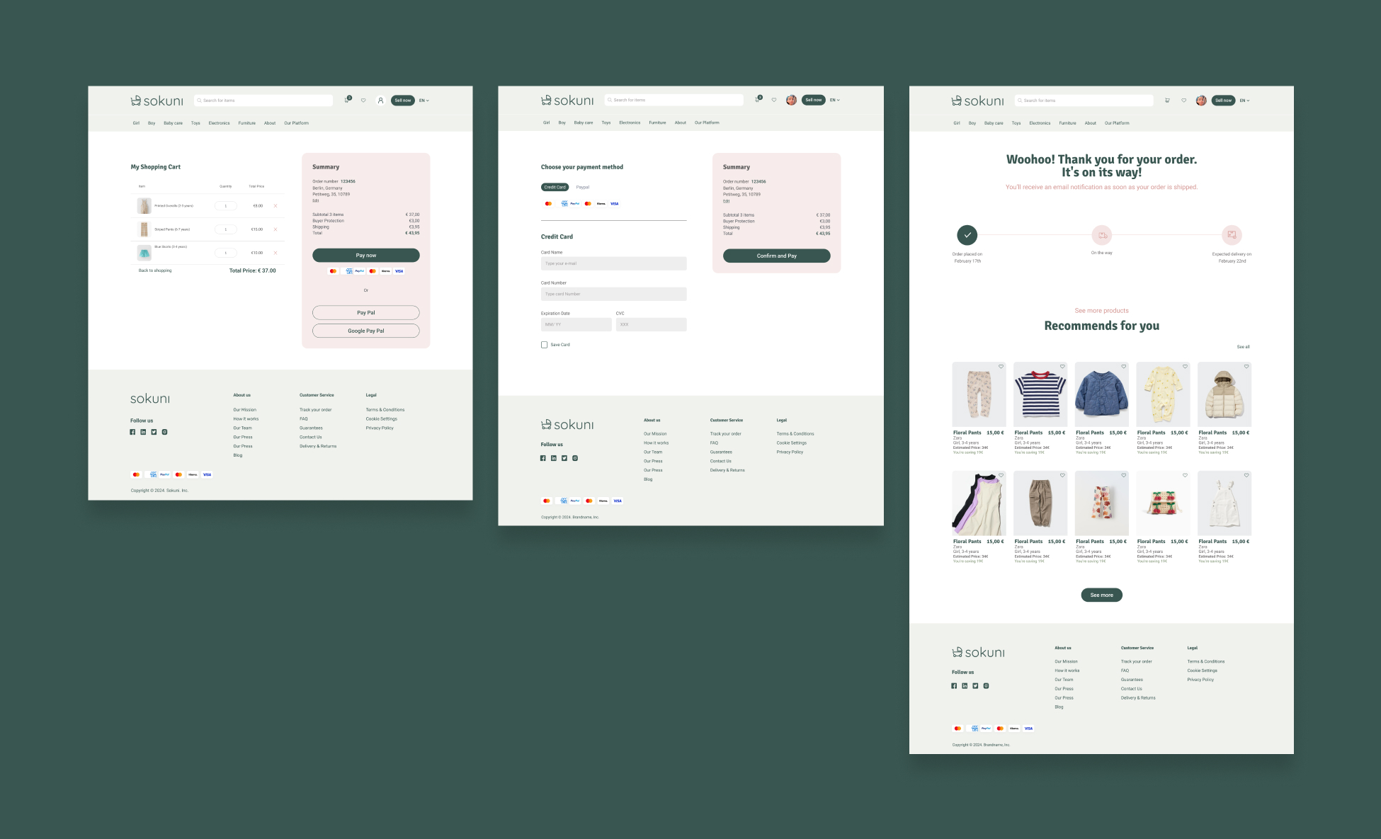
- Streamlined checkout with auto-fill and saved payment options
- Flexible delivery options (same-day delivery, local pickup)
8. User Flow
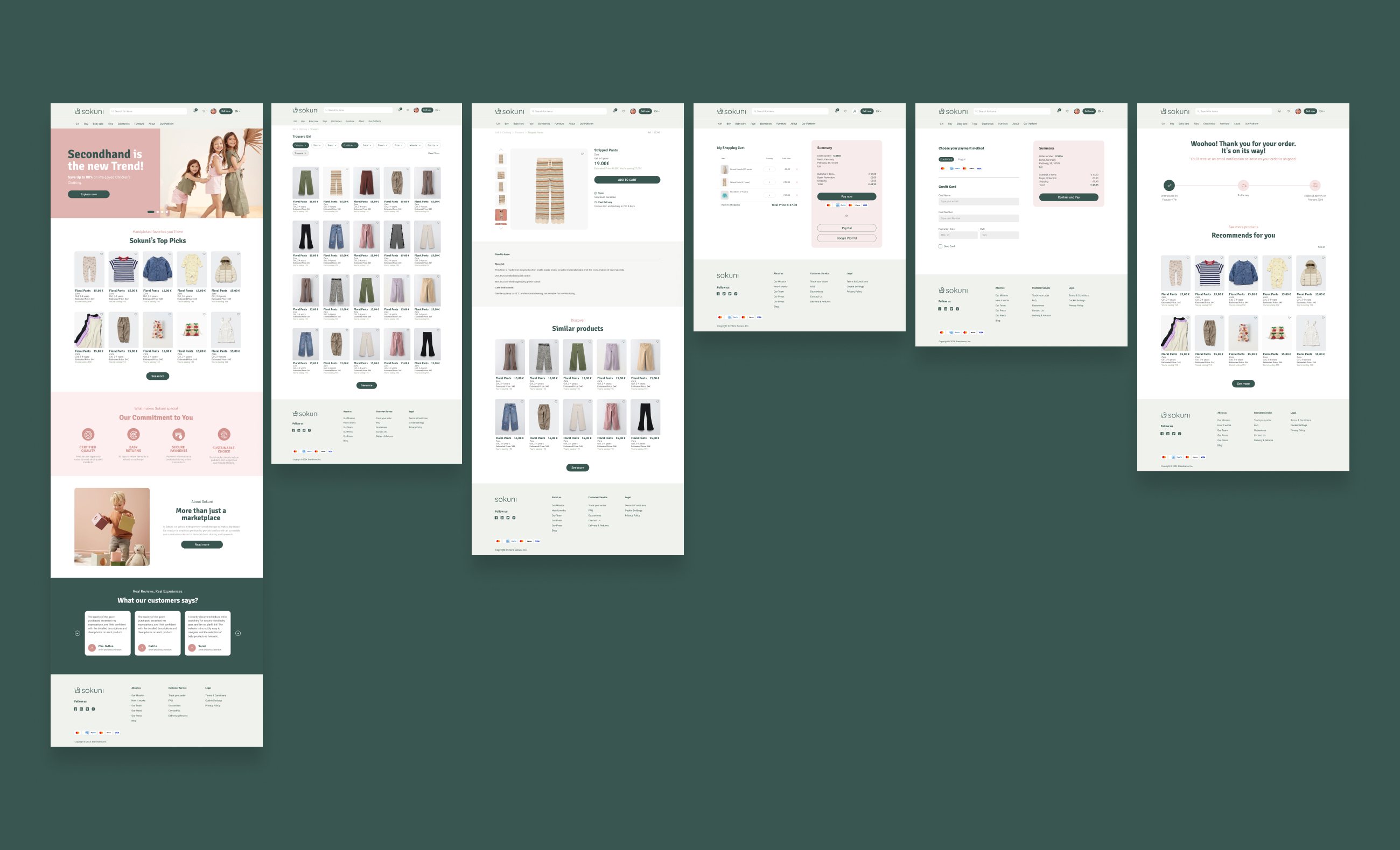
The goal was to create a clear and frictionless path from discovery to purchase. The experience guided users through a simple flow: browse, filter, evaluate products, understand total cost, select delivery, and complete the purchase.
As Lead UX/UI Designer, I focused on reducing friction by surfacing key information—such as product details, pricing, and shipping—at the right moments to support confident decision-making.
In the second iteration, I restructured the homepage to improve brand presence and simplify navigation, resulting in a more intuitive journey built around trust, clarity, decision, and conversion.
This process reinforced that effective UX is not about adding features, but about improving the structure, timing, and clarity of information.
9.Visual System
The visual features were crafted not just for aesthetics, but to enhance usability, build trust, and strengthen brand recognition across every touchpoint.
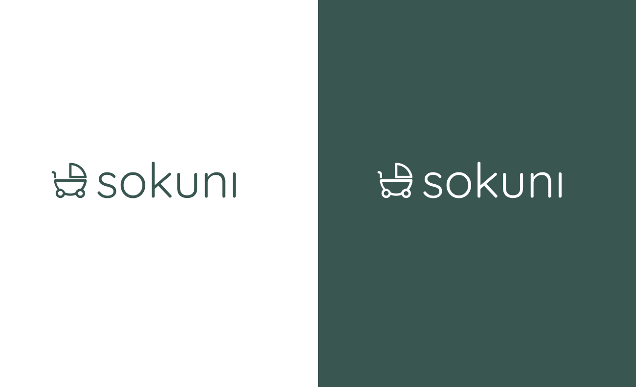
- Logotype
In the first iteration, we explored multiple directions. The founders selected a version that felt simple and clean, but it lacked immediate recognition. We refined it by introducing a supporting symbol, designed to quickly communicate the context of baby products.
- Typography
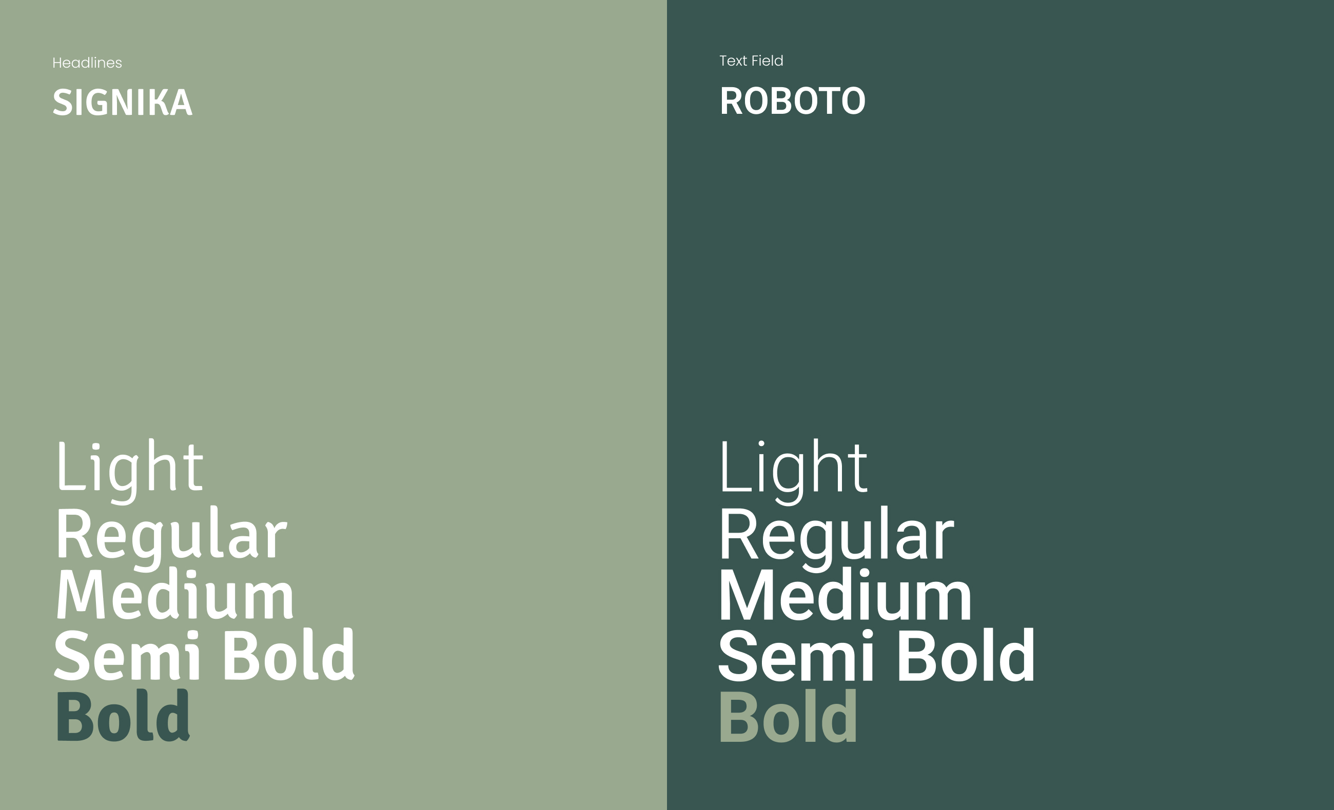
The typography system was designed to feel approachable and trustworthy while maintaining excellent readability. Quicksand adds personality and warmth, while Signika and Roboto ensure clarity and ease of use throughout the experience.
- Color Palette
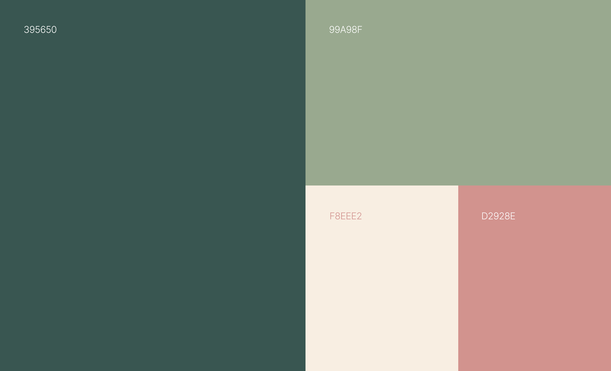
The color palette was designed to reflect the brand's core values and create an emotional connection with users. Green reinforces the brand's commitment to sustainability and growth, while salmon introduces a sense of warmth, care, and human connection throughout the experience.
- Iconography
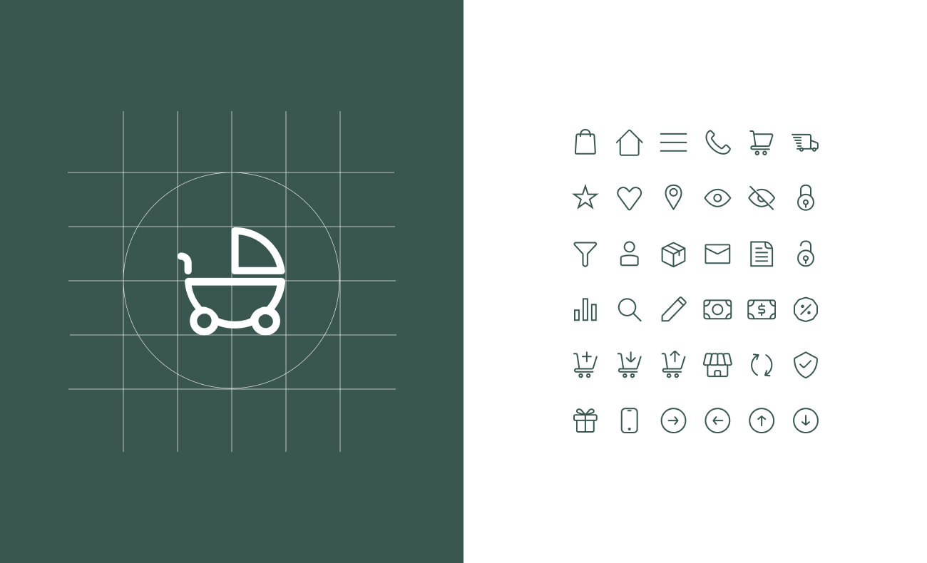
The visual language emphasizes consistency across the entire ecosystem. A unified set of icons, components, and visual patterns creates a familiar and intuitive experience, helping users navigate with confidence.
10. Prototype
To watch videos, you need to change your cookie settings preferences. Go to cookie manager and accept the field Tracking.
11. Impact & KPI's
- +25% User engagement. Driven by an improved product discovery experience: structured filters, clear listings, and intuitive navigation reduced friction between search and view.
- -20% Expected bounce rate. A clearer value proposition and trust signals on landing and product pages resolved the abandonment issue plaguing competing platforms.
- Growth in registered users (first 6 months). Driven by greater clarity in the onboarding process and a heightened perception of trust.
- Delivery of the complete design system. A scalable, documented component system, built from scratch, that enables faster iteration for a small team without sacrificing design consistency or brand integrity.
12. Learnings
One of the biggest challenges in this early-stage product was maintaining focus amid a constantly evolving set of ideas and opportunities. While exploring new possibilities was valuable, it also posed the risk of losing sight of core user needs and of expanding the scope beyond what the team could effectively deliver.
As Lead UX/UI Designer, I helped keep the team aligned by grounding decisions in user research and validating insights. Establishing a clear, evidence-based design strategy provided a shared direction for stakeholders, reduced ambiguity, and ensured that product decisions remained focused on solving the most critical user problems.